UX/UI Design · Eurotransport · Website, design system and navigation
One way in to three brands, from first sketch to a site ready to launch in less than a week
Eurotransport moves and prepares vehicles for car makers, importers, dealers and leasing companies, under three brands: Eurotransport, eta. and asc. The question was how the three brands should fit into the site and its navigation. Together with Eurotransport’s team, who had already done great work on the content and the first ideas, it went in less than a week from the brand question to a tested, bilingual site ready to launch.
- My role
- UX/UI designer and design system owner
- Team
- Eurotransport's management and team, with Claude as build partner
- Platform
- Web, desktop, tablet and mobile
- Tools
- Figma, Claude, Astro and GitHub
- Status
- Ready to launch
- Period
- 2026 · less than a week
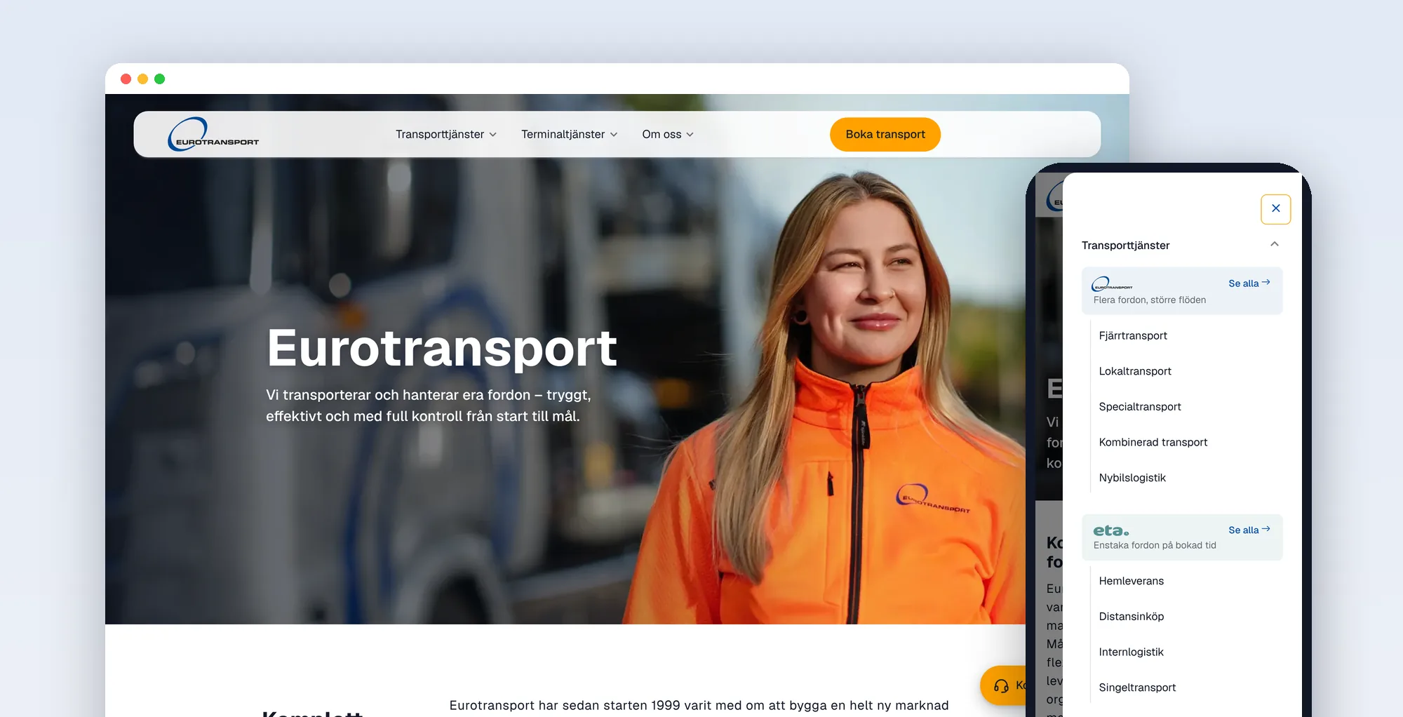
The short version
The challenge
The brief was how three brands should fit into the site and its navigation. The old site had three menus that each told a different story, and no trace of the brands. Customers had to know the company's internal words to find the service they needed.
What I did
I found one way in to three brands, with the navigation and pages built around what customers need: move vehicles, prepare them and get to know the company. That needed a redesign and a new design system, which I kept as small as the job. I built the site as a prototype in Claude, then in Astro, with the code in GitHub, all in less than a week.
What I delivered
A design system in Figma, in Claude and in code, a prototype you can try, and 26 pages in Swedish and English as an Astro site in GitHub that passes automated checks for accessibility, links and search on every change. It is ready to launch.
What I did as UX/UI designer
Information architecture
I sorted every service by the customer's need and by brand, and gave each one a place in the menu, on its page and in the footer.
Navigation design
A top menu with mega menus, an in-page section bar, a mobile drawer, breadcrumbs and a footer that work as one system.
Design system
Tokens named by role, one typeface and one component per job, the same in Figma and in code, in light and dark mode.
UI for three screen sizes
Twelve page templates for desktop, tablet and mobile, from the start page to the privacy policy.
Where we started
Eurotransport has moved vehicles in Scandinavia since 1999. Over the years the company grew three businesses: transport of many vehicles at once, single vehicles delivered at a booked time under the brand eta., and services before and after the transport under the brand asc.
The work didn’t start as a new website. It started with one question: how should three brands fit into the site and its navigation?
Eurotransport’s team came well prepared. They had already done great work on the content and on the first ideas, and that is a big part of why the work could move so fast. We worked closely together all the way: they knew the business and the customers, and I shaped it into structure, navigation and design.
None of that showed on the old site. I mapped every link on it and found three menus that didn't agree with each other. Fitting the brands in properly meant a redesign, not a new menu on top of the old one.
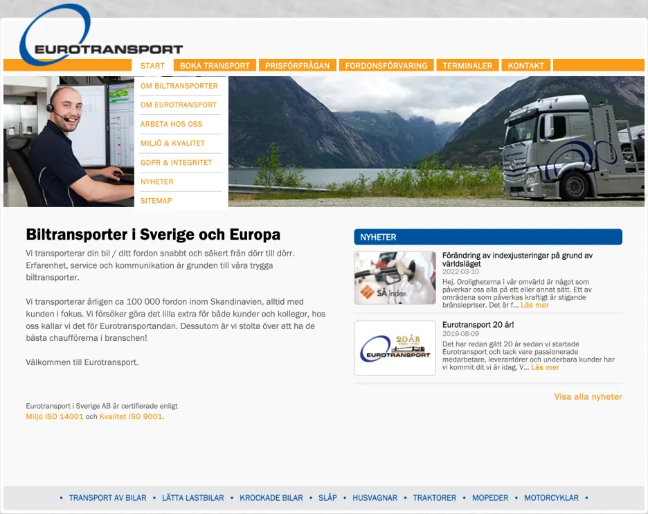
- An orange tab barStart, booking, price request, storage, terminals and contact: tasks and places mixed in one row.
- A list of links on the sideAbout the company, work with us, quality and news, in the same style as the services.
- A row of vehicle types at the bottomCars, light trucks, trailers and tractors, each leading to almost the same page.
Insight: the menu followed the organisation, not the customer
A customer comes with a need: move vehicles, get them ready or find out who we are. The old menus asked them to know the company first. The new structure starts from the need and lets the brand explain who does the job.
The top menu
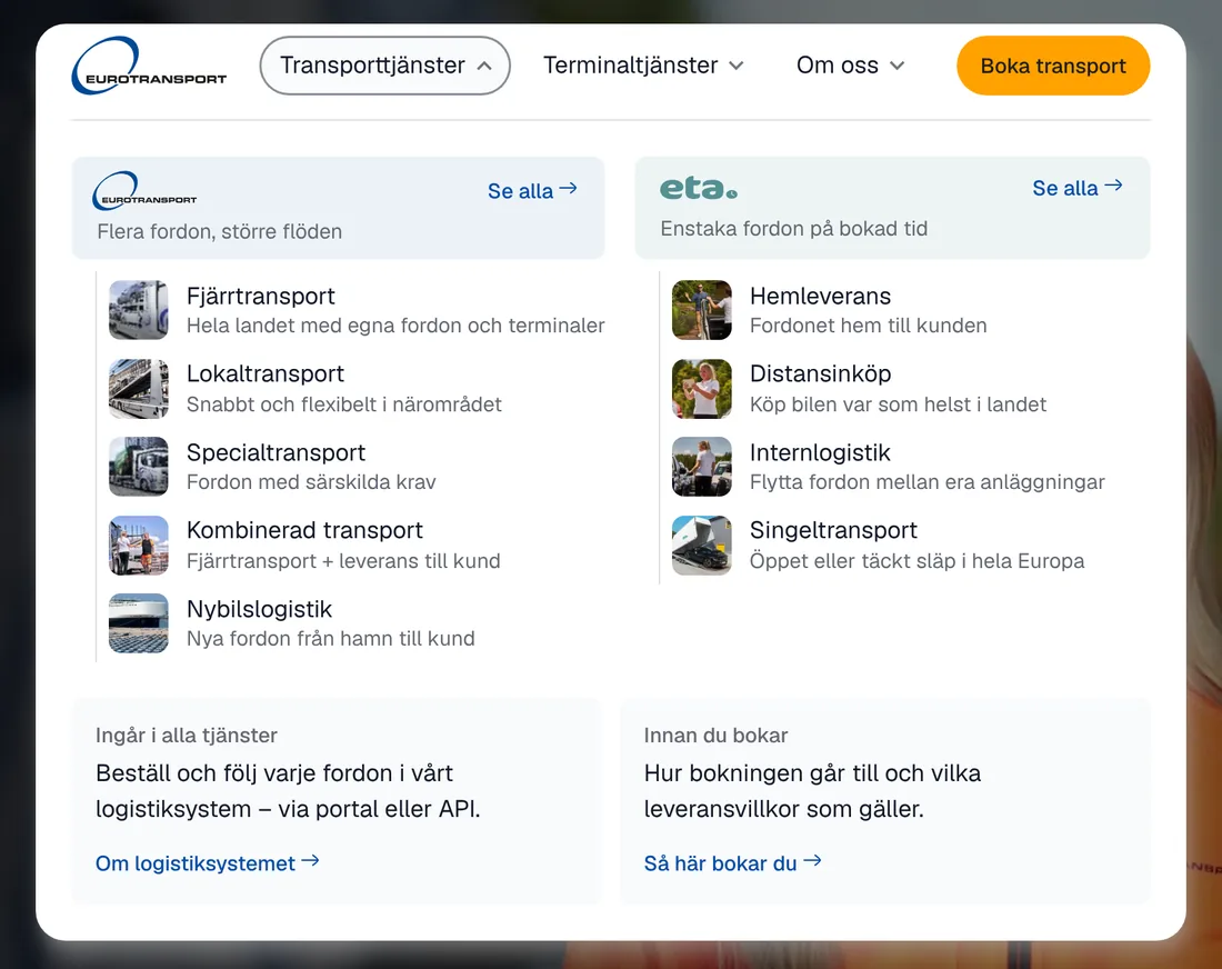
The top menu has three items that mirror what customers come to do: transport services, terminal services and about us. Booking a transport is the one orange button, always in view.
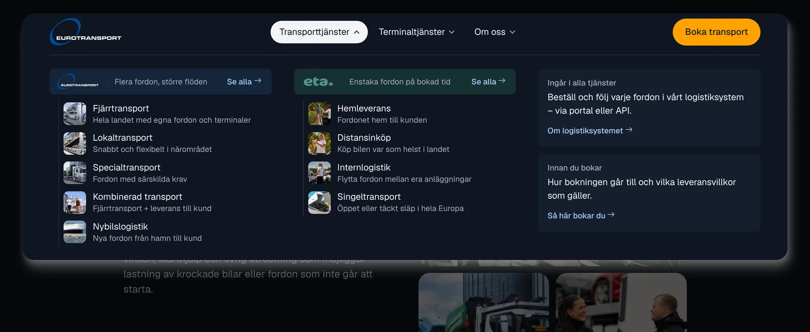
Each item opens a mega menu. Inside, the services are grouped by brand, and each group header carries the brand's logo and a short line that says what it is for. The customer chooses by need, and learns the brands on the way.
Three mega menus, one pattern
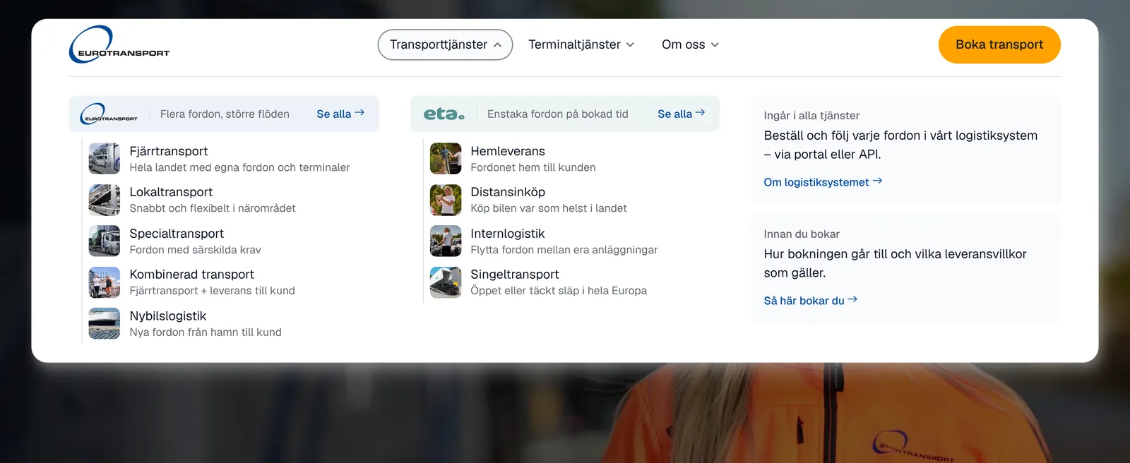
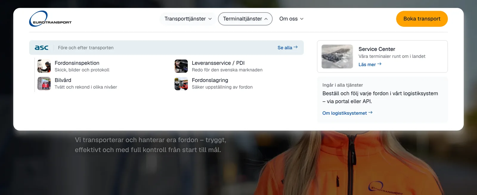
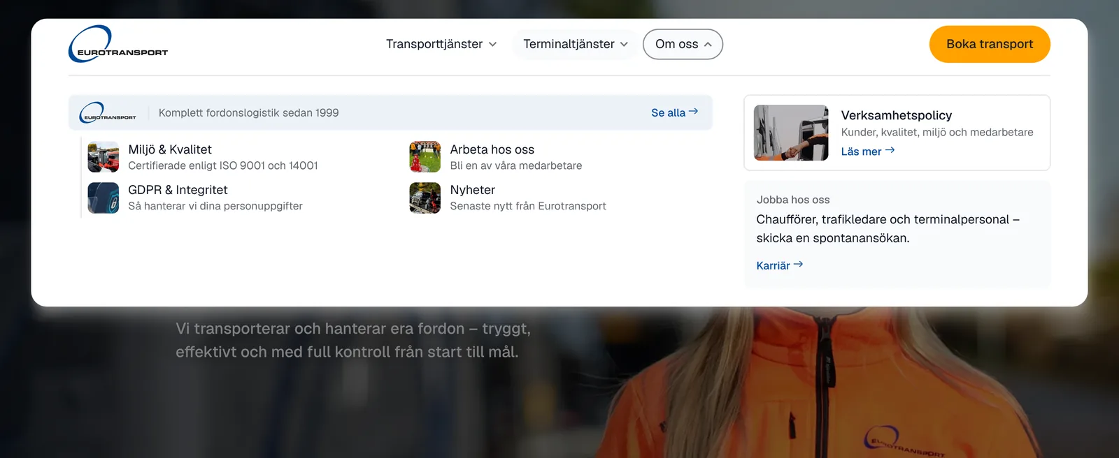
- Clear statesThe open item gets an outline, the current section a dark fill, and keyboard focus a blue ring.
- A floating barThe menu sits as a rounded bar 24 pixels from the top, so the photo behind it stays part of the page.
- Works by keyboardArrow keys move between items, Escape closes the menu and returns focus to where you were.
Insight: the brand belongs in the group, not in the menu
An early version had one top item per brand. It looked tidy, but customers had to know that eta. means single vehicles before they could choose. Moving the brands into the mega menu, with a line about each, let the menu speak in customer words and still show the brands.
Finding your way on a page
The service pages are long. A brand page such as asc covers five services, each with its own section. To keep customers oriented, I designed a section bar that sits under the top menu.
The section bar on a page
At the top of the page it sits under the hero. When you scroll, it sticks under the menu and follows you.
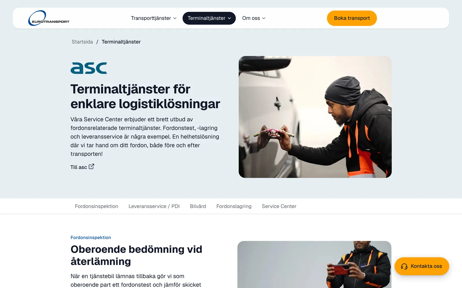
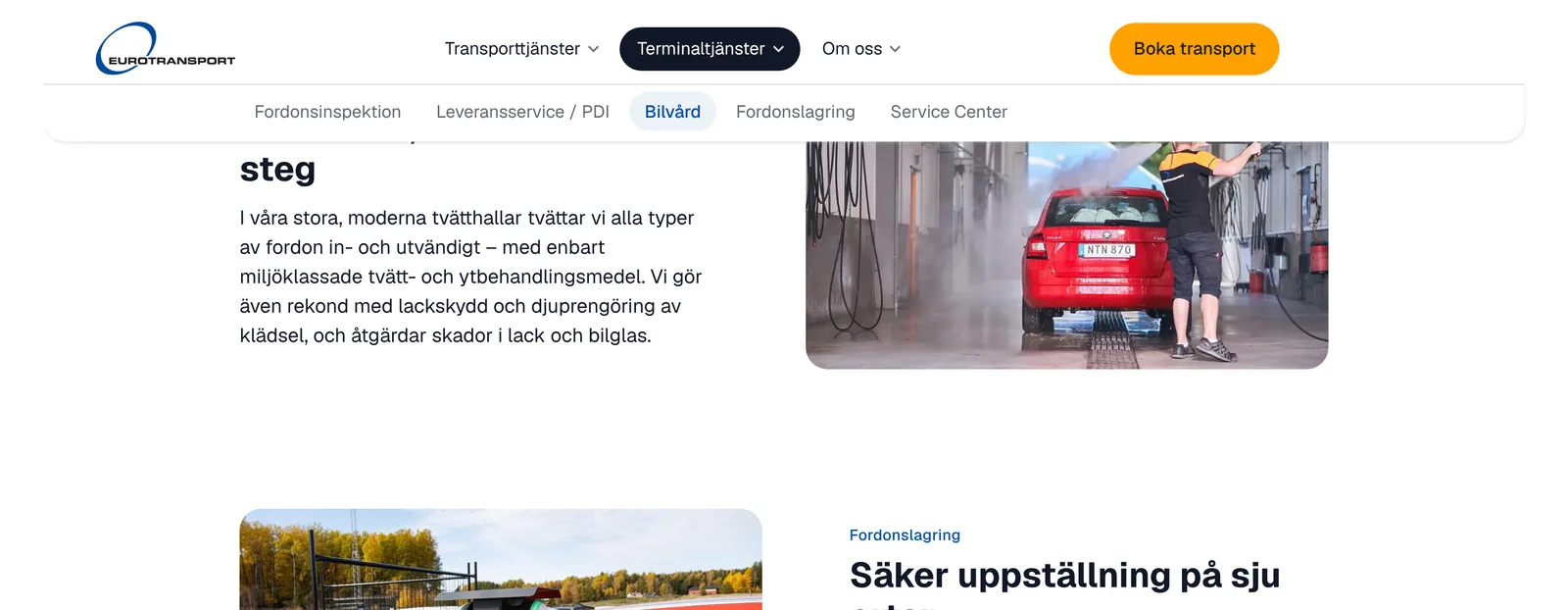
- The active tab follows the scrollYou always see where you are, without having to look for it.
- Headings land in viewA tap scrolls the section to 24 pixels under the bar, so the heading is never hidden behind it.
- A nudge to the other brandsThe end of each brand page points to the services the other two brands offer.


Insight: a tab you can’t see doesn’t exist
In the first mobile version the last tab sat just outside the screen, and nothing showed it was there. I only noticed when I looked for a section I knew existed. The fade and the arrows came from that.
Tablet and mobile
The same structure had to hold on every screen. I designed tablet and mobile as their own layouts, not as a shrunk desktop.
The menu on mobile
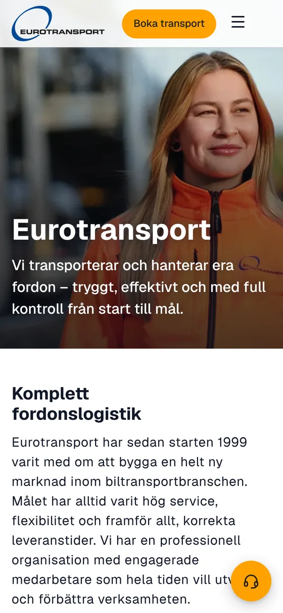
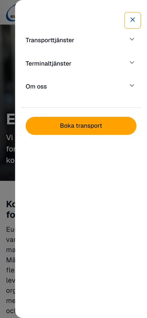
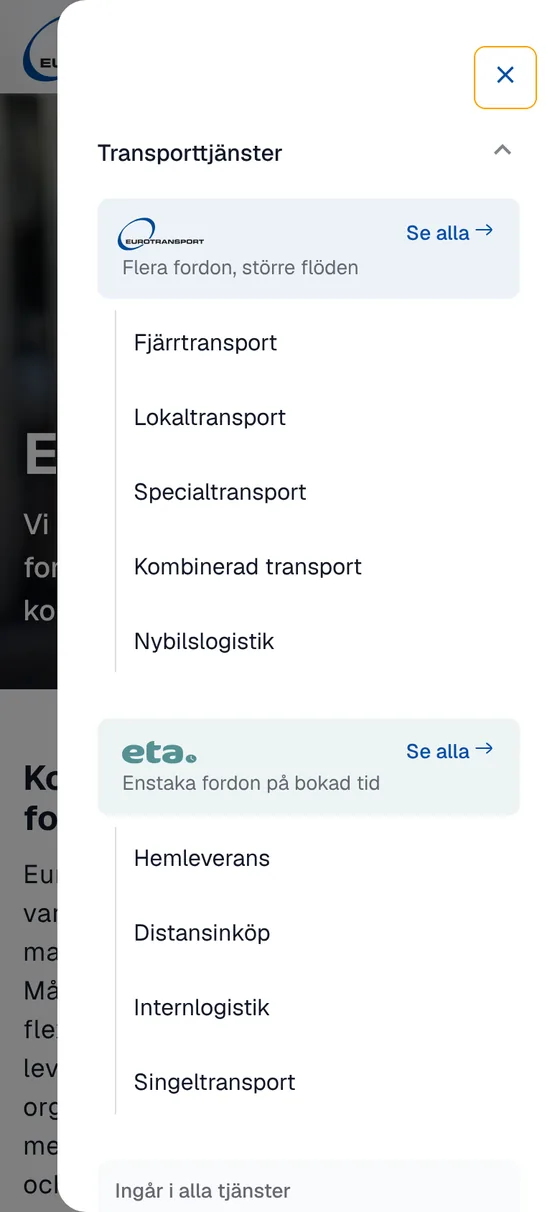
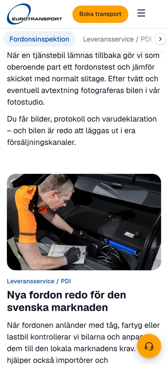
- Names only in the drawerOn desktop each service has a short description. On mobile the names stand alone, so the whole list fits without endless scrolling.
- A contact button that steps asideThe round contact button hides when the footer comes into view, so it never covers the contact details.
- Breadcrumbs on every sub-pageA short path back to the start page and the parent section, also on mobile.
A light design system, in Figma and in Claude
The redesign needed a new design system, but not a heavy one. I kept it to what the site needed: a few rules for what the three brands share and what may differ, so every page didn’t invent its own answer. I started it in Figma, with the parts the first pages needed.
When I moved to Claude, I took the system with me and completed it there, so the prototype and the code start from the same tokens and components.
- Tokens named by roleColours are called action, link, focus or surface, not orange or blue. That made dark mode a matter of new values, not new designs.
- One colour per brand, and only thereEurotransport blue, eta. teal and asc petrol mark which brand a service belongs to. Orange is kept for the one main action: book a transport.
- One component per jobA navigation link, a group header and a section bar each exist once, with their states, and are reused on every page.
- Action#FFA100Main buttons
- Brand blue#004996Eurotransport
- Link#054DA7Links
- Text#111827Body and headings
- Focus#096BDEFocus ring
- eta.#549093Brand colour
- asc#045E80Brand colour
- Tint#EDF2F8Soft surface
- eta. tint#EEF4F4Soft surface
- asc tint#E6EFF2Soft surface
- Display48 · Bold
- Kompletta fordonstjänster
- Heading 232 · Bold
- Transporttjänster
- Heading 320 · Medium
- Flera fordon, större flöden
- Body16 · Regular
- Vi transporterar och hanterar era fordon – tryggt, effektivt och med full kontroll.
- Small14 · Regular
- Hela landet med egna fordon och terminaler


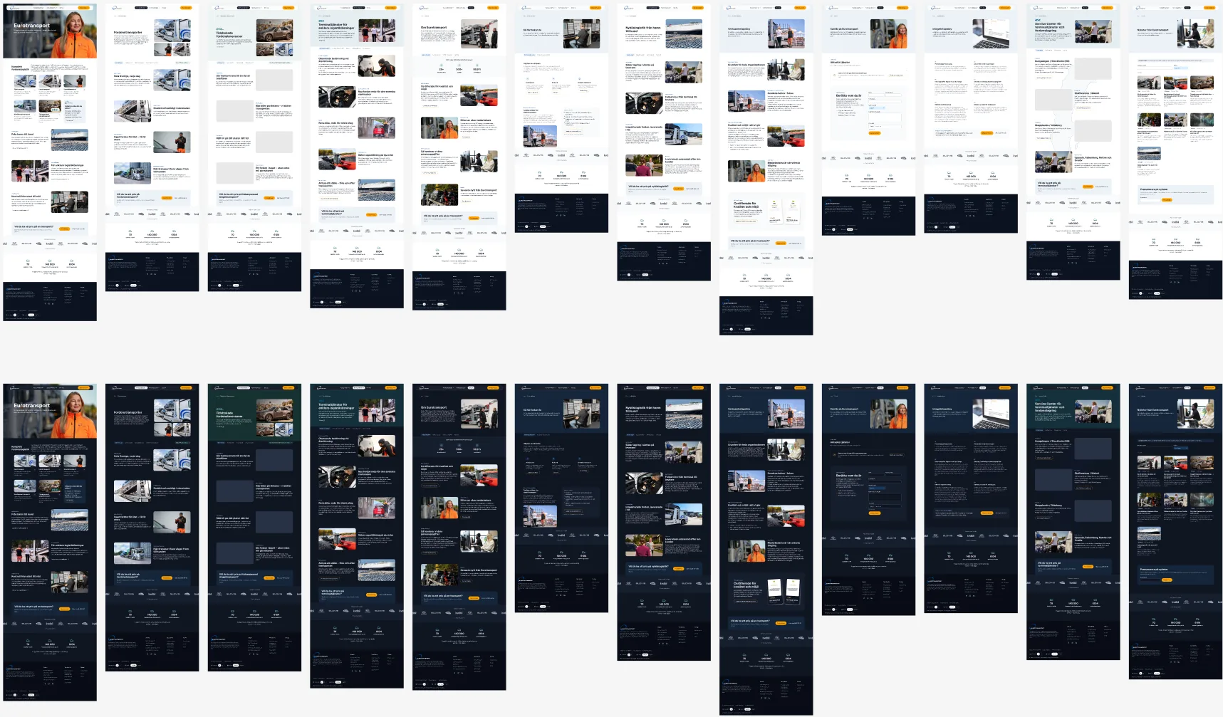
A prototype in Claude
Before any production code, I built the whole site as a working prototype in Claude, from the design system and the first pages in Figma. It runs in the browser, on every screen size and in light and dark mode.
That meant the navigation could be clicked through and tried, not just judged from drawings. Building it for real showed gaps that drawings hide, such as the last tab on mobile that sat outside the screen.
Built in Astro, and why
From the prototype, I built the real site in Astro. I chose it because it fits a site like this one: mostly content, three brands, two languages, and a company that should be able to publish it without a heavy platform.
- Plain, fast pagesAstro turns the components into static HTML pages, which load fast and are simple to host and publish. The key pages score 100 in Lighthouse.
- The same components as in FigmaSectionBar in Figma is SectionBar.astro in the code, so the design system carries straight into the site.
- Two languages from one sourceThe English site is built from the Swedish, and a check flags any text left untranslated.
- Checks on every buildAccessibility, links, search and translation are checked each time the site is built.
In GitHub, ready to launch
The code is pushed to a GitHub repository for the site. Every change runs the checks below, so the site stays ready to launch.
I scanned every link on the old site against the new one. Five pages had no home: the business policy, careers, privacy, the Service Center and news. They got their own templates and a new place in the menu, About us.
0 accessibility errors
Every page is checked with axe in light and dark mode, at desktop and mobile width.
100 in Lighthouse
The key pages score full marks for performance, accessibility, best practice and search.
4,700 links checked
A link check runs on every change, so no menu item or button leads nowhere.
Two languages, one source
The English site is built from the Swedish, and a check flags any text left untranslated.
Search was part of the navigation work too: each page has a title and description written for how customers search, and breadcrumbs that search engines can read.
What I took with me
Navigation is information architecture you can see. Most of the work happened before any menu was drawn, in sorting services by need and deciding where each brand should speak.
A light design system was enough, and it still paid off. Three brands, three screen sizes and two colour modes would have been three times the work without shared tokens and components.
It took less than a week from the brand question to a site ready to launch, and that was only possible because Eurotransport’s team had done such good groundwork on the content and the ideas.
The case also shows how my way of working has changed. I used to do everything in Figma. Here I started there: part of the design system and first ideas for the navigation, the start page and the brand pages, enough to have something concrete to talk about with the team. When the navigation needed adjusting, I moved to Claude, took the design system with me and completed the whole site there.
Figma is still where I think out loud and agree on a direction. But the decisions that matter most for navigation, how it feels to open a menu, scroll a long page or find the last tab on a phone, I can only really judge in something that works. Moving to code earlier didn’t make the design work smaller. It moved it closer to what customers will actually use.