Leading the product development of a mobile ordering and loyalty app for restaurant brands
As Product Manager at Leeroy, I led product discovery and development of a white-label ordering and loyalty app for iOS and Android, helping restaurant brands create simpler, more connected experiences for their guests. Working closely with customers, users, designers and developers, I combined user research, experience design and product leadership to shape what we built and why. Insights from discovery informed the end-to-end user journey, experience principles and a user-centred product roadmap. I led the cross-functional development process, translating long-term experience goals into priorities and sprint goals, while balancing user needs, business objectives and technical considerations.
My role
Product Manager | Product Discovery & Development Leadership
Year
2017–2021
Team
One cross-functional team of designers and developers, with me accountable for the overall user experience
Restaurant brands wanted their own app, and their guests wanted to get food quickly from a favourite place. As Product Manager, I drove and carried out product discovery to understand what made ordering, paying, pickup and loyalty hard for diners, and what we needed to learn to make well-founded decisions about what to build.
The product discovery combined four kinds of research:
Interviews and co-labsWith several restaurant brands, to understand their needs and goals together.
Trend researchWhat was happening in ordering, payments and loyalty, in Sweden and abroad, to follow the latest developments in self-ordering and loyalty.
Observations and field studiesIn the restaurants, to see how ordering and pickup worked in practice.
Usability testsOf flows and prototypes, to validate solutions with users before they were built.
Three insights that shaped the app
Insight 1
Getting started took too long
Diners wanted to get food quickly from a favourite place, but had to sign up before they could see anything, and extras and allergens were hard to find.
Insight 2
Waiting was the most uncertain part
Once the order was paid, diners didn’t know when to pick it up, or whether it was ready. So they stood and waited at the counter, or asked the staff.
Insight 3
Loyalty broke when the diner paid at the till
Points went missing when diners paid at the till instead of in the app. Diners don’t think in channels, and missing points cost their trust.
Where diners got stuck
I mapped the insights onto the mobile ordering journey, from opening the app to picking up the order and getting the points. It showed where diners got stuck, and where the biggest opportunities were.
Scroll sideways to see the whole journey.
Open the appFind the restaurantChooseOrder and payWaitPick up and earn
Experience
GoalGet food quickly from a favourite placePick the right venueFind what I feel likePay without hassleKnow when it is readyGet my food, and my points
DoingOpens the brand’s appPicks a venue from the list or by locationBrowses the menu and adds extrasChecks the cart and pays by cardWaits near the counterShows the order number and collects
Pain pointsHas to sign up before seeing anythingUnsure which venue is openAllergens and extras hard to findUnclear pickup timeDoes not know if the order is readyPoints missing when paying at the till
OpportunitiesBrowse first, sign up laterSort by my position, with opening hoursClear item details with allergensPickup time in the cartPush notification: your order is readyOne membership in the app and at the till
A simplified version of the mobile ordering journey, redrawn for this case.
From pain points to opportunities
Each pain point became an opportunity, and each opportunity was linked to what we built. The map kept the team’s backlog tied to real needs, and to the outcome we wanted: diners who order more often and come back.
OutcomeDiners order more often, and come backBusiness direction: more orders through the app, and brands that stay on the platform
Opportunities from customer and user insights, the service blueprint and the mobile ordering journey
OpportunityBrowse first, sign up laterWhat we builtAn open start page, with membership when it pays off
OpportunityFind the nearest open restaurantWhat we builtStore list sorted by position, with opening hours
OpportunitySee what is in the foodWhat we builtItem details with extras and allergens
OpportunityKnow when to pick upWhat we builtPickup time chosen in the cart
OpportunityKnow when it is readyWhat we builtOrder status: accepted, preparing, ready
OpportunityOne membership everywhereWhat we builtMembership card scanned at the till
The opportunity map for the ordering app, simplified and redrawn for this case.
02
Shaping the experience
From the product discovery insights, we also developed design principles for the app’s ordering and loyalty experience. The principles were based on users’ needs and gave designers and developers a shared foundation for making consistent design decisions across the whole user journey. They guided the design of the app’s flows and interactions, and also formed the basis of the design system that created a coherent and consistent product experience.
1
The brand comes first: the app is the restaurant’s, not ours
2
Order in a few taps
3
Always know the status of the order
4
One membership in the app and at the till
The design principles for the ordering and loyalty app, used by diners.
From insight to product direction
The principles were the link between what we learned and what we built. Here is how three of the insights ran all the way through: from the principle they gave us, to the design decision, the roadmap theme, and how we would know it worked.
Discovery insightDiners had to sign up before seeing anything, and extras and allergens were hard to find.
Design principleOrder in a few taps
Design decisionBrowse first and sign up later, item details with extras and allergens, and pickup time chosen in the cart.
Product direction“I can order and pay without waiting in line”
Measuring successOrders through the app · Conversion from menu to paid order
Discovery insightDiners didn’t know when the order was ready, so they waited at the counter or asked the staff.
Design principleAlways know the status of the order
Design decisionOrder status in the app (accepted, preparing, ready), and a notification when the kitchen marks the order ready.
Product direction“I know when my food is ready”
Measuring successOrders ready on time · Support contacts per order
Discovery insightPoints went missing when diners paid at the till.
Design principleOne membership in the app and at the till
Design decisionThe membership card in the app, scanned at the till, so points are earned and used in both.
Product direction“I get rewarded wherever I pay”
Measuring successActive members · Repeat purchase rate
Three insights, followed from discovery to how success was measured. Simplified for this case.
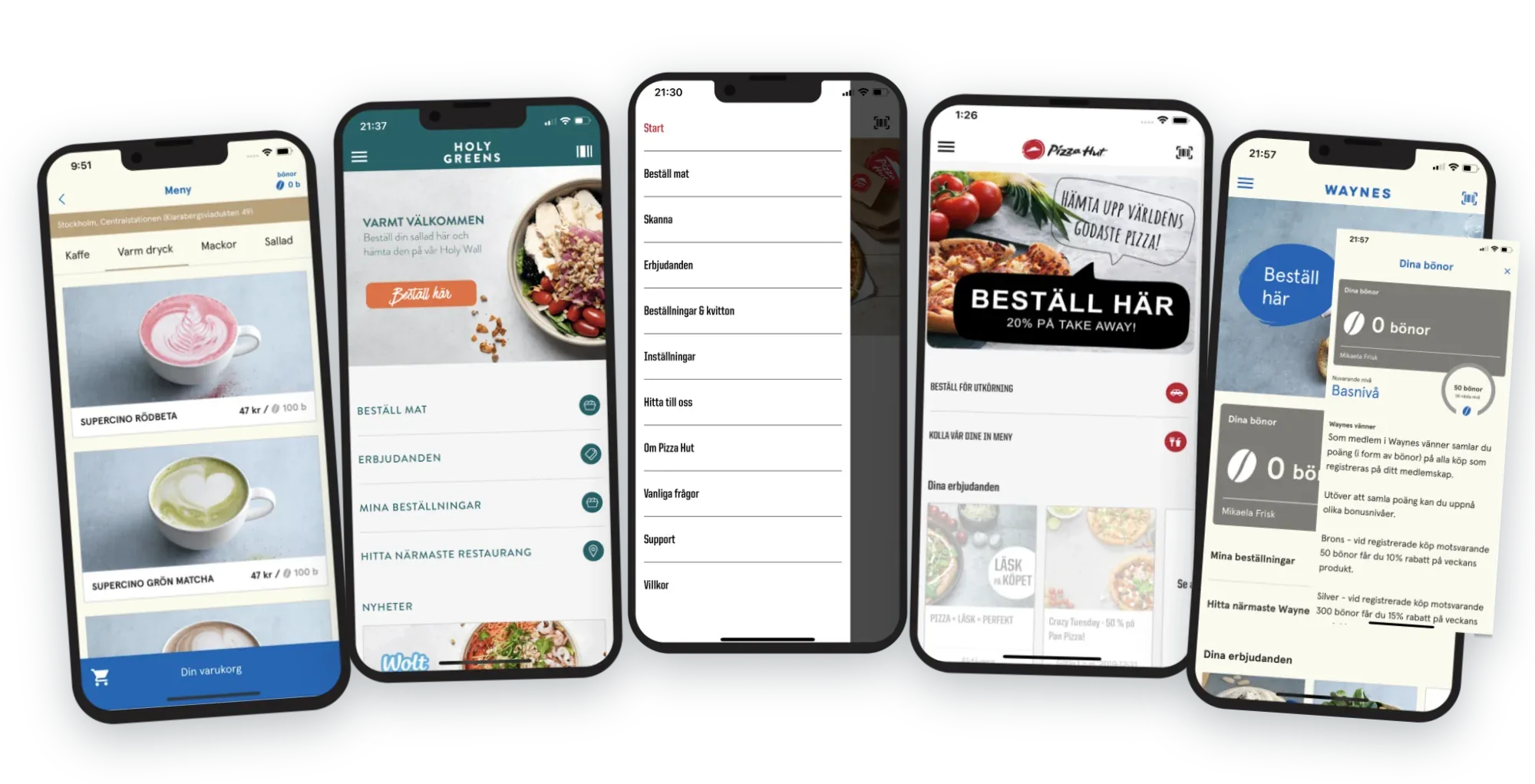
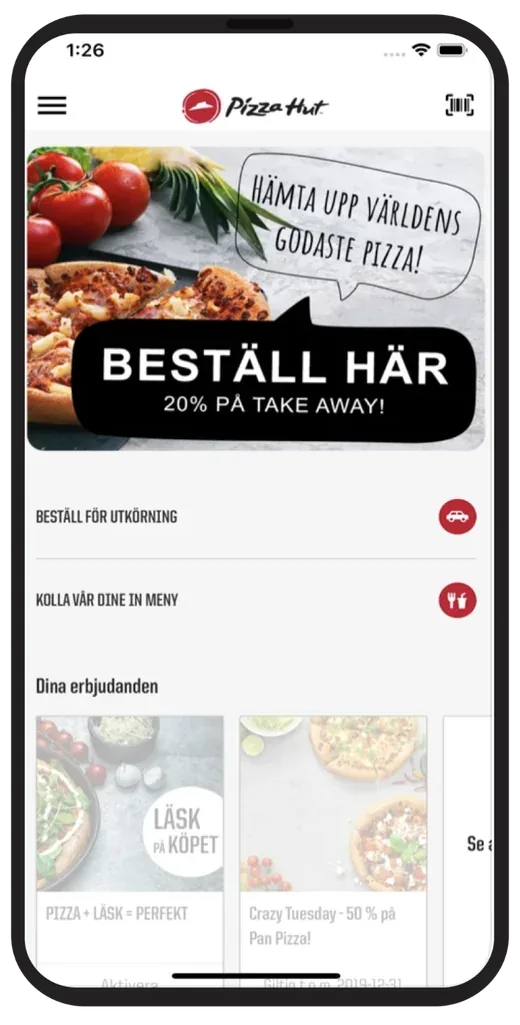
Here are some of the screens from the app. It was one white-label app, released for each restaurant brand with its own logo, colours, images and menu.
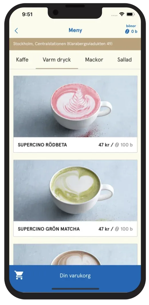
1The menu
The restaurant’s categories as tabs, and each product with image, price and its price in points. The chosen restaurant is at the top, and the basket is always at hand.
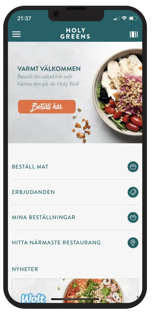
2A brand’s start screen
The brand’s own image and order button, with shortcuts to ordering, offers, my orders and the nearest restaurant.
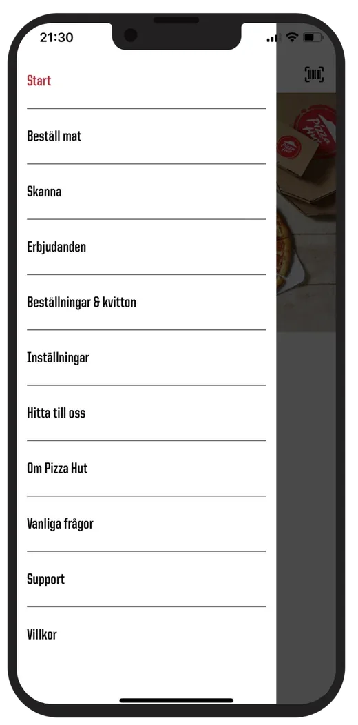
3The side menu
Everything else in one place: ordering, scanning the membership card, offers, orders and receipts, settings, restaurants and support.
4Another brand, the same app
A campaign at the top, ordering for delivery or the dine-in menu, and the member’s offers below.
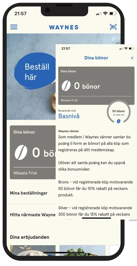
5Loyalty points and levels
The member’s points and level, and how the loyalty programme works, in a sheet over the start screen.
Screens from the app for five different restaurant brands. One white-label app, with each brand’s own look.
How the journey works end to end
Almost every step in the app depended on another product. Together with the designers, I mapped the user flow front stage and backstage: what the diner does, what the staff at the counter and in the kitchen do, and what the systems behind them must do. I agreed each step with the Product Manager for the POS and the kitchen display.
Scroll sideways to see the whole flow.
BeforeThe visitAfter
DiscoverOrderPayPreparePick upReturn
DinerDecides where to eat and opens the restaurant’s appChooses dishes and orders, ahead or at the restaurantPays in the app and earns pointsFollows the order statusGets a notification, picks up and eatsGets rewards and offers, and comes back
Line of interaction
Staff at the counterScans the member card at the tillHands over the orderRedeems rewards at the till
Line of visibility
KitchenThe order appears on the kitchen displayMarks the order ready
Line of internal interaction
Owners, back office and systemsMenu, offers and opening hours, set by the restaurantMenu and prices synced with the POSPayment provider and loyalty engineOrder routed to the POS and the kitchenPush notification to the dinerCampaigns and loyalty rules, set by the owner
The user flow for online ordering in the app, front stage and backstage. Simplified and redrawn for this case.
03
Setting the product direction
The roadmap was built from themes, not features. Each theme was written from the diner’s point of view, as an outcome they would notice. Then we broke it down into what it includes, and linked it to the KPIs it should move.
Themes kept the team focused on why something mattered, and left room to find the best way to get there. When priorities changed, it was easier to move a whole theme than to reshuffle single features.
NowWhat we build now
Theme 1Diners
“I can order and pay without waiting in line”
Order ahead or at the table, pay in the app, and the order goes straight to the kitchen.
What it includes
Menu and prices from the POS
Basket with extras
Pay in the app
Order straight to the POS and the kitchen
KPIs it should move
Orders through the app
Conversion from menu to paid order
Theme 2Diners
“I know when my food is ready”
No need to ask the staff, or to stand and wait at the counter.
What it includes
Order status in the app
A notification when the kitchen marks the order ready
Pick-up at the counter
KPIs it should move
Orders ready on time
Support contacts per order
NextWhat we build next
Theme 3Members
“I get rewarded wherever I pay”
Points and rewards follow the diner, in the app and at the till.
What it includes
Become a member in the app
Earn points in the app
Recognised at the till
Use rewards in both
KPIs it should move
Active members
Repeat purchase rate
LaterWhat comes after
Theme 4Members and brands
“I get offers that make me come back”
Stamp cards and offers, set up by each restaurant brand itself.
What it includes
Stamp cards
Offers in the app
Campaigns set up by the owner
KPIs it should move
Visits per member
Reward redemption rate
Theme 5Diners
“I can make changes to my order”
Change or add to the order after it is placed, as long as the kitchen has not started on it.
What it includes
Change or cancel before the kitchen starts
Add to an order
Refund or extra payment in the app
KPIs it should move
Support contacts per order
App store rating
The roadmap as themes, written from the diner’s point of view, each broken down into what it includes and the KPIs it should move. Redrawn for this case.
An insight from the live app
Insight
Offers got diners to download the app, loyalty brought them back
The app was downloaded the most when we introduced campaigns and offers in it. Ordering in the app was convenient, but what made diners download it and start using it was claiming an offer. Repeat purchases, in turn, were closely tied to the loyalty programme, which we could see when we measured loyalty through purchase card tokens.
Dependencies to other product teams
Almost every theme depended on the POS and the kitchen display, owned by another product team with its own Product Manager. My team also built parts of the POS back office. I aligned our themes with their Product Manager, so the changes we needed were planned in their roadmap too.
My product teamThe ordering and loyalty app
Ordering and payment in the app
Order status and notifications
Membership and loyalty in the app
And in the POS back office
The loyalty programme: earn points or stamps, exchanged for rewards
White-labelling the app: the brand’s colours and images
Campaigns and offers in the ordering app
Another product team, with its own Product ManagerThe POS and the kitchen display
Taking orders at the till or the table
Managing the items to sell
Setting up venues and venue information
Showing orders in the kitchen, and marking them ready
What the app neededWhat it depended onRoadmap theme
Menu, prices and extras in the appPOSThe items to sell, set up in the POS1“I can order and pay without waiting in line”
Store list with opening hoursPOSVenues and venue information, set up in the POS1“I can order and pay without waiting in line”
The order goes straight to the kitchenPOS · Kitchen displayThe POS and the kitchen display receive the order1“I can order and pay without waiting in line”
A notification when the order is readyKitchen displayThe kitchen display marks the order ready2“I know when my food is ready”
Points when paying at the tillPOSThe POS recognises the member at the till3“I get rewarded wherever I pay”
Points or stamps, and rewards to exchange them forPOS back officeThe loyalty programme, set up by the restaurant in the POS back office. Built by my team.3“I get rewarded wherever I pay”
Campaigns and offers in the appPOS back officeSet up by the restaurant in the POS back office. Built by my team.4“I get offers that make me come back”
Changing an order after it is placedPOS · Kitchen displayThe POS, the kitchen display and the payment5“I can make changes to my order”
Dependencies between the ordering and loyalty app and the POS and kitchen display, per roadmap theme. Simplified for this case.
Measuring success
Every theme pointed at the KPIs it should move, towards one outcome: diners who order more often and come back, and restaurant brands that stay.
That made every priority discussion concrete: which KPI will this move? And once a theme was live, the same KPIs showed whether it had worked, and what to improve next.
OutcomeDiners order more often and come back, and restaurant brands stay
Ordering
Orders through the app
Conversion from menu to paid order
Average order value
Payment success rate
Moved by
1“I can order and pay without waiting in line”
Experience
Orders ready on time
Support contacts per order
App store rating
Moved by
2“I know when my food is ready”
5“I can make changes to my order”
Loyalty
Active members
Repeat purchase rate
Visits per member
Reward redemption rate
Moved by
3“I get rewarded wherever I pay”
4“I get offers that make me come back”
What it adds up to for the businessGrowth
New members
Share of a brand’s sales through the app
Brands live on the platform
Brands that stay
SubscriptionsPayment transactions
The KPIs, from the outcome to the roadmap themes that should move them. Shown without figures.
Targets per KPI
Each KPI had a target, so the team knew what good looked like, and could see when a theme had done its job.
KPIWhat it showsTarget
Ordering
Orders through the appGrowth in orders paid in the app, month on month+10% per month
Conversion from menu to paid orderShare of visits to the menu that end in a paid order30%
Average order valueApp orders compared with orders at the till+30%
Payment success rateShare of payments in the app that go through≥ 98%
Experience
Orders ready on timeShare of orders ready at the chosen pickup time≥ 90%
Support contacts per orderShare of orders that lead to a support contact< 1%
App store ratingAverage rating in the App Store and Google Play≥ 4.5
Loyalty
Active membersShare of members who order at least once a month40%
Repeat purchase rateShare of diners who order again within 30 days50%
Visits per memberVisits per active member and month3
Reward redemption rateShare of earned rewards that are used25%
Growth
New membersGrowth in members per brand, month on month+5% per month
Share of a brand’s sales through the appApp sales as a share of the brand’s total sales20%
Brands that stayShare of brands that renew their subscription each year≥ 90%
The KPIs in the case, with the target for each. Simplified for this case.
04
Leading product development
Each theme on the roadmap came with the KPIs it should move. Together with the cross-functional team, I turned the themes into sprint goals: what we wanted to be true at the end of the sprint, and why it mattered for the diners and the restaurants. The team then planned how to get there.
1Roadmap themeWith the KPIs it should move, and a reason for its place in the order.
2RefinementThe team and I broke the theme into user stories, with the designers’ flows as the base.
3Sprint goalWhat should be true at the end of the sprint, and why it matters.
4Sprint planningThe team planned how to reach the goal.
5Demo and retroWe showed the result to stakeholders, and improved how we worked.
How a roadmap theme became work for the cross-functional team. Simplified for this case.
A prioritisation decision: ordering before loyalty
Decision
Build ordering, payment and order status first, and loyalty next.
Why
Without orders in the app there are no transactions, and nothing to reward. The core of the product had to work first.
What it meant for the team
The first sprint goals were about the core ordering flow. Loyalty followed in the next phase, so that members come back and brands have a reason to stay.
05
Balancing user and business needs
The app was built on two revenue streams: subscriptions, where restaurant brands pay for their own app, and transactions on the orders paid in it. Every theme was weighed on user value, business potential and complexity, and an impact matrix made the trade-offs easy to discuss in the team and with the other product owners.
Impact: business potential and user value →
Quick winsHigh impact, low effort
Big betsHigh impact, high effort
Fill-insLower impact, low effort
Think twiceLower impact, high effort
1“I can order and pay without waiting in line”2“I know when my food is ready”3“I get rewarded wherever I pay”4“I get offers that make me come back”5“I can make changes to my order”
Complexity and effort →
1“I can order and pay without waiting in line”
2“I know when my food is ready”
3“I get rewarded wherever I pay”
4“I get offers that make me come back”
5“I can make changes to my order”
The impact matrix we used to prioritise, with the roadmap themes placed on it. Redrawn for this case.
A trade-off: changes to orders could wait
User and business need
Being able to change an order mattered to diners, and fewer support contacts mattered to the restaurants.
Technical reality
A change touches the POS, the kitchen display and the payment, so it needed work in another team’s products as well as ours.
Decision
Changes to orders were placed later on the roadmap, after the core flow and loyalty were in place.
06
Outcomes and learnings
Here is what the work led to. I keep what was delivered apart from the goals we steered by.
Achieved
What was delivered
One white-label app for iOS and Android, released for each restaurant brand with its own logo, colours, images and menu.
Ordering and payment in the app, with the order going straight to the POS and the kitchen display.
Order status in the app, and a notification when the order is ready.
Tools in the POS back office, where restaurants set up their loyalty programme with points or stamps, the colours and images of their app, and campaigns and offers.
One membership in the app and at the till, where members earn and use rewards in both.
Flows and prototypes validated in usability tests with users before they were built.
Intended
What we aimed to move
More orders paid in the app
Diners who order more often and come back
Restaurant brands that stay on the platform
Measured by the KPIs in chapter 3. These were the goals we steered by.
Adoption30
restaurant brands used the white-label app, each with its own brand.
Order value+30%
higher order value on average through the app and Express Check-out.
Loyalty+39%
increased sales on average with the loyalty programme.
Learnings
Looking back, five things stay with me from leading the ordering and loyalty app at Leeroy.
1
Write the roadmap in the user’s words from day one
Writing the themes as something the diner would say, like “I know when my food is ready”, changed the conversations. Instead of debating features, we talked about what the diner should notice and why it mattered. When priorities shifted, we moved whole themes instead of reshuffling single features. Next time, I would start with themes from day one, not move to them along the way.
2
Agree on the KPIs before the work starts
Linking each theme to the KPIs it should move made priorities concrete. The bigger learning is about timing. If we agree on the KPIs, and know where they stand today, before a theme starts, we can say afterwards whether it worked. Measuring only after launch shows what happened, but not why.
3
The app is only as good as the service behind it
The best ordering flow in the app still fails if the order doesn’t reach the kitchen, or if nobody marks it ready. Almost every flow depended on the POS, the kitchen display or the loyalty engine. Leading the app meant leading across product teams: aligning early with the other product owners and owning the experience end to end, not just the screens.
4
White-label means two customers
Every decision had to work both for the restaurant brand paying for the app and for the diner using it. “The brand comes first” gave each brand its own look, while shared components and patterns kept one product we could build and maintain. That balance between brand freedom and one scalable product was a big part of the job.
5
Loyalty has to follow the diner, not the channel
Diners don’t think in channels. If points went missing when they paid at the till, they lost trust in the whole programme. Designing loyalty for wherever the diner pays, in the app and at the till, was harder and depended on more teams, but it was what turned diners into regulars.
“I worked closely with Mikaela for several years. What impressed me most was her ability to lead product discovery, turn customer and user insights into product direction, and drive product development through her leadership of the design team — always with contagious passion and drive!”
Anders Hären · CEO/CTO at Leeroy
More of my responsibilities at Leeroy
At Leeroy, I had several responsibilities. Each one is its own case.