UX/UI Design · Savvy Match · The employer side
Designing the complete hiring journey, from need to decision
Two founders wanted to create a recruitment service that gave greater weight to skills and potential. To make the idea work, employers needed to move from an initial hiring need to filling a role – and every candidate needed a clear response.
Making sure no candidate was left without an answer was one of the product’s guiding principles. It shaped how we thought about the entire service, not just how a recruitment ended.
As product designer, I designed the employer side of Savvy Match, from creating and publishing jobs to reviewing matched candidates, communicating and closing a recruitment.
The work began with user flows and interface designs in Figma, alongside the candidate app. I later revisited the designs and built a working prototype in code. Moving through the complete hiring journey revealed gaps in the flows, states and transitions – and allowed me to design solutions for them.
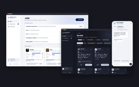
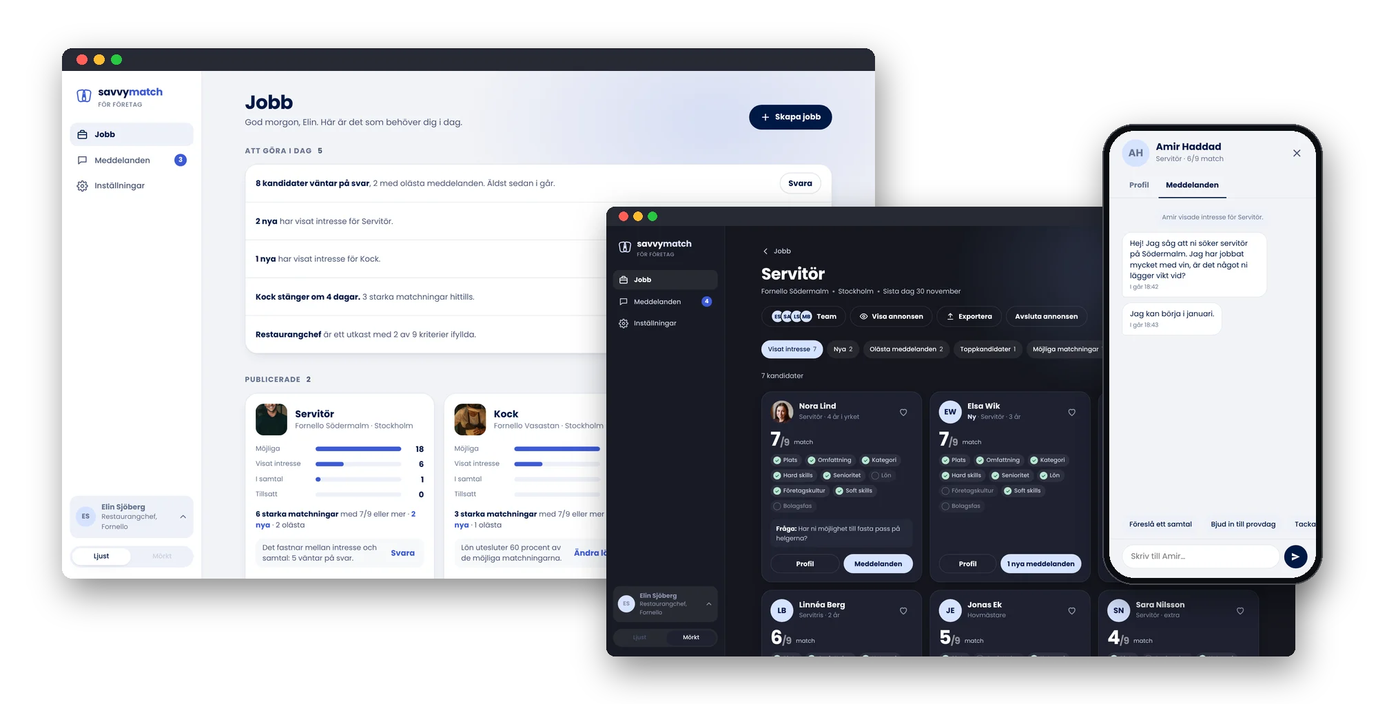
The result is a connected, responsive prototype that can be explored on desktop and mobile. It shows how employers can manage the journey from beginning to end, including giving candidates the right message when a role is closed.
- My role
- Product Designer
- Year
- 2021–2022, prototype 2026
- Industry
- Recruitment
- Company
- Savvy Match
- Users
- Employers and their hiring teams
- Platform
- Web, desktop and mobile
The short version
The problem
Savvy Match aimed to bring candidates and employers together based on skills and potential. But a relevant match achieves little if the employer can’t act on it.
People hiring need to create jobs quickly, understand which candidates match, manage conversations and make decisions – often alongside their other responsibilities.
At the same time, the product principle that every candidate should receive a response needed to work in practice, from initial contact to closing the role.
My contribution
I mapped the employer journey as part of the same service as the candidate app and designed the flows in Figma together with the founders.
I later built a working prototype in code, based on the earlier flows and Savvy Match’s design system. Walking through the complete process helped me identify and resolve gaps involving tasks, team roles, messages and closing a role.
The result
A working, responsive prototype of the complete employer journey, from the initial hiring need to closing a role.
It shows how employers can publish jobs, review matches, communicate, collaborate as a team and give candidates the appropriate response when recruitment ends.
The work also made gaps between the original Figma screens visible, so they could be designed for.
When a match needs to lead somewhere
Savvy Match was built around matching candidates and employers based on skills, cultural fit and potential, rather than bias related to factors such as gender, age and ethnicity.
The candidate app helped people discover relevant jobs and express interest. But that was only one side of the service.
For a match to lead anywhere, employers needed to receive expressions of interest, understand why a candidate matched and move the process forward.
Employers start from a different place
Many people recruit alongside their other responsibilities. A manager may need to find staff while still running the day-to-day business.
The tool therefore needed to make the next step clear without expecting someone to monitor recruitment constantly.
It wasn’t just about displaying information. It was about helping employers understand what needed their attention.
No candidate should be left without a response
Mapping both sides of the service made it clear that matching couldn’t end when someone expressed interest.
One of Savvy Match’s product principles was that every candidate who had shown interest should receive a response.
That meant statuses, conversations and closing a role needed to be part of the first version. Employers had to be able to follow up throughout the process and give people an appropriate response when a role was filled or closed for another reason.
My design challenge
I needed to create a tool that helped employers move from a hiring need to a decision while keeping their experience connected to the candidate journey.
The question wasn’t only how employers could find the right person, but how the service could help both sides move through the entire process.
From Figma flows to a working prototype
I designed the employer flows alongside the candidate app, working with Savvy Match’s two founders.
We started from a shared user story map covering both groups. It made the dependencies between their actions visible and helped us define what the first version needed to include.
I later returned to the employer side and took the design further by building a working prototype in code.
First, we needed to understand the whole service
The story map followed the journey from an employer’s initial need through to closing a role.
We could see what needed to happen after a candidate expressed interest: employers had to receive the information, review the profile, respond and continue the conversation.
This helped us prioritise a complete first version rather than only the features for publishing and discovering jobs.
Figma gave us a shared picture
I designed flows for publishing a job, reviewing candidates, opening profiles and communicating.
The screens made it possible to discuss the experience with the founders, make design decisions and establish a direction for the product.
But static flows tend to show the intended paths through a service. It’s easy to skip over what happens between screens.
The prototype exposed what was missing
When I later rebuilt the flows in code, the service gained data, states and transitions that could be tried out.
It became possible to create a job, manage candidates, send messages and close the process, rather than simply click between predefined screens.
That raised new questions: Who can edit a job? What happens when a new colleague is invited? Which messages should be ready to use? How do we make sure the person who was hired doesn’t receive a rejection?
These details became visible when I followed the complete journey.
Testing the design from beginning to end
I worked through the prototype in five stages, from the first hiring need to closing the role.
Whenever I found a gap, I designed a solution and brought it back into the connected experience.
It was only when I could work through the entire recruitment that I saw what was missing between the screens.
From a hiring need to a closed role
The working prototype shows the employer journey in five stages. I used a fictional restaurant group and fictional people to make the experience concrete. All screens are in Swedish and can be explored in the prototype.
Working prototypeTry it yourselfStart from a recruitment need, publish the job, review candidates, chat and close the job. Desktop and mobile web, light and dark. In Swedish.1 · Start with a hiring need
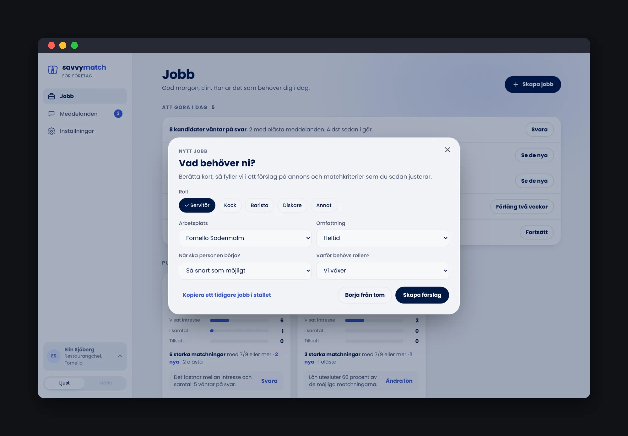
Recruitment starts before the job ad.
Instead of an empty form, employers first describe their need and can choose templates for common roles such as waiter, chef, barista and dishwasher. Each template creates a draft of the role, requirements and team, all of which can be edited.
2 · Publish the job and see the candidate’s perspective
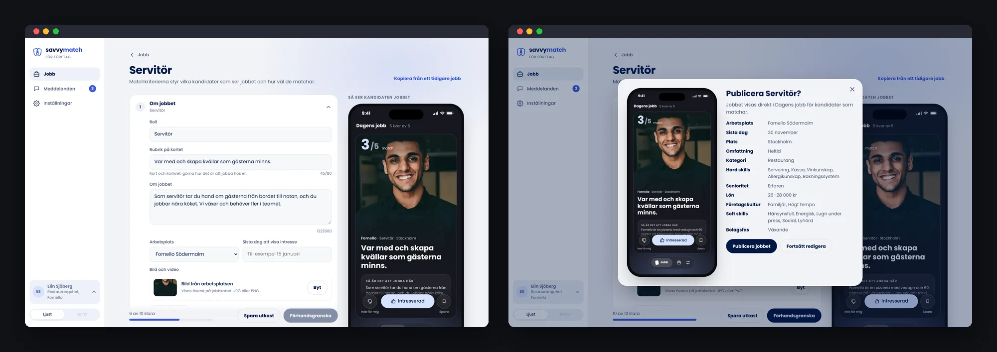
The job is built in short steps, with a live preview of the card as candidates will see it.
The requirements in the job ad are also used for matching. Employers therefore need to understand both how the role is presented and what their choices mean. A review step lets them check everything before publishing.
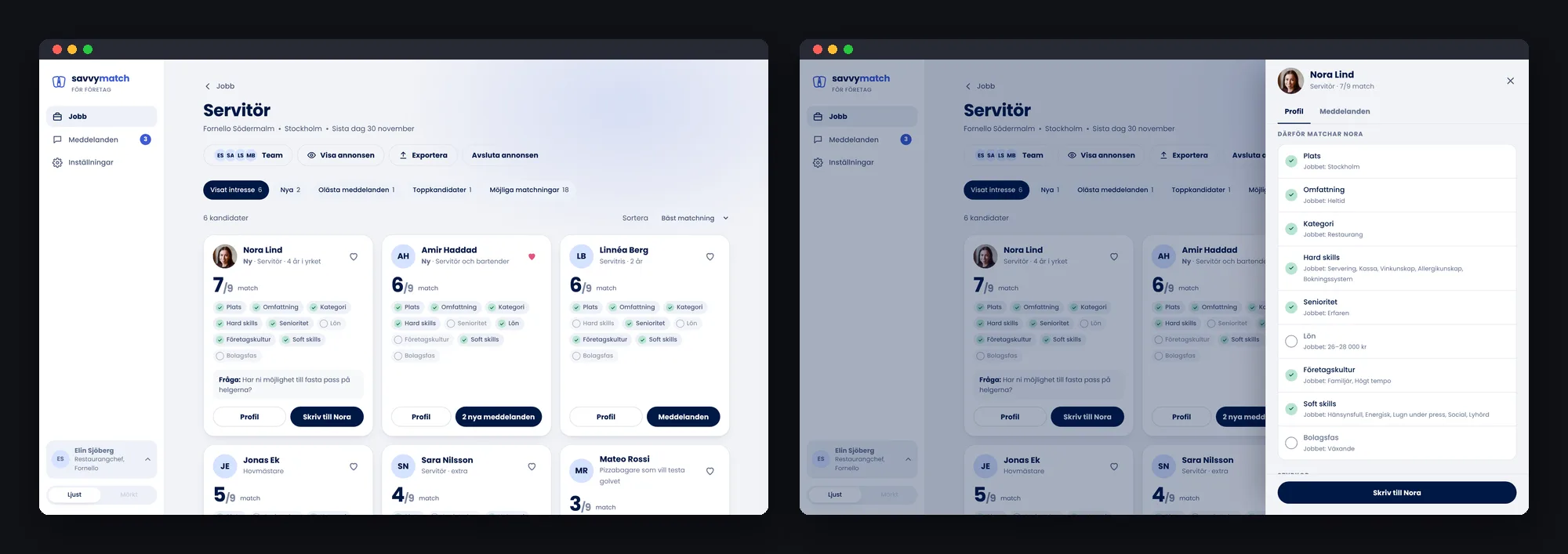
3 · Review candidates and understand the match
Candidates who express interest appear as cards with a prominent match number and details of the job requirements they meet.
The number shows how many stated requirements match – not someone’s worth or their probability of being hired. Clicking it opens the profile at the explanation of why the candidate matches.
Filters for new, unread and favourite candidates help employers manage several people. The candidate app uses the same underlying way of describing a match.
4 · Talk to candidates
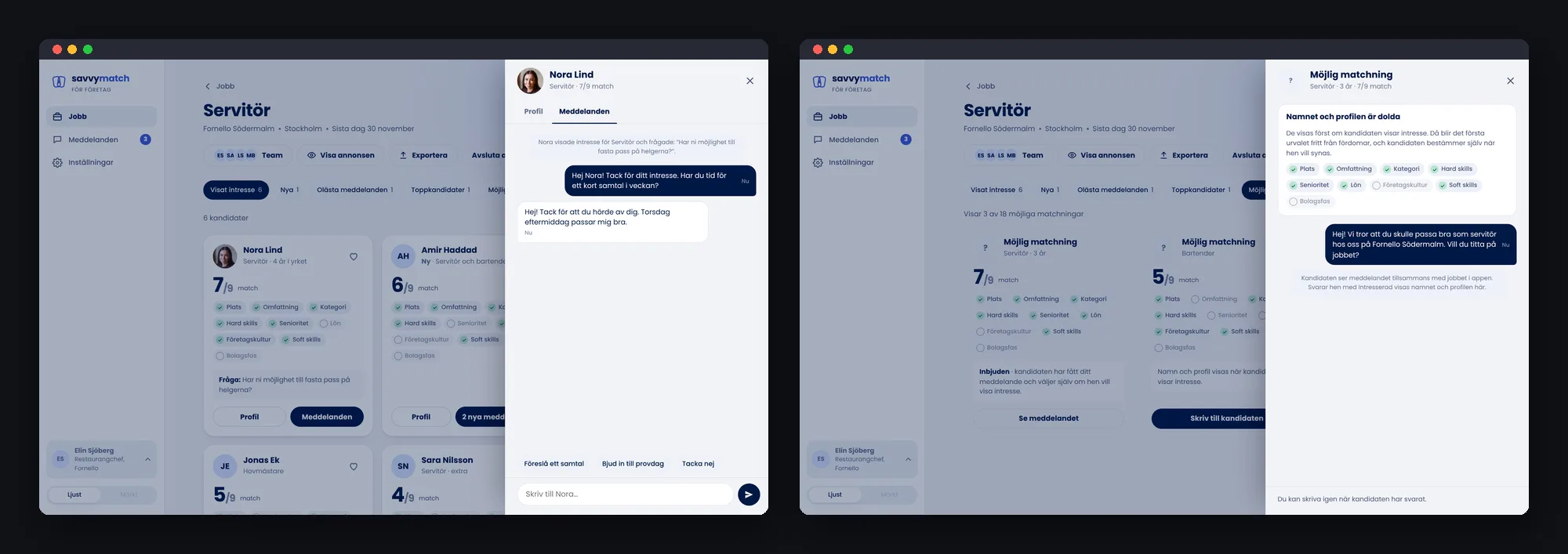
The conversation opens alongside the candidate’s profile, letting employers respond without losing context. Quick replies support common next steps, such as inviting someone to a trial shift.
Employers can also contact potential matches who haven’t expressed interest. These candidates remain anonymous until they reply; their name and photograph aren’t shared in advance.
5 · Close the role and give the right response
Closing a recruitment is more than changing a status.
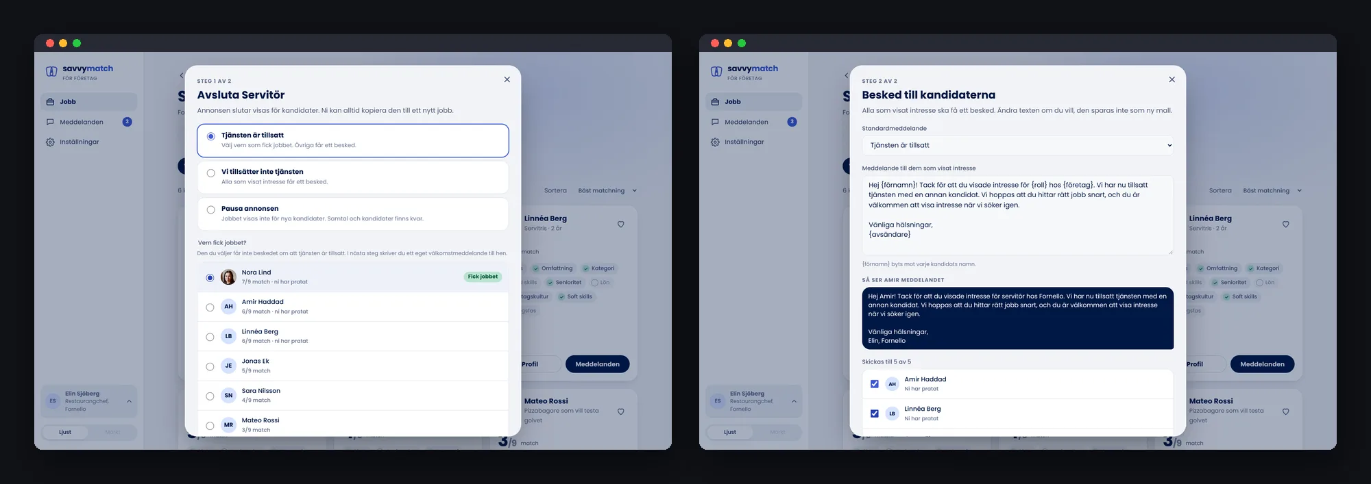
I therefore designed a two-step closing flow: first the reason the job is closing, then who got the job and what the remaining candidates should hear.
The person hired shouldn’t receive a rejection. Everyone else receives a considerate standard message that the employer can edit.
A recruitment isn’t complete until candidates have received a response. This is how one of the product’s guiding principles becomes a concrete interaction.
Try the complete journey
The working prototype lets visitors start from a hiring need, publish a job, review candidates, have conversations and close a recruitment.
It works on desktop and mobile web, in light and dark mode.
Designing for the work between the steps
Building the prototype showed me that employers needed more than support at major milestones. The tool also needed to work in everyday situations: when candidates were awaiting a reply, when colleagues shared responsibility and when work continued on a phone.
A Jobs page that shows what needs doing
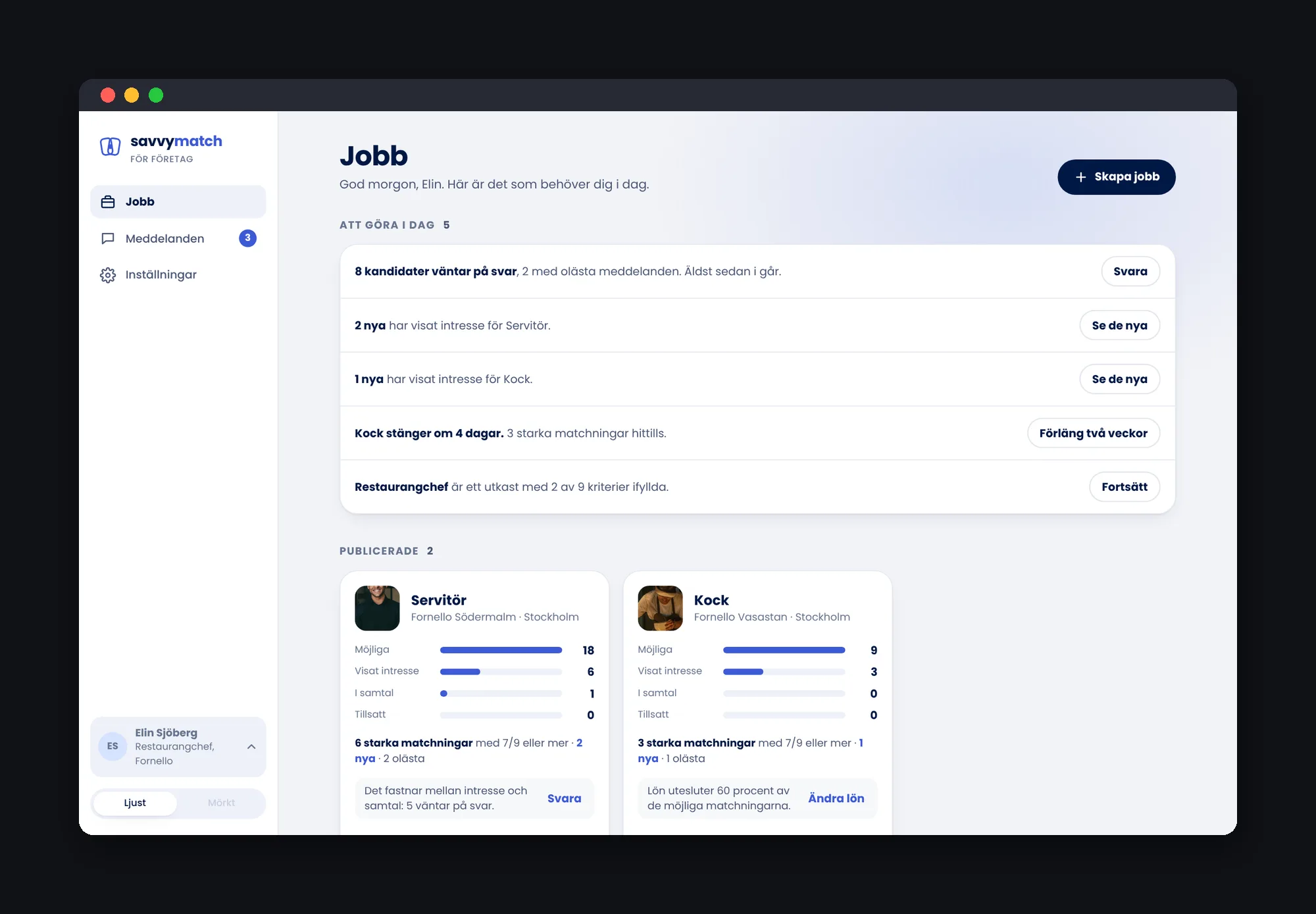
I wanted to avoid a landing page dominated by statistics.
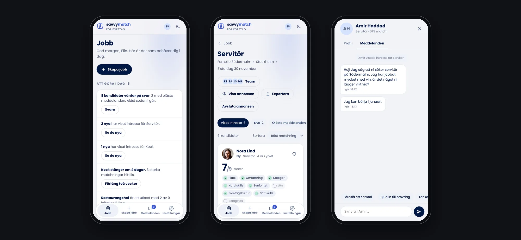
Instead, the Jobs page begins with a practical to-do list: candidates awaiting a response, unread messages and jobs about to close. Each job card shows where candidates are in the process and suggests a next action.
The information helps employers prioritise and go directly to what needs attention.
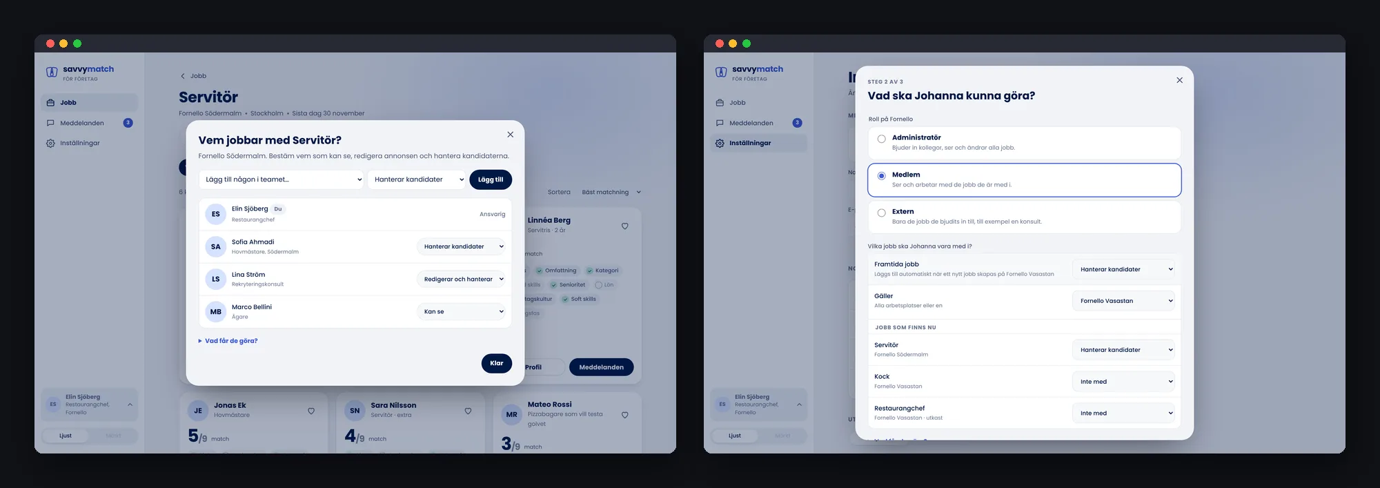
Roles based on real responsibilities
Recruitment is often a team effort.
I designed permissions around what each person needs to do for a role: view information, edit job details or manage candidates.
When someone is invited, their access can cover current jobs and, if selected, future recruitment. A regular team member doesn’t need a new invitation for every job.
The same journey on mobile
People hiring aren’t always at a desk.
I therefore designed the employer tool as a responsive web service. The to-do list, candidate overview and conversations remain available on mobile, while navigation moves to the bottom of the screen.
It’s the same working journey on a smaller screen, not a cut-down separate mobile product.
One design system for both sides of the match
Savvy Match’s candidate app and employer tool are parts of the same service. They therefore needed to share a visual identity and a consistent way of showing match information, statuses and feedback.
A shared way of understanding matches
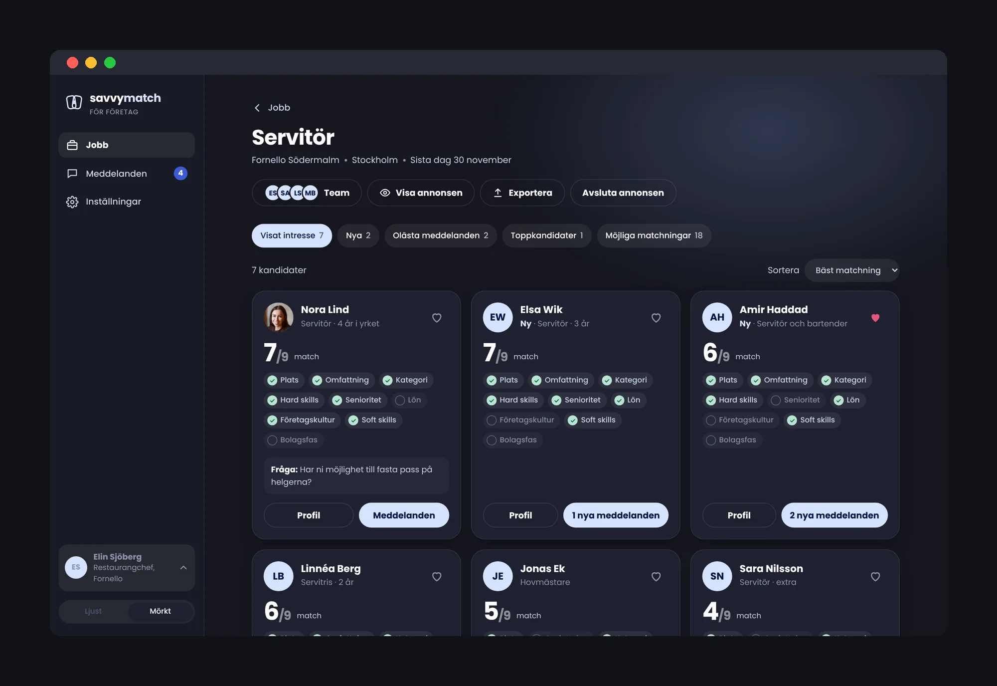
I built on the candidate app’s design system, using deep navy, lavender, Poppins and shared components for match numbers, chips and statuses.
Employers encounter the same underlying match information as candidates. Both sides can understand what the number and requirements represent.
Adapted for a work tool
The employer side also needed different kinds of interfaces from the mobile app.
I extended the system with side navigation, contextual drawers and dialogs for decisions requiring more attention. Employers can review a profile and have a conversation without losing the context of the job.
Light, dark and responsive
The prototype uses the same colour roles in light and dark mode and adapts its layout for desktop and mobile.
The shared design foundation connects both sides of Savvy Match, while the employer tool is tailored to a different kind of work.
What I took with me
This project strengthened my understanding of what it means to design a complete journey.
A user flow can look finished in Figma and still miss the moments between screens. It was when I built and worked through the prototype from beginning to end that I saw where decisions, states and transitions needed more thought.
I also took away how closely the employer experience affects the candidate experience.
Leaving no candidate without a response was one of the product’s principles. Putting it into practice means helping employers see who’s waiting, follow up and bring recruitment to a thoughtful close.
For me, Savvy Match shows that good matching isn’t only about bringing two sides together. The service needs to help them through the whole process, all the way to a clear outcome.
“Mikaela was a rock who helped us get the flow in place and work out how the app should be designed, so that we could then build and launch it.”