UX/UI Design · Savvy Match · The employer side
Companies go from a recruitment need to a filled job, and every candidate gets an answer
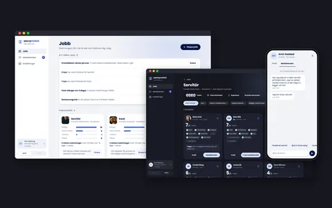
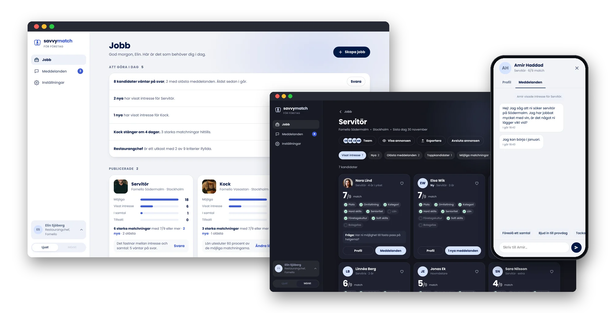
The other side of Savvy Match: the tool employers use to publish jobs, meet matched candidates and close the loop. I designed the employer flows in Figma, then rebuilt them as a working prototype in the app’s design system, end to end.
- My role
- Product Designer
- Year
- 2021–2022, prototype 2026
- Industry
- Recruitment
- Company
- Savvy Match
- Users
- Employers and their hiring teams
- Platform
- Web, desktop and mobile
- Tools
- Figma and a working prototype in code
The short version
The problem
A matching app only works if employers take part. They need to publish a job quickly, see who fits and why, and answer everyone, often alongside running a business.
What I did
I designed the employer flows in Figma, from the recruitment need to closing the job, and rebuilt them as a working prototype in the same design system as the candidate app.
What it led to
A complete, clickable employer journey in five steps, where the gaps a static flow hides came to light and were designed for, from team roles to the message for the candidates who didn’t get the job.
What I did as product designer
Employer journey
The employer’s half of the user story map, from a recruitment need to a closed job, so both sides of the match were designed as one service.
Flows in Figma
The employer flows for publishing a job, reviewing candidates and talking to them, designed in Figma together with the founders.
A working prototype
The flows rebuilt in code, with real states, data and transitions, so the whole journey can be clicked through on desktop and mobile.
Interaction design
A Jobs page that says what to do today, a match number that opens why someone matches, and closing a job in two clear steps.
Team and roles
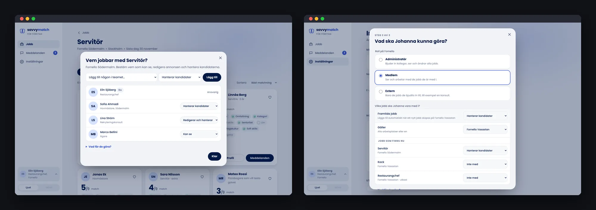
Who can view, edit and handle candidates, per job, and an invite flow that covers both current and future jobs.
Design system
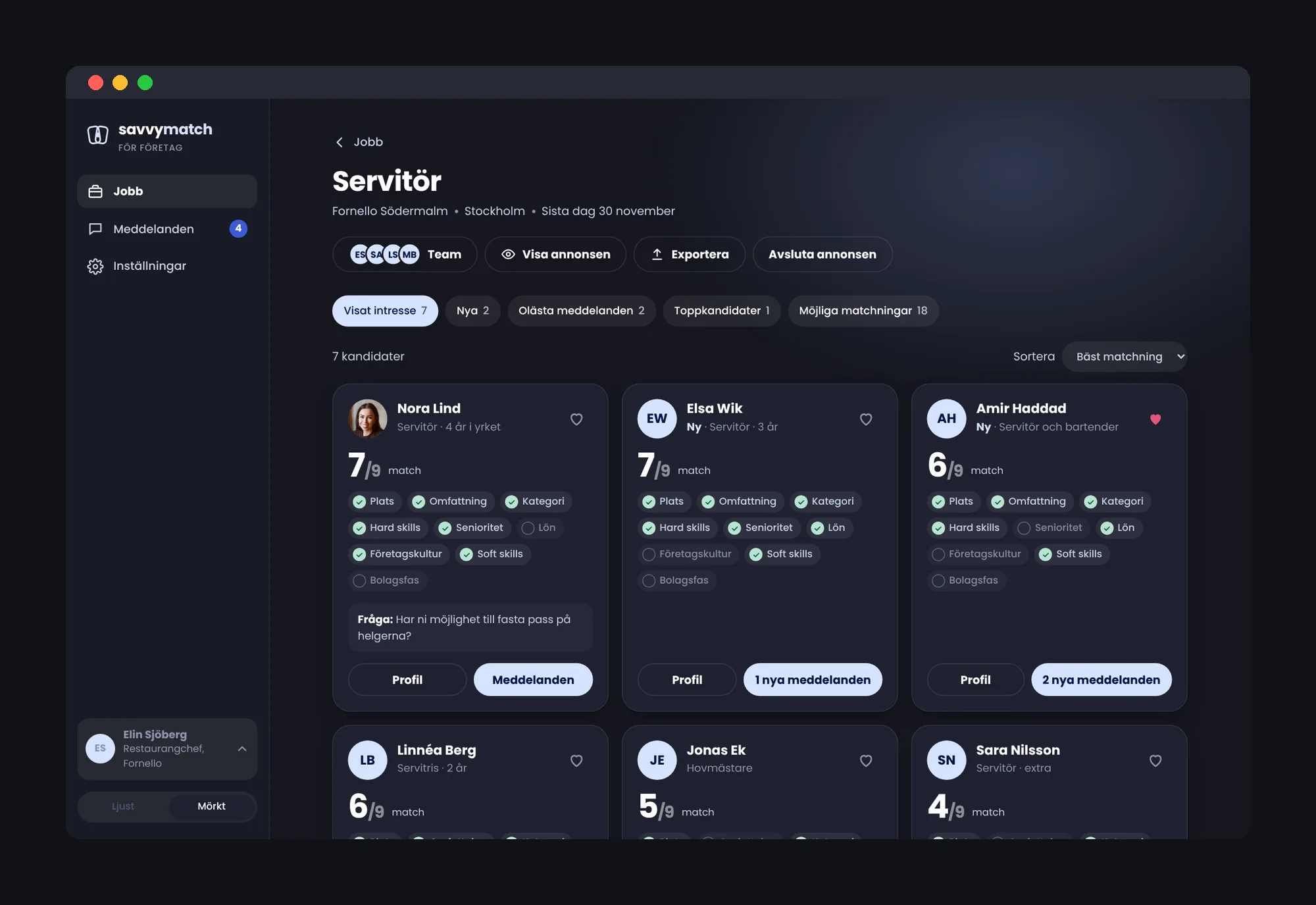
The candidate app’s colours, type and components, extended for a larger screen, in light and dark.
The challenge
Savvy Match set out to match candidates and companies on skills, culture fit and potential, not on gender, age or ethnicity. The candidate app is one half of that promise. The other half is the employer: if no one answers, a fair match is still a dead end.
Mapping both sides together showed it clearly. Statuses, the conversation and closing a job had to be part of the first version, not extras. And the people hiring are often managers who recruit on the side, between shifts, on a laptop or a phone.
How might we help employers go from a need to the right person quickly, while every candidate is treated fairly and gets an answer?
How I worked
I designed the employer side alongside the candidate app, as one service. Later I took the Figma flows further and built them as a working prototype, to test the whole journey rather than single screens. Each step gave me something the one before couldn’t.
- One story map for both sidesThe employer’s steps sit in the same user story map as the candidate’s, with an MVP line. It made the dependencies visible: a candidate’s interest is only worth something if an employer sees it and answers.
- Flows in FigmaI designed the employer flows screen by screen: publishing a job, the list of candidates, the profile and the conversation. It gave the founders and me a shared picture of the tool before anything was built.
- A working prototypeI rebuilt the flows in code, in the candidate app’s design system, for desktop and mobile web. With real data and states, the journey could be walked from start to finish, and what a static flow skips over became obvious.
- Walking it end to endI checked the prototype against five steps, from the recruitment need to ending the job, and designed for each gap I found. That is how team roles, standard messages and the choice of who got the job came in.
Five steps, end to end
The employer’s journey, recreated with a made-up restaurant group and made-up people. All screens are in Swedish. Click a picture to enlarge it.
Working prototypeTry it yourselfStart from a recruitment need, publish the job, review candidates, chat and close the job. Desktop and mobile web, light and dark. In Swedish.1 · A recruitment need
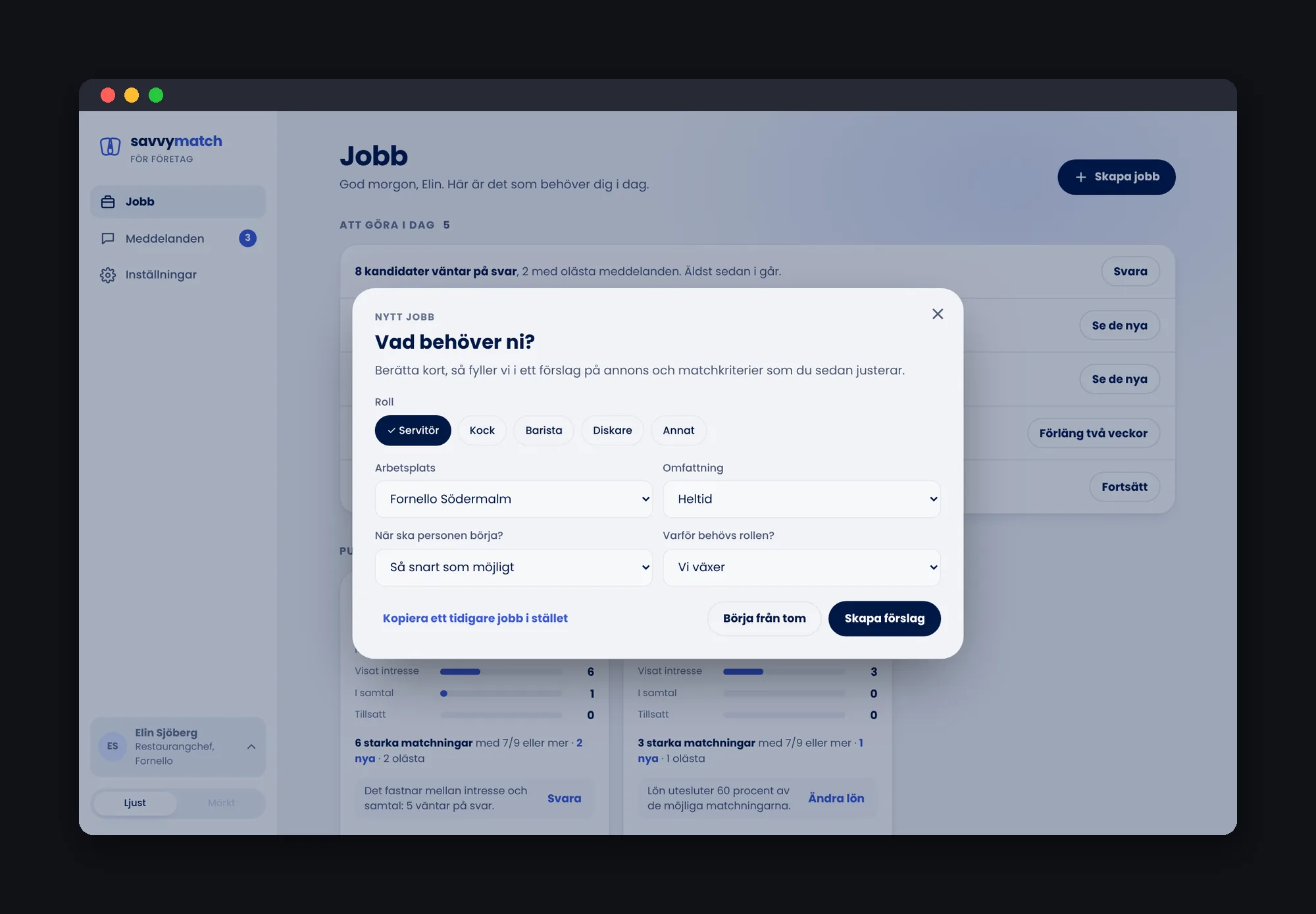
Hiring starts before the ad. Create job asks what the need is first, and offers templates for common roles, so the employer starts from a sensible draft instead of a blank page.
2 · Post the job
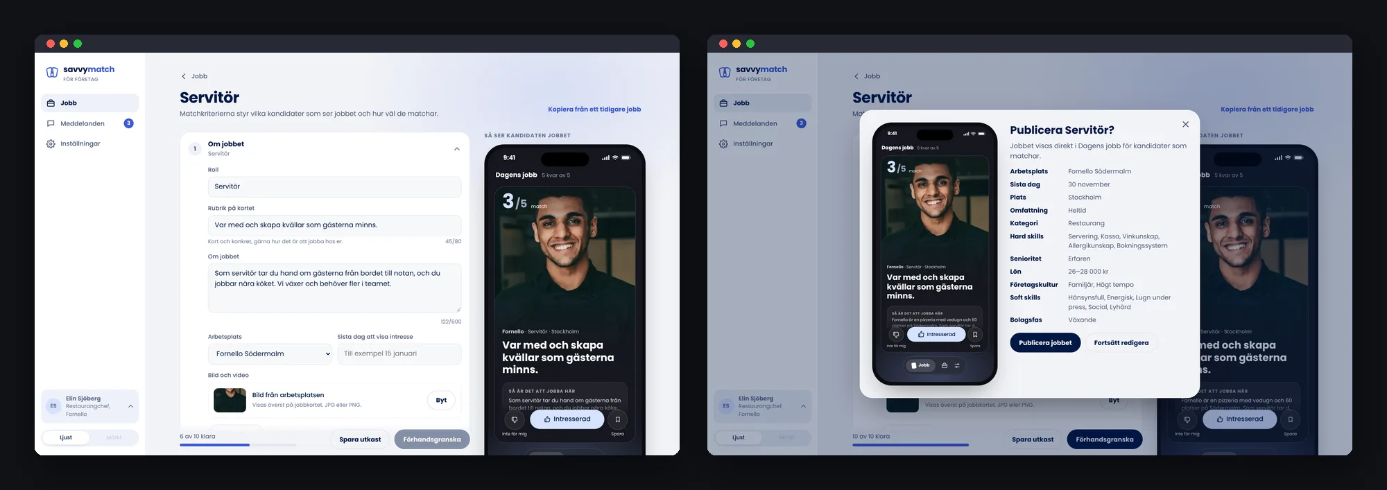
The job is built in short steps, with a live preview of the job card as candidates will see it in the app. The requirements set here are the same ones the match is counted on, so the employer sees why they matter.
3 · Review candidates
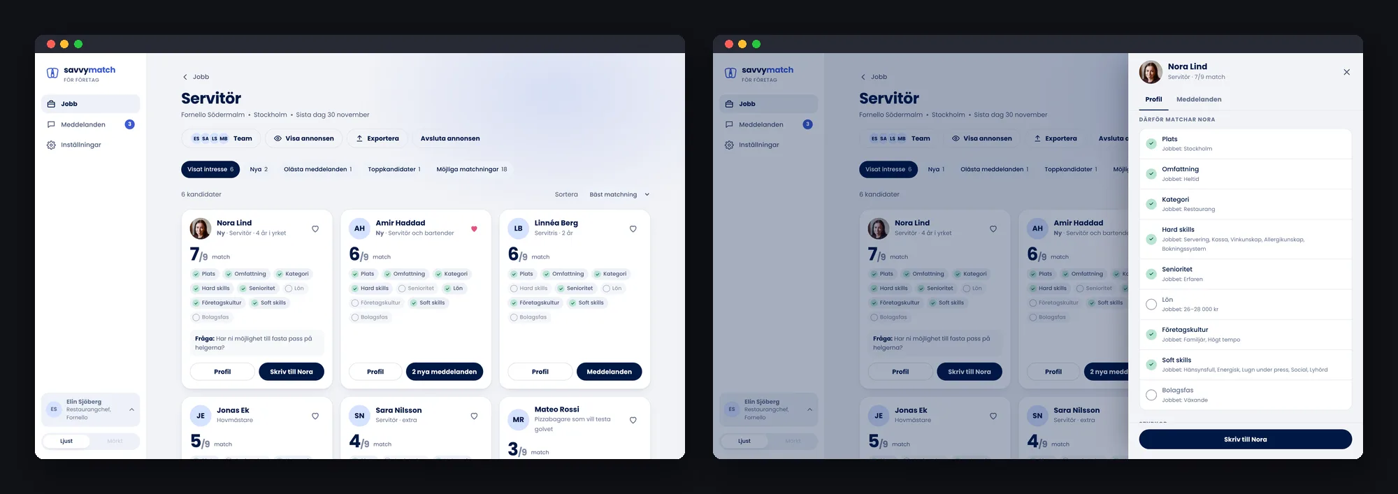
Candidates who showed interest come in as cards with one large match number and the requirements they meet. Filters for new, unread and favourites keep the list manageable, and clicking the number opens the profile at Why they match.
4 · Talk to candidates
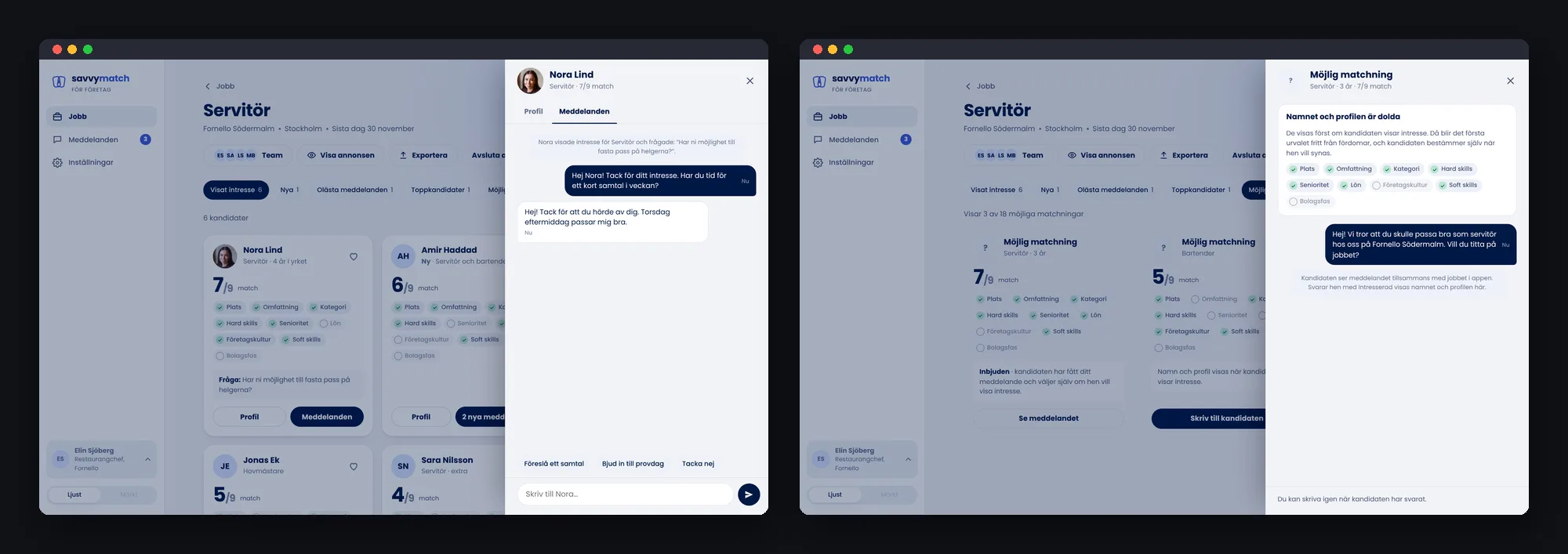
The conversation opens beside the candidate, with quick replies for the usual next steps, like inviting someone to a trial shift. Possible matches who haven’t shown interest yet can be contacted too, but stay anonymous until they answer.
5 · End the job
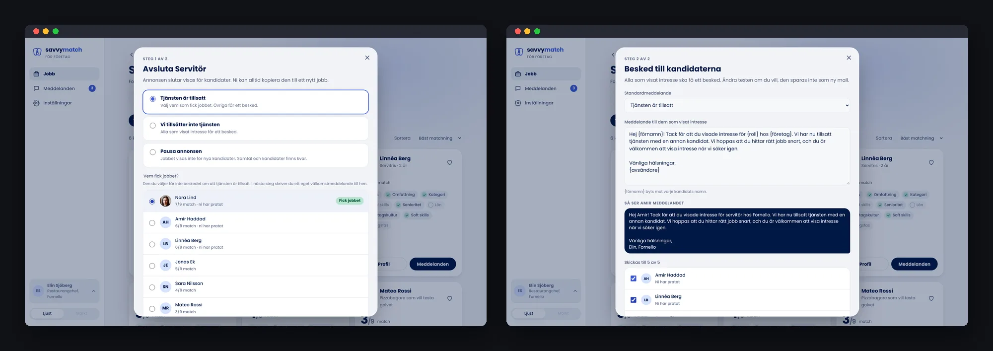
Closing a job is two steps: why it is closing, then who should hear what. The employer picks who got the job, so that person isn’t sent a rejection, and everyone else gets a kind standard message that can be edited.
Design decisions
Building the flows as a working prototype raised questions a static flow never asks. These are the decisions that shaped the tool, and why.
A Jobs page that says what to do today
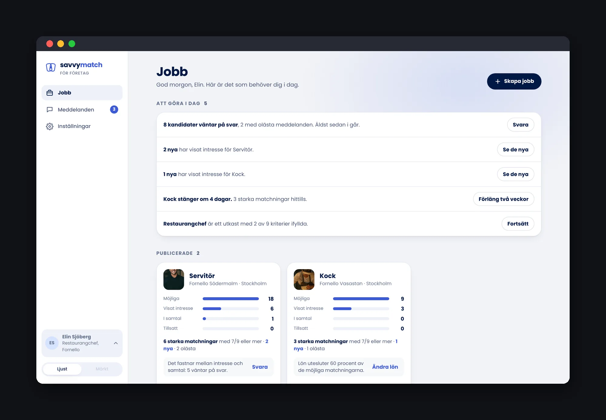
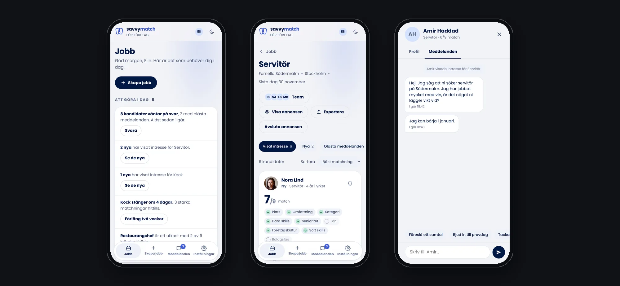
Instead of a dashboard of numbers, the Jobs page starts with a short to-do list: candidates waiting for an answer, unread messages and jobs about to close. Each job card shows where candidates get stuck, from possible matches to hired, with one suggestion for what to do about it.
Hiring is a team effort
A manager rarely hires alone. Each job has a team, and each person has a role: view, edit the job, or handle candidates. Inviting someone covers the jobs that exist now and, if you choose, the jobs that come later, so a new colleague doesn’t have to be added again and again.
Made for the phone too
Many of the people hiring are on the floor, not at a desk. The same tool works on a phone: the to-do list, the candidates and the conversation, with the navigation moved to the bottom within thumb reach.
One design system for both sides
The employer tool uses the candidate app’s design system: deep navy, lavender for actions and the match, Poppins, and the same chips, statuses and match number. I extended it for a larger screen with a side menu, drawers and dialogs, in light and dark.
Sharing one system means a requirement, a status or a match looks the same to the candidate and the employer, which matters when the whole idea is a fair, shared view of the match.
What I took with me
A matching service is only as fair as its slowest answer. Designing the employer side made that concrete: the details that decide whether a candidate is treated well, like who gets which message when a job closes, live on the employer’s screen.
Building the flows as a working prototype also changed how I see a finished flow. Screens can look complete and still leave out the moments in between. Walking the journey from need to closed job, with real states, is what showed me where they were.
“Mikaela was a rock who helped us get the flow in place and work out how the app should be designed, so that we could then build and launch it.”