UX/UI Design · Savvy Match · UX/UI design for a mobile app
Job seekers and companies find each other on skills, not bias, in an app built to scale
As product designer, I helped turn the founders’ idea for fair, bias-free recruitment into a native mobile app for job seekers and employers. I designed the user flows from wireframes and prototypes to finished UI, and built a design system so the experience stayed consistent and ready to scale.
- My role
- Product Designer
- Year
- 2021–2022
- Industry
- Recruitment
- Company
- Savvy Match
- Team
- The two founders and the developers
- Platform
- Mobile app, iOS and Android
- Tools
- Figma and Miro
The short version
The problem
Candidates were being overlooked because of gender, age and ethnicity. The founders wanted a platform that matches on skills, culture fit and potential instead.
What I did
I mapped the journey between candidates and employers, defined the MVP together with the founders, and designed the app from flows to finished UI, with a design system.
What it led to
A flow and a design the founders could build and launch on: specifications, interactive prototypes and a design system the developers could follow.
What I did as product designer
Research and direction
Desk research into matching platforms and bias-free hiring, built on the founders’ insight into recruitment. It gave us a shared picture of what makes a match feel fair before any screens were drawn.
End-to-end journey and MVP
The journey between candidates and employers, mapped as user stories and tasks with an MVP line, so we could agree on what to build first and what could wait.
UI design for iOS and Android
Finished screens for the whole candidate journey, from the welcome screen to the conversation with an employer, with each platform’s own system parts.
Interaction design
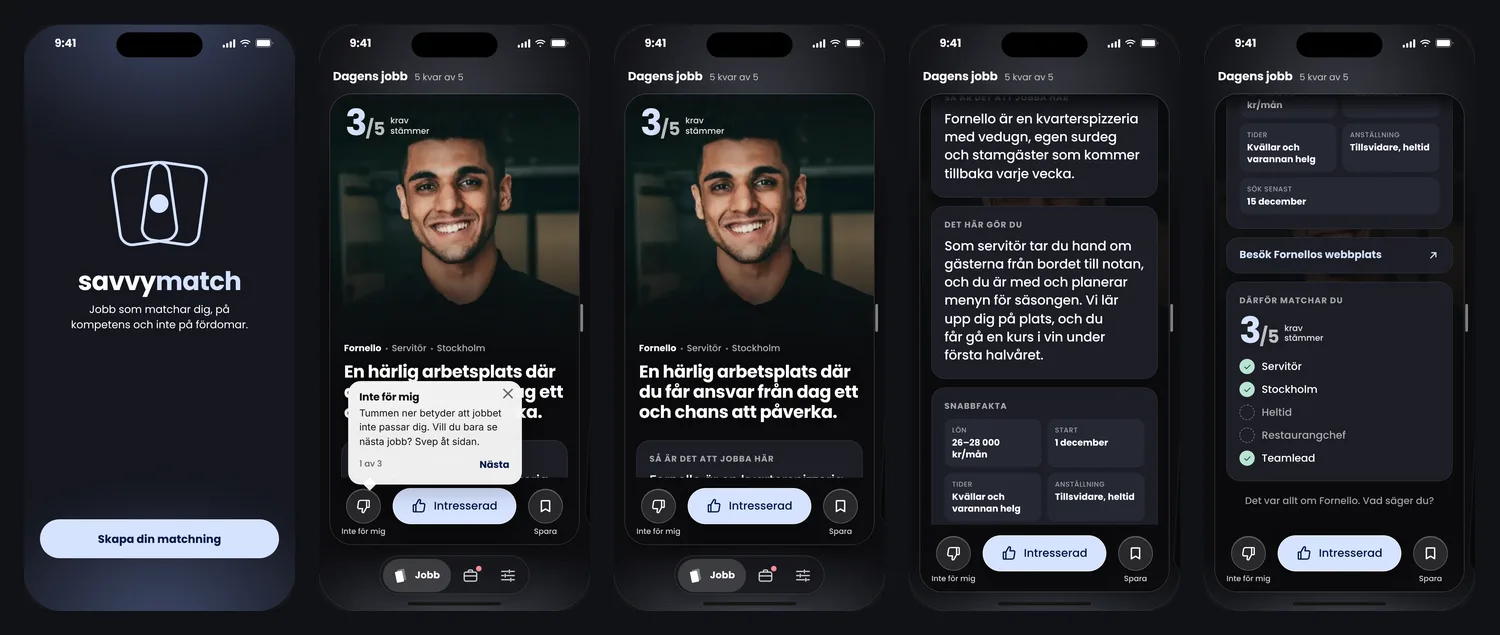
A job card you swipe to browse and scroll to read, one large number for the match and three labelled buttons to decide, so candidates compare first and decide on purpose.
Design system
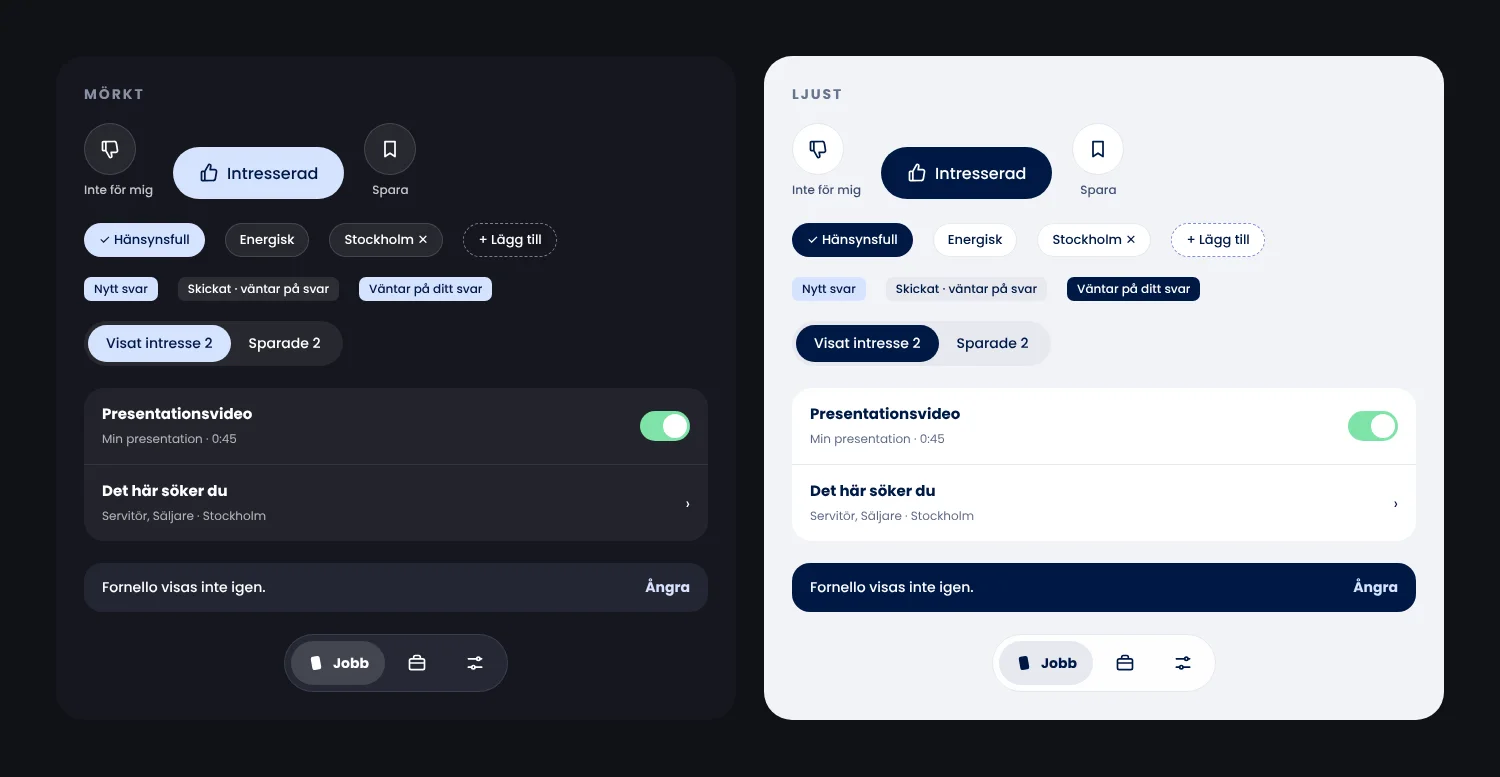
Colours, type and components in dark and light, so the app stays consistent and new screens are quicker to design and build.
Handoff to developers
Design specifications, interactive prototypes and design system documentation, so the developers could build without guessing.
The challenge
The two founders came to me with a clear mission: to change recruitment by removing bias and discrimination. With years in the industry, they had seen candidates overlooked because of gender, age and ethnicity.
Their vision was a platform that matches candidates and companies on skills, culture fit and potential. They brought deep recruitment expertise from both sides, the candidate’s and the employer’s.
The design had to make matching feel simple and fair, without losing what a relevant match needs.
How I worked
My role was to design the app and the service for candidates and employers, ready for the developers to build. We defined the MVP together, and I worked in four steps.
- ResearchDesk research into matching platforms and best practice in bias-free hiring, together with what the founders had learned in the industry. It gave the core features a shared foundation: what a fair match needs, from both the candidate’s and the employer’s side.
- Setting the directionI mapped the end-to-end journey between candidates and employers as user stories and tasks, made low-fidelity wireframes of the main interactions, and drew an MVP line together with the founders. It showed what the first version needed, and kept later ideas from slowing the launch.
- Designing the experienceI designed the full experience in continuous iteration with the founders, and built a design system for components, typography and interactions. It kept the app consistent across screens and platforms, and quicker to extend.
- ImplementationI worked closely with the developers, with design specifications, interactive prototypes and design system documentation, and stayed involved to answer questions. It let the developers build without guessing, and gave the founders a product they could launch.
End to end: candidates and employers
The whole flow between candidates in the app and employers, as a user story map. Each step has its tasks and a user story. Everything above the line is the MVP; below it are ideas for later.
Mapping both sides together showed that the app only works if employers answer, so statuses, the conversation and closing a job are part of the MVP, not extras.
-
Candidate
Get started
- Open the app
- Set match criteria
- Build the profile
As a candidate, I want to say where and how I want to work, so that I only see jobs that fit me.
Import the profile from LinkedIn
-
Employer
Publish a job
- Describe the job
- Set the requirements
- Show the workplace
As an employer, I want to set clear requirements, so that I meet candidates who match them.
Record a video from the workplace in the app
-
Candidate
Browse today’s jobs
- Swipe between jobs
- Read the card
- See why I match
As a candidate, I want to compare jobs before I decide, so that I don’t say no by mistake.
A notice when a strong match appears
-
Candidate
Show interest
- Ask a question
- Adjust the profile for this job
- Send
As a candidate, I want to choose what the company sees, so that I can lift what matters for this job.
An anonymous profile until the employer replies
-
Employer
Review interest
- See matched candidates
- Read the profile
- Reply
As an employer, I want to see how each candidate meets the requirements, so that I can decide quickly and fairly.
Compare candidates side by side
-
Both
Talk
- Chat in the job
- Suggest a time
- Follow the status
As a candidate, I want to see what is waiting for me, so that I never miss a reply.
Book a meeting or a trial shift in the app
-
Employer
Close the job
- Fill the role
- Tell other candidates
- Move to ended
As a candidate, I want to know when a job is filled, so that I can move on.
Feedback to candidates who weren’t chosen
The app, flow by flow
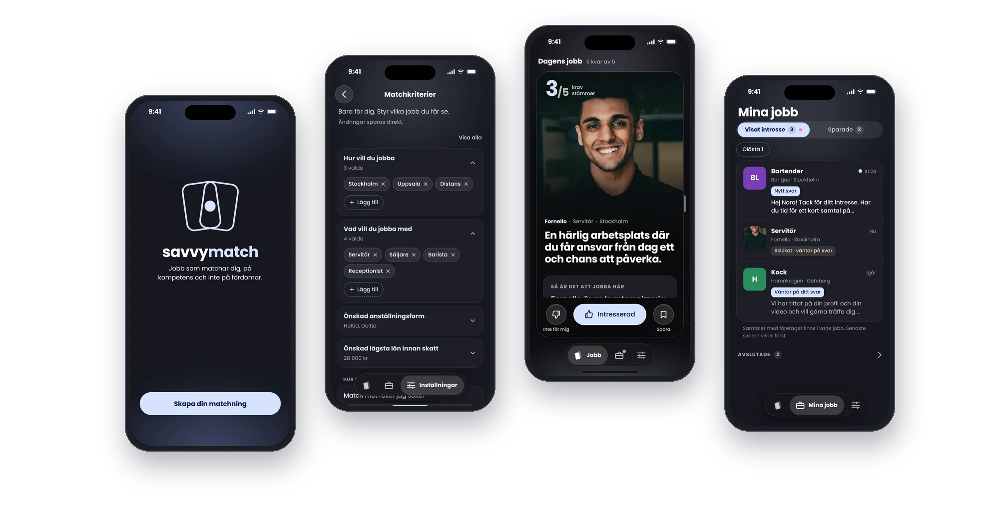
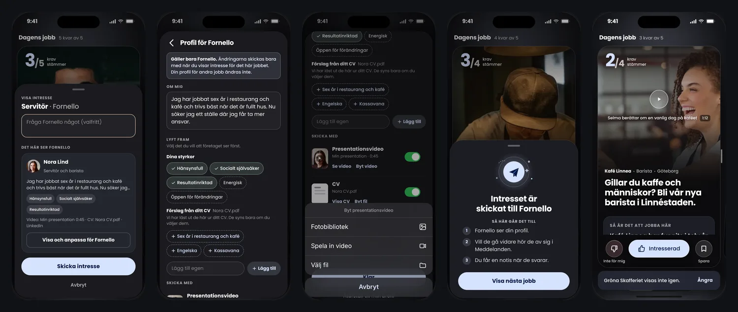
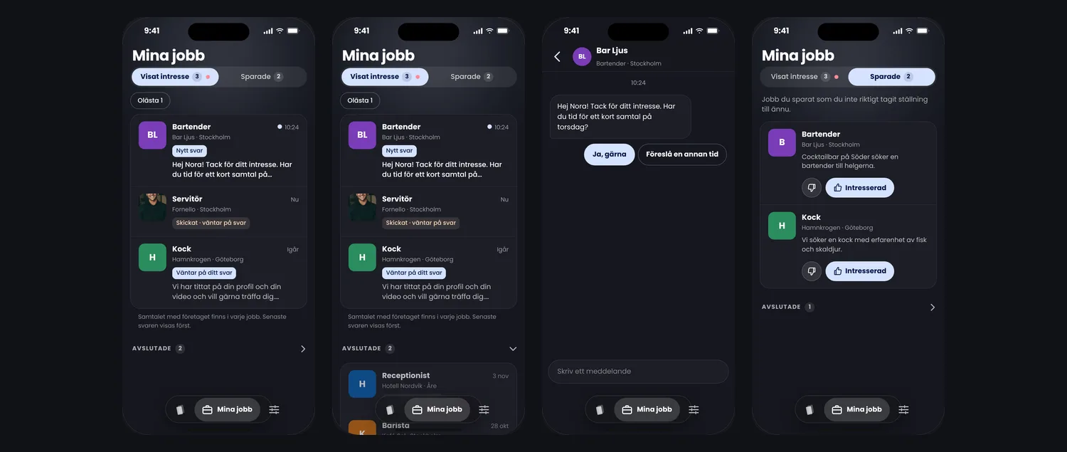
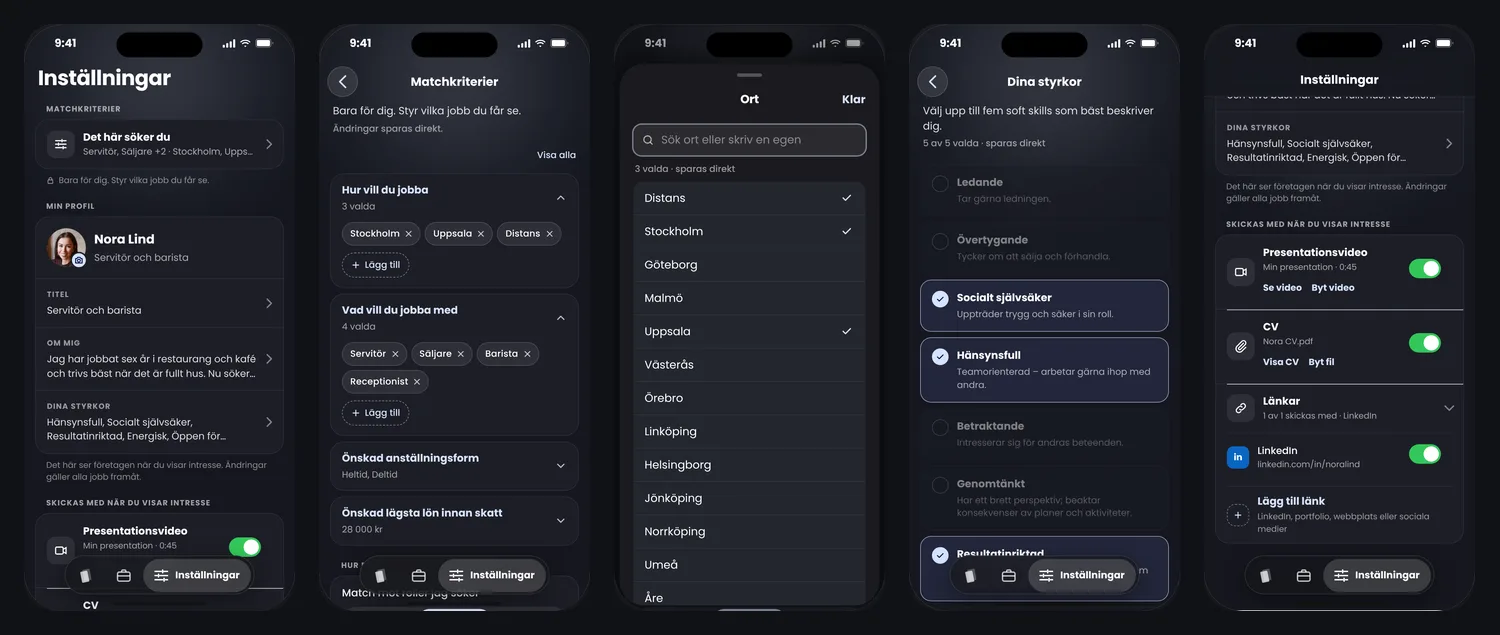
The candidate’s journey through the app, from the welcome screen to a conversation with an employer. The screens are on iOS 27, from a working prototype with made-up companies and people; in the prototype you can switch to Android and to light mode. All screens are in Swedish. Click a flow to enlarge it.
Working prototypeTry it yourselfBrowse today’s jobs, show interest and follow up in My jobs. Switch between iOS and Android, dark and light. In Swedish, on desktop or mobile.Start and today’s jobs
Show interest
My jobs
Settings and match criteria
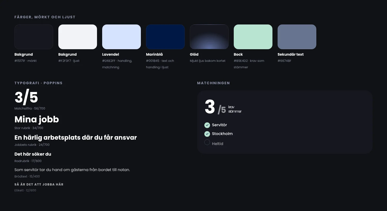
Design system
I built the design system while designing the flows: colours, type and components in dark and light. It kept the app consistent across screens and platforms, and made new screens quicker to design and build.
What I took with me
I’m proud to have helped create a platform built for fairer, unbiased hiring.
Working this closely with founders who knew their field so well meant their insight shaped the product from day one. My part was to turn that knowledge into a journey, flows and screens that felt simple to use, on both sides of the match.
“Mikaela was a rock who helped us get the flow in place and work out how the app should be designed, so that we could then build and launch it.”
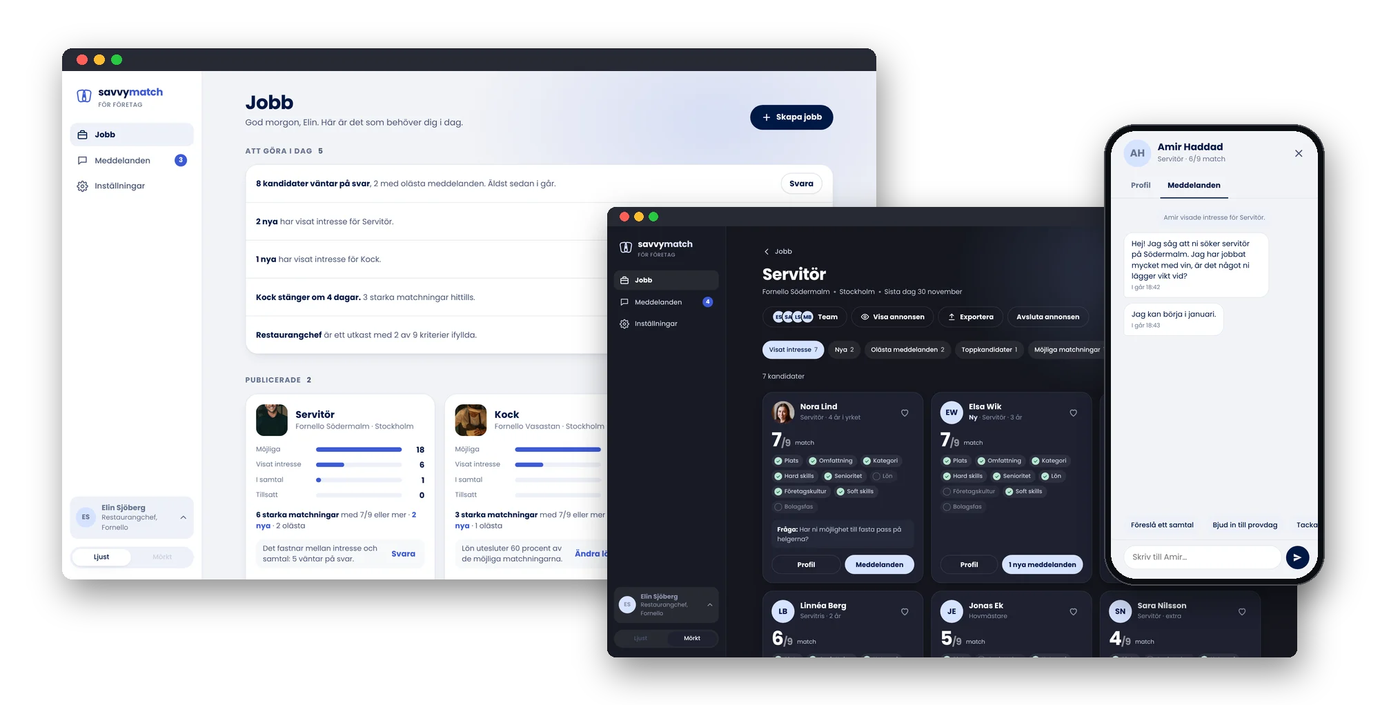
The other side: Savvy Match for companies
The app only works if employers answer. I also designed the employer side, from a recruitment need to closing the job, and rebuilt it as a working prototype.