UX/UI Design · Design system · TRR · With designers from other product teams
Setting one filter standard for TRR, so filtering works the same wherever people look
People use filters to narrow down job ads, activities and candidates across TRR’s services. Over time, each team had built filtering its own way, so the same task worked differently from one service to the next. Together with designers from other product teams, I designed one shared filter component, and the list and table actions around it, and set it as the standard in TRR’s design system. People learn it once and recognise it everywhere. Teams use one documented component instead of building their own.
- My role
- UX/UI designer, together with designers from other product teams
- Company
- TRR
- Type
- Design system component and pattern
- Platform
- Web, desktop and mobile
- Delivered
- Filter, list and table actions and datagrid, documented in Figma
- Tools
- Figma
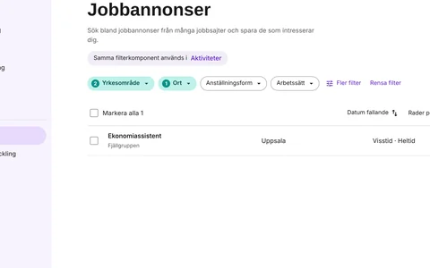
The short version
The problem
Filtering had grown up differently in each service. People had to relearn how to choose, see and clear filters every time they moved between services.
What we did
Designers from several product teams agreed on one filter component, with every state drawn out, plus the list and table actions that belong with it.
What it gives
For users, one way to filter everywhere. For teams, one documented standard in the design system instead of many local versions.
The problem
Filters are how people find what is relevant to them: job ads in their field, activities near them, candidates for an employer. At TRR, filtering had been built team by team over time. Each solution made sense on its own, but together they didn’t.
Relearning in every service
The same task, narrowing down a list, looked and behaved differently depending on where you were. People had to work out each version again.
Hard to see what was on
With different patterns, it could be unclear which filters were active, or how to get back to the full list.
Many versions to maintain
Each team designed, built and fixed its own filter, so an improvement in one service didn’t reach the others.
The goal
Set one filter standard for TRR: a component that works the same for users in every service, and that every team can use.
The design challenge
One component had to fit very different services. Some lists have a few filters, others many. Some are used on a phone, others mostly on a desktop at work. Some show cards, others are tables with selectable rows.
It also had to be agreed across teams. A standard nobody uses is not a standard, so the design had to answer each team’s needs well enough that they would choose it over their own version.
One pattern, many contexts
Simple enough to learn once, flexible enough to cover every service’s filters.
My role: designing the standard together
My role
I worked on the filter together with designers from other product teams at TRR. We compared how filtering worked in each service, agreed on the behaviour users should meet everywhere, and I designed the component and its states in Figma.
The work grew into a small family of shared patterns: the filter itself, the list and table actions that sit with it, and a datagrid for tables. Each one is documented in the design system as shared layout and functionality.
How we worked
We started from the services that already had filters and looked at what users met in each one. From there we agreed on one way to choose, show, clear and overflow filters, and drew every state so designers and developers wouldn’t have to guess.
From many versions to one standard
Look at how filtering works in each service → agree on shared behaviour with the other designers → design the component and its states → document it in the design system → teams use it in their services.
Key design decisions
Four decisions make up the standard. Each one is about what people need when they narrow down a list.
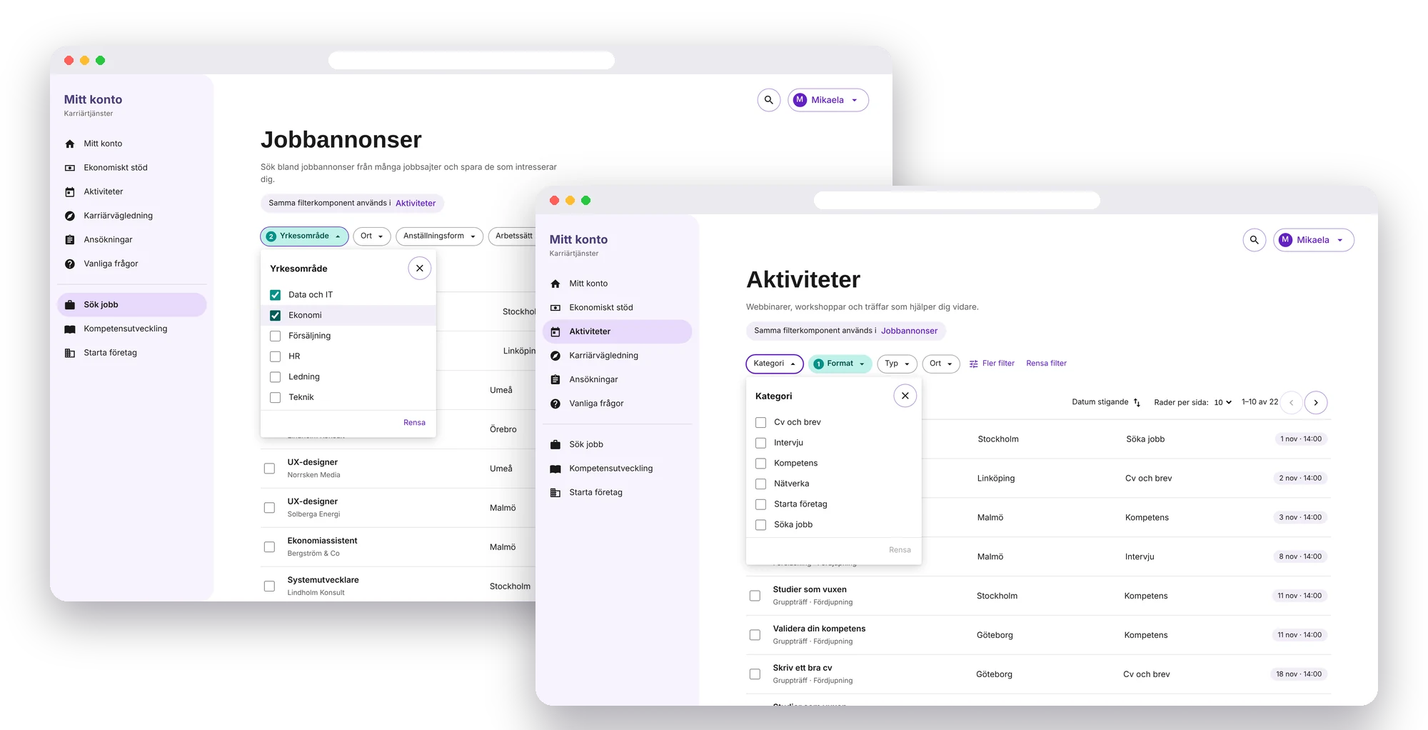
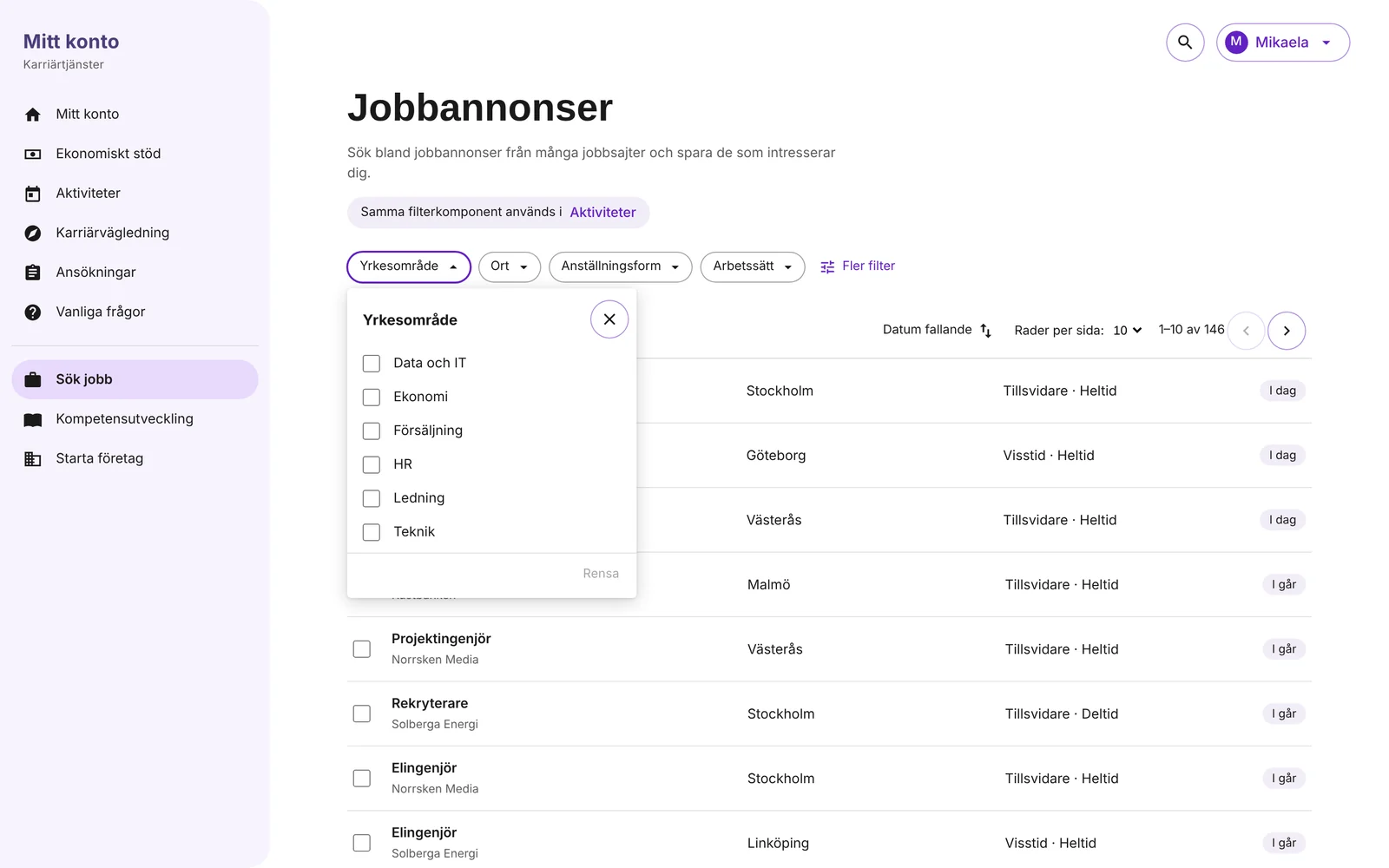
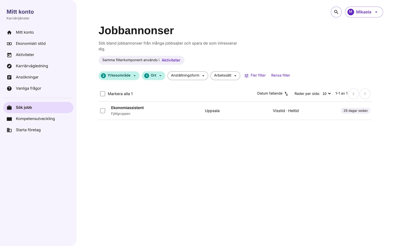
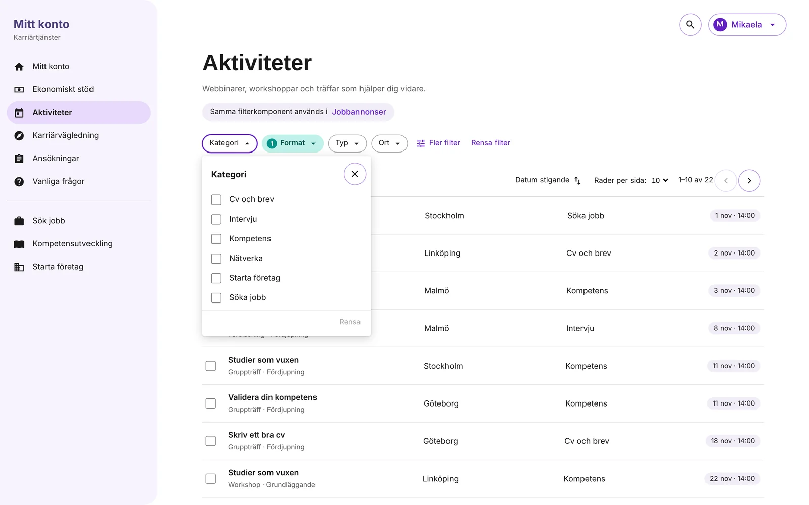
- One filter, one buttonEach filter is a button in a row above the list, and opens a small panel with its options. People see every filter at a glance and choose without leaving the page.
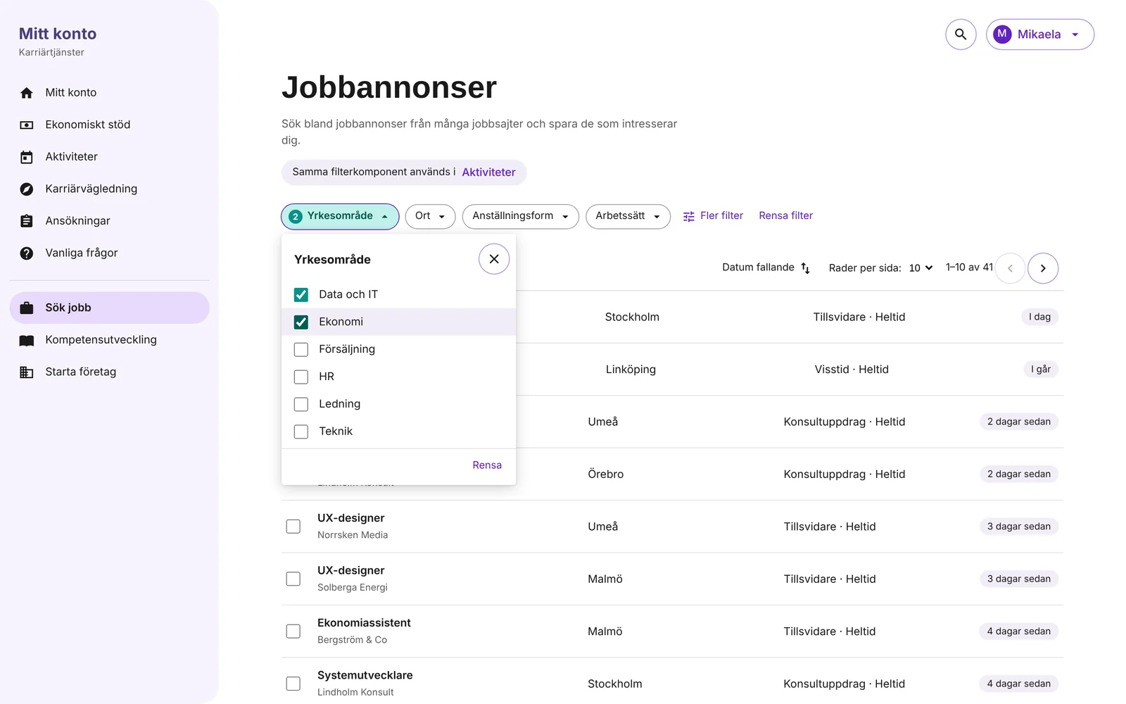
- Always show what is onAn active filter changes colour and shows how many options are chosen. One “Clear filters” link resets everything, so it is always easy to get back.
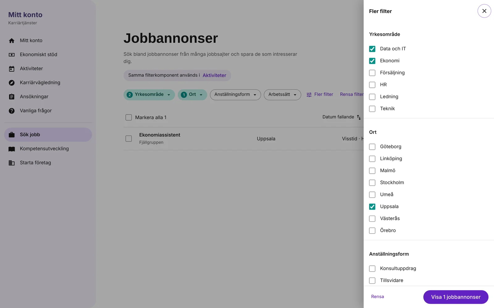
- Room for many filtersThe most used filters stay in the row. The rest go into “More filters”, a drawer with every filter grouped, so a long list never pushes the content down.
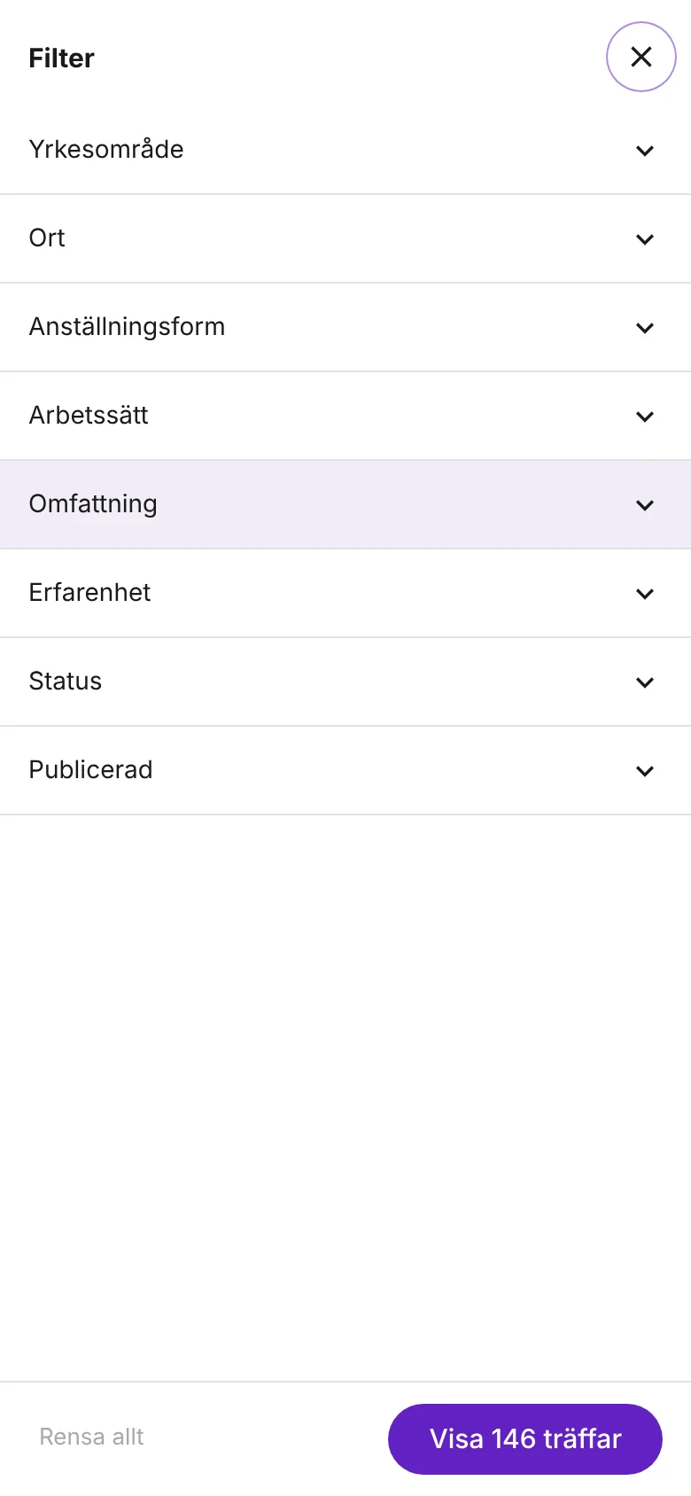
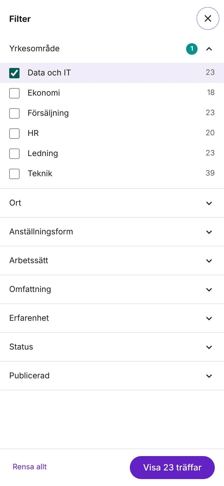
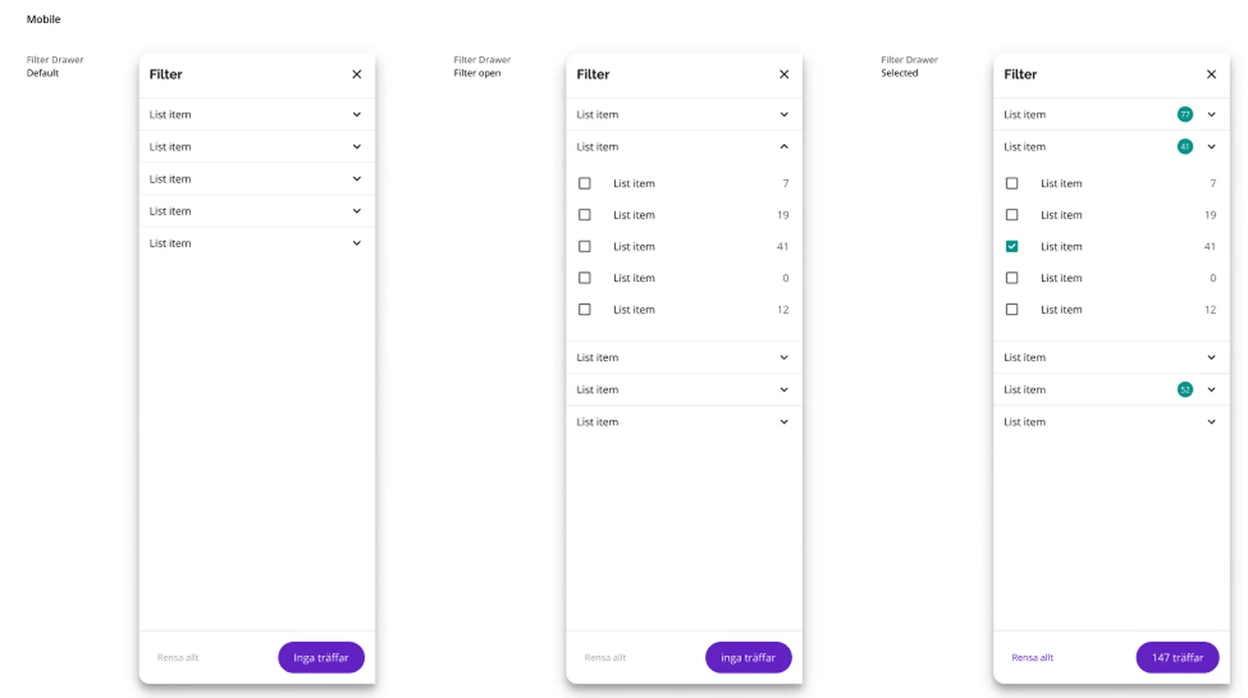
- A mobile drawer that shows the result firstOn a phone, one Filter button opens a drawer with each filter as a section. The button at the bottom says how many hits the choice gives, or “No hits”, before the user applies it.
The standard in use
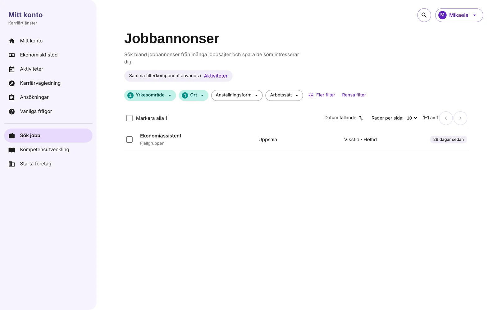
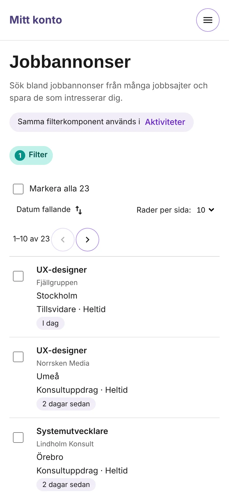
The screens are in Swedish, from a working prototype built from the design in Figma. It shows the same filter component in two services, job ads and activities. The content is made up. Click an image to enlarge it.
Working prototypeTry it yourselfFilter job ads and activities with the same component, open More filters, select rows and try the mobile drawer. In Swedish, on desktop or mobile.Choose
See and manage
Act on the list
On mobile
The component and its states
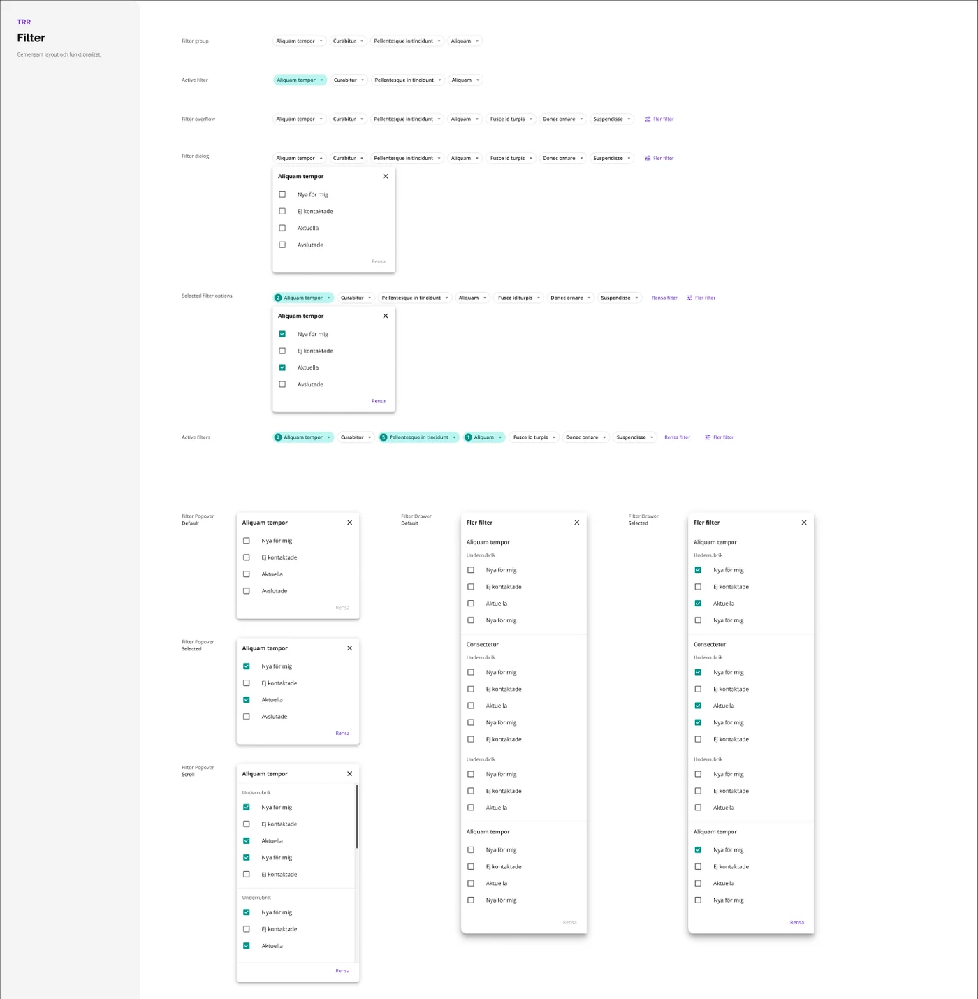
States designers and developers can rely on
- Filter groupThe row of filter buttons, the starting point in every service.
- Active filterTeal with a count, so what is on is never hidden.
- Filter overflowWhen there are more filters than fit, the rest go into More filters.
- Popover: default, selected and scrollOptions with a Clear link that wakes up when something is chosen. Long lists scroll inside the panel, with subheadings.
- Drawer: default and selectedMore filters with every filter grouped, for services with many filters.
- Mobile drawer: default, open and selectedSections that open one at a time, counts for each option, Clear all and a button that shows the number of hits.
The patterns around the filter
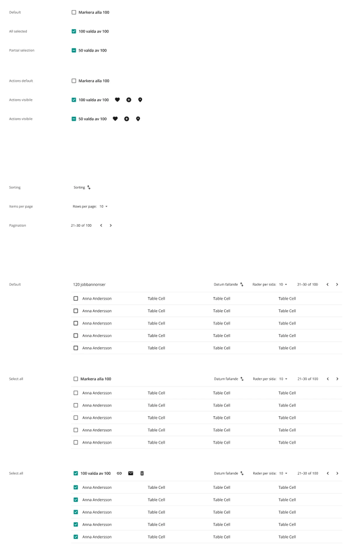
Filtering rarely comes alone. The same work defined the list and table actions that sit above a list, and a datagrid for tables, so the whole area around a list behaves the same way.
- Select all with three states: none, all and some selected.
- Actions that appear only when something is selected.
- Sorting, rows per page and paging in the same place on every list.
- A datagrid for tables, with column settings, filters and selectable rows.
Value for users and teams
For the users
Learn it once
Filtering works the same in every service, so what people learn in one place they can use in the next.
Always know what is on
Active filters are visible and countable, and one link brings back the full list.
No dead ends on mobile
The button shows how many hits a choice gives before it is applied, and says so when there are none.
For the design system and the teams
One component instead of many
Teams use the shared filter instead of designing and building their own version.
Every state already decided
Designers and developers don’t have to guess how the filter behaves when it is empty, full, active or on a phone.
Improve once, improve everywhere
A fix or improvement to the component reaches every service that uses it.
Why it matters
Consistency is not about looking the same. It is about people not having to think about how to filter, so they can focus on finding a job, an activity or a candidate.
UI design: what and why
The filter sits on top of busy lists, so it had to be quiet until it is used, and clear once it is.
- Built on TRR’s design systemPurple for actions, teal for chosen states, Open Sans for text and the existing checkbox and button components.
- Teal means chosenSelected checkboxes, active filter buttons and selected rows all use the same teal, so “chosen” looks the same everywhere.
- Small buttons, one rowCompact buttons keep the filters to one row above the list, so the content starts high on the page.
- Clear is quiet until it is neededClear is grey and inactive with nothing chosen, and turns purple when there is something to clear.
- Counts as small badgesA round teal badge shows the number of choices on a filter button and a mobile section, without adding text.
What I took with me
A design system component is only a standard when teams choose it. Working on it together with the designers who would use it made it fit their services, and made it theirs as much as mine.
The most user-centred part of a component is often invisible: that it behaves the same every time. People notice inconsistency much more than consistency, and removing it lets them focus on what they came to do.