UX/UI Design · TRR · Sole UX designer in a product team, internal tool
Helping TRR’s advisors find the right candidates, so more employers make contact
When a company gets in touch with a recruitment need, TRR’s advisors look for people in career transition who could fit. Finding them was hard: it took deep knowledge of job titles and geography, and there was always a risk of missing someone. As the only UX designer in this area of a product team, I designed a new way to search, filter and choose candidates, built on what people enter in their match profile. I involved advisors throughout and tested the design with them before it was built.
- My role
- Sole UX designer in the area, in a product development team
- Year
- 2023
- Users
- TRR’s advisors, an internal tool
- Company
- TRR
- Method
- Interviews, prototype testing with 4 advisors, design iteration and a beta plan
- Tools
- Figma
The short version
The problem
Advisors found it hard to find candidates for an employer’s recruitment need. It took expert knowledge of job titles and places, and they worried about missing people.
What I did
As the only UX designer in the area, I designed search, filtering and candidate lists from the advisors’ needs, and tested the design with advisors across the country.
What changed
All four advisors in the test valued starting broad, seeing the number of candidates early and choosing by distance. The test also showed what to remove before anything was built.
The problem
TRR helps people who have lost their job to find a new one. When a company gets in touch with a recruitment need, an advisor searches among the people TRR helps and suggests candidates. The goal is that employers contact those people, which can lead to a job.
Hard to find the right titles
One role can have many job titles. An architect, for example, can belong to several titles, areas and groups, and companies use their own role names. Knowing which titles fit took deep knowledge.
Hard to choose the place
Choosing where candidates want to work took good knowledge of geography. Advisors sometimes used a map to decide which areas to include.
Afraid of missing someone
There was no information about how many candidates there were for a title, and advisors were never sure they had found everyone they wanted in the selection.
The goal
Make the people TRR helps more visible to employers, so more companies contact them and more of them find a job.
The design challenge
Advisors needed a wide selection, so they didn’t miss good candidates. They also needed to narrow it down when an employer had specific needs. And everything had to build on what candidates had entered in their match profile, nothing else.
On top of that, advisors work in different ways. Some send a broad selection to an employer, others pick a few people by hand. The tool had to support both.
Wide, then precise
Help advisors start broad without expert knowledge, and narrow down only when they need to.
My role: the only UX designer in the area
My role
I was the only UX designer in this area, working in a product development team. I led the design from the advisors’ needs to a tested solution: research, concepts, prototypes, user tests and the recommendations for what to build.
I involved TRR’s advisors, the internal users of the tool, throughout. Their needs from earlier interviews and tests were the starting point, and they tested the design before it was built.
How I worked
I iterated sketches with the product team to explore what was technically possible with TRR’s occupational taxonomy and search. I then tested the prototype in a one-hour test with four advisors from different parts of the country, who all work actively with matching.
From needs to a tested design
Needs from earlier interviews and tests → sketches with the product team → three hypotheses → prototype test with 4 advisors → refined sketches → a beta with 4 users for 2–4 weeks before release to everyone.
Key design decisions
I turned the advisors’ needs into three hypotheses, and the design was built to test them.
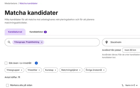
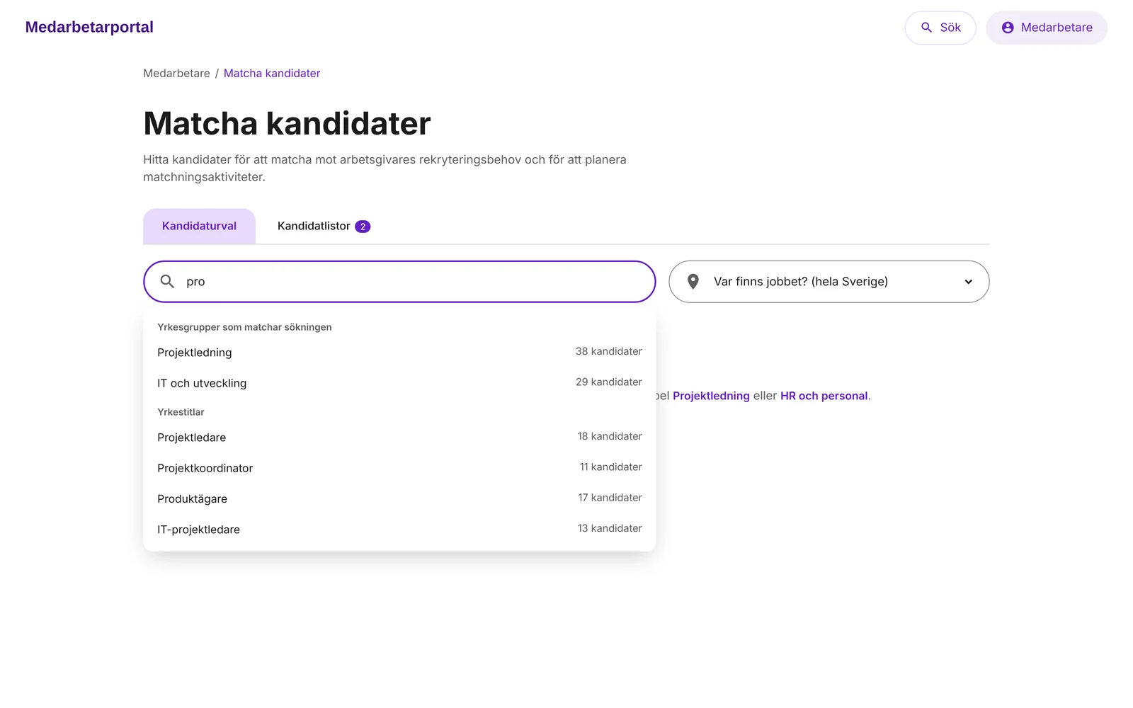
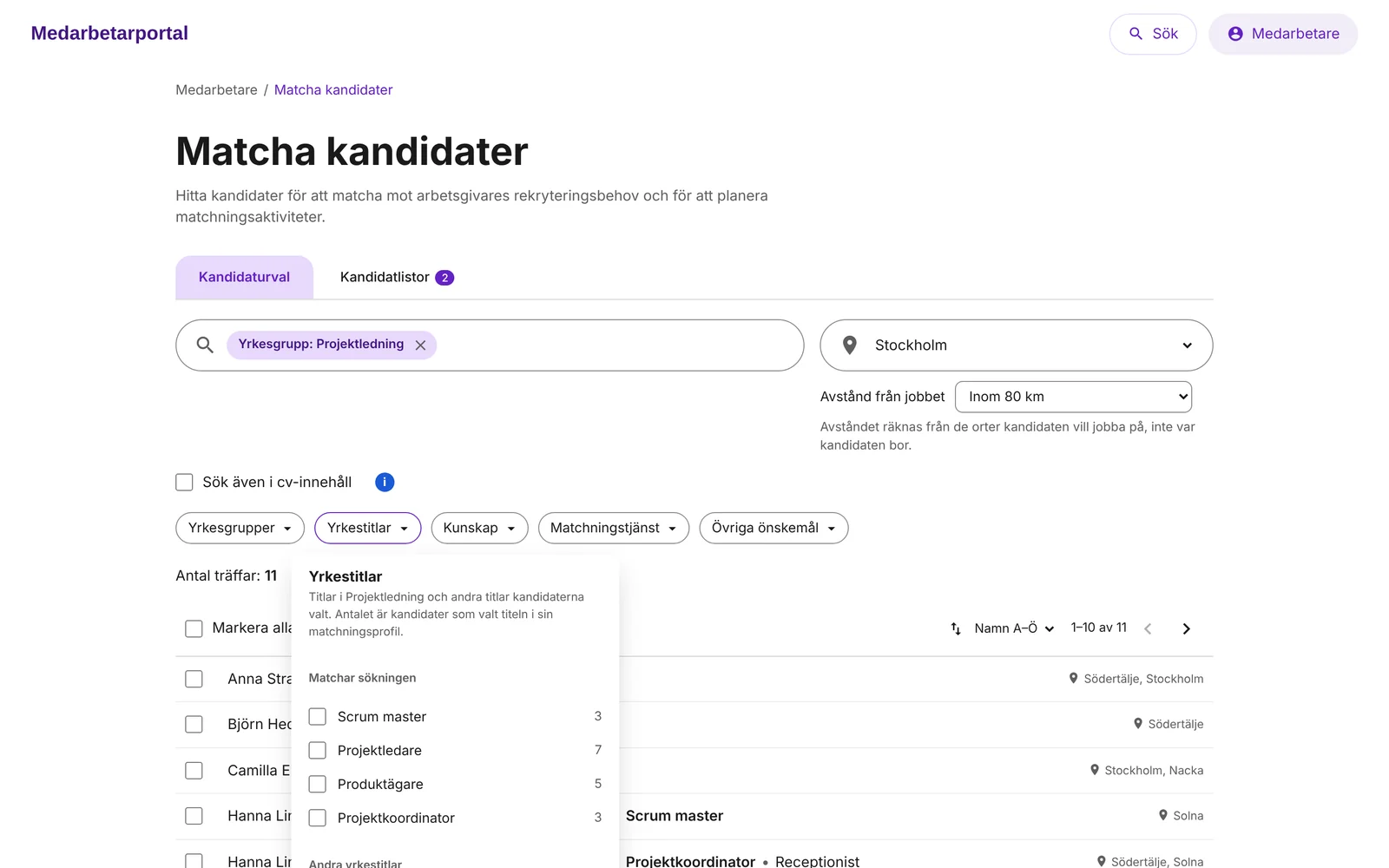
- Start broad with occupational groupsSuggesting occupational groups that match the search gives a wider selection, including job titles advisors wouldn’t have found on their own. Detailed filters then help make it relevant, when needed.
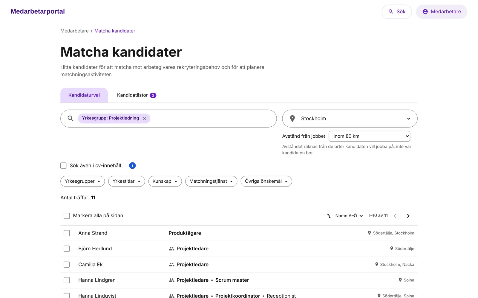
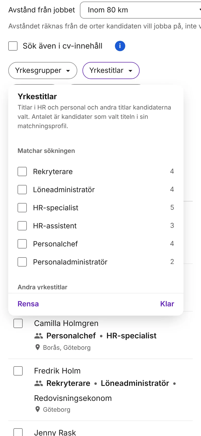
- Choose by distance from the jobInstead of picking places one by one, the advisor chooses where the job is and a distance. That makes it easier to adjust the selection and find candidates within commuting distance.
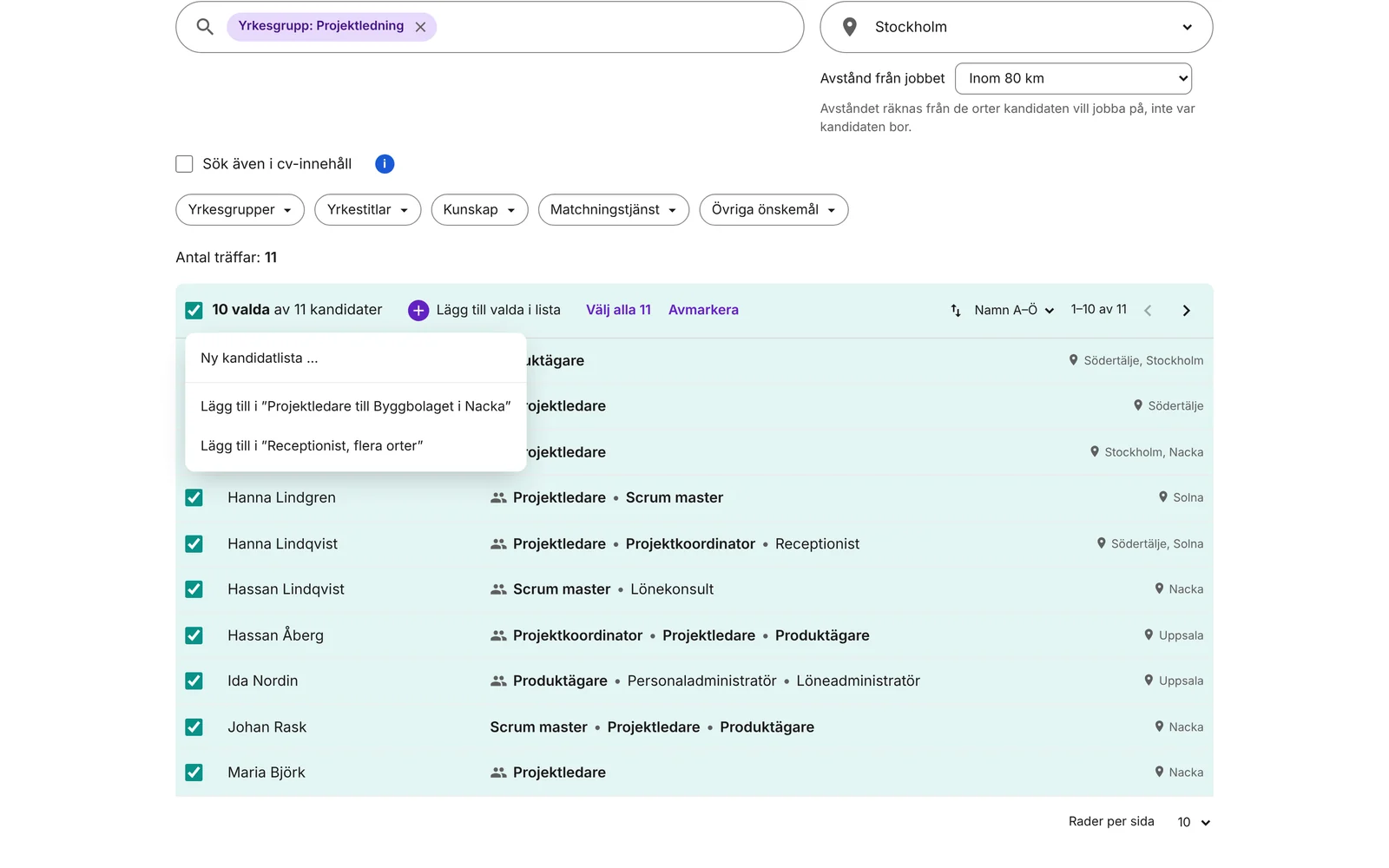
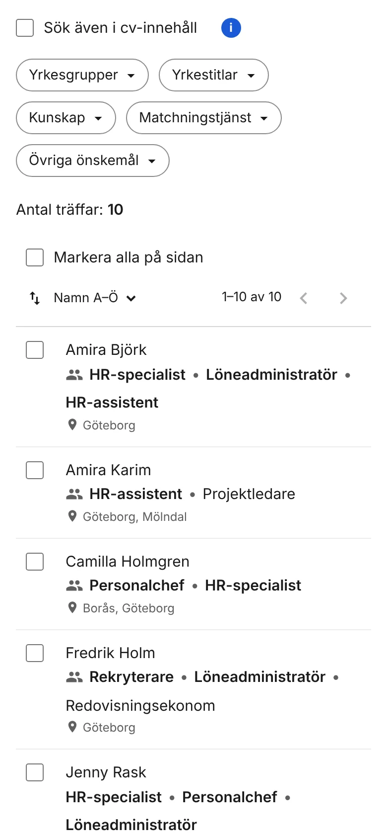
- Enough information to choose, and choose many at onceEach row shows the job titles that match the search, so advisors can choose without opening every profile. They can add one, several or all candidates to a list in one go.
The end-to-end flow
The tool sits in the middle of a longer chain, from a person’s match profile to an employer making contact. Steps 3 to 6 are the part I designed. The rest is why it matters.
- CandidateCreates a match profileJob titles, skills, places and wishes. Chooses whether to be matched directly and to share the profile.
- EmployerGets in touch with a recruitment needA company tells TRR which role it needs to fill, and where.
- AdvisorSearches broadlyOccupational group or job title, where the job is and a distance.
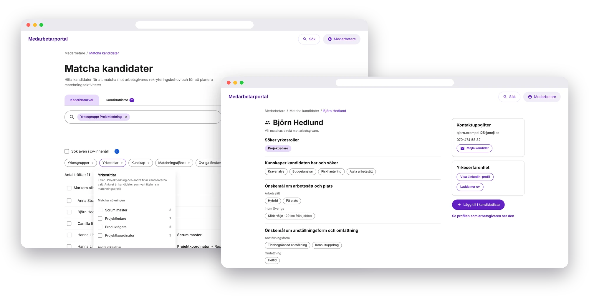
- AdvisorNarrows when neededJob titles, skills, matching service and wishes, with a count for each choice.
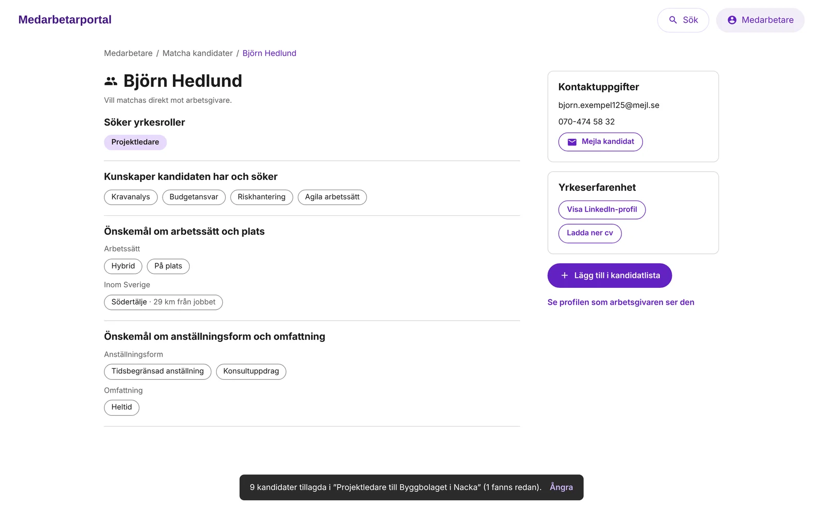
- AdvisorChecks and choosesReads the match profile and adds one, several or all candidates to a list.
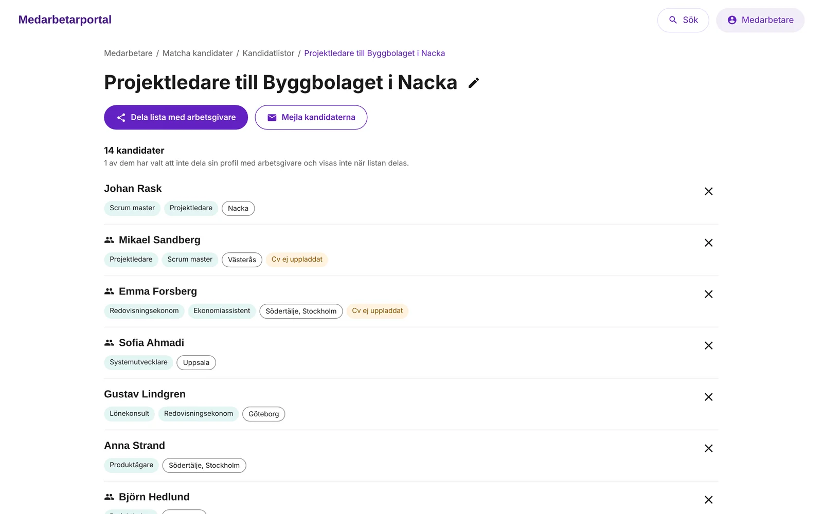
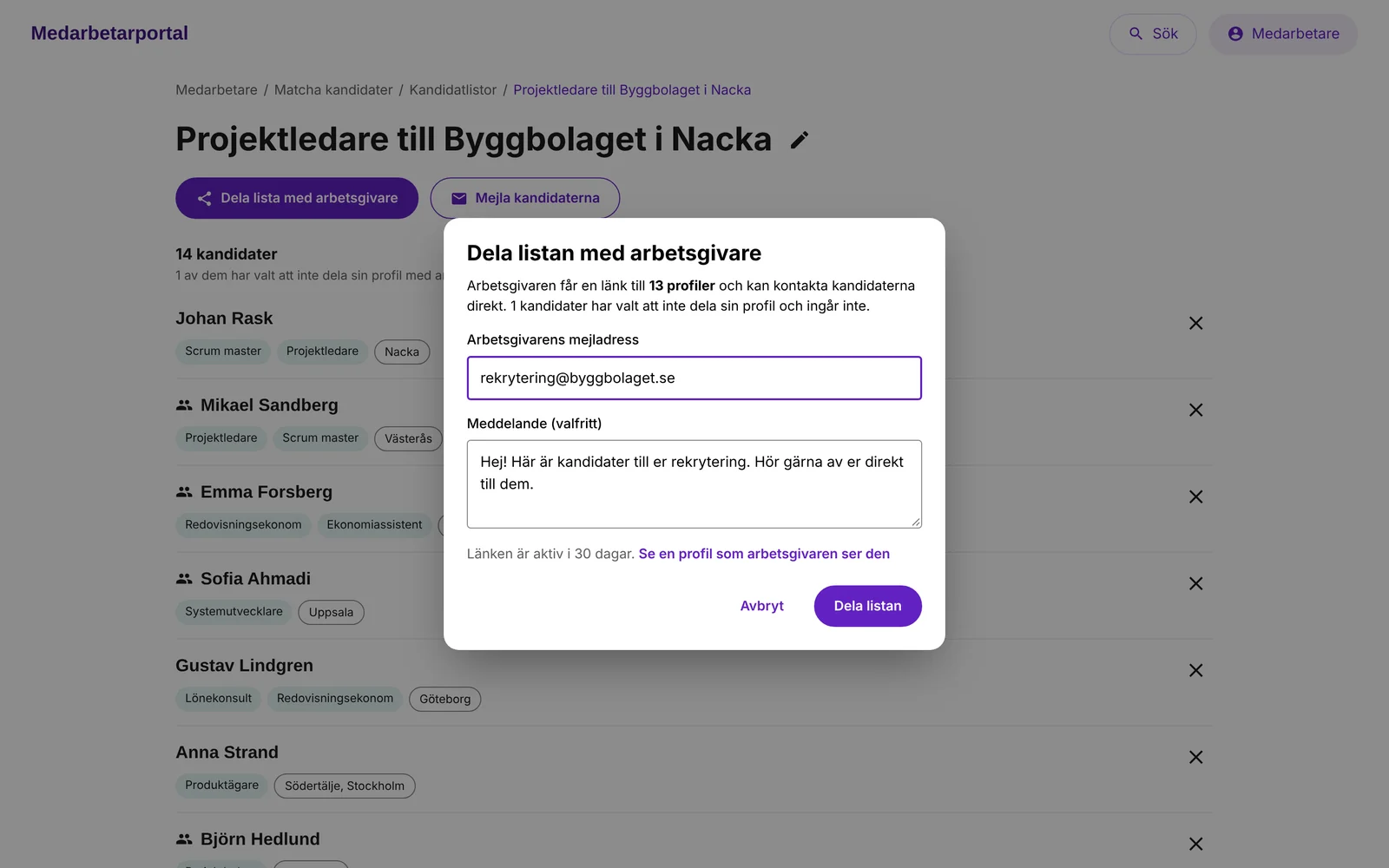
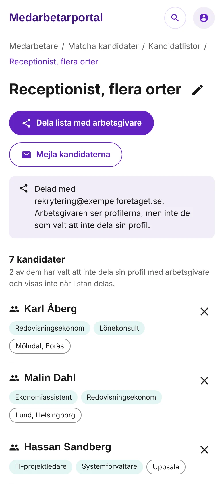
- AdvisorShares the listSends it to the employer, or emails the candidates. Only profiles that may be shared are included.
- EmployerViews the profilesReads the candidates’ profiles and contacts the ones who fit.
- CandidateIs contactedTalks to the employer and, hopefully, gets the job.
In the tool I designedBefore and after the tool
The solution, step by step
The flow follows an advisor from a recruitment need to a list the employer can see. The screens are in Swedish, from a working prototype built from my design in Figma. All people in it are made up. Click an image to enlarge it.
Working prototypeTry it yourselfSearch by occupational group and distance, narrow with filters, add candidates to a list and share it with an employer. In Swedish, on desktop or mobile.Search: start broad
Narrow: filter when needed
Check: the candidate profile
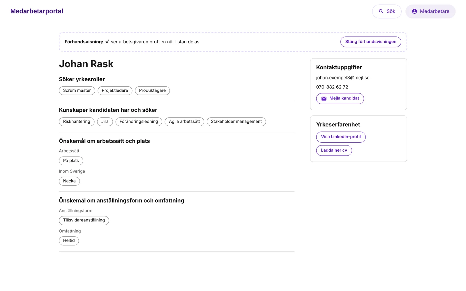
Share: a list for the employer
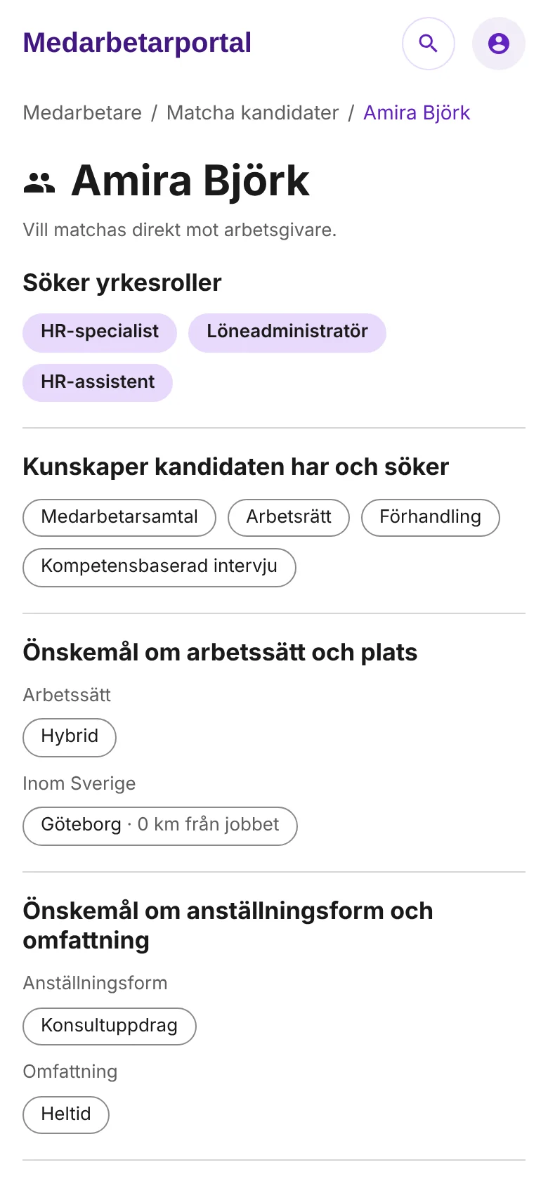
The same tool on mobile
What testing changed
I tested the prototype with four advisors. Their answers confirmed the main ideas, and showed what to change or remove before anything was built.
What the test confirmed
- 4 of 4valued starting with a broad selection and seeing the number of candidates early.
- 4 of 4valued choosing by distance from the job, once it was clear it counts from where candidates want to work.
- 4 of 4said matched job titles for the chosen groups made the selection more precise, without adding titles one by one.
- 4 of 4valued seeing the matching job titles on each candidate row.
What I changed after the test
- Swapped where and whatThe count showed candidates in all of Sweden until a place was chosen, so I recommended changing the order of the two fields to make the number more useful.
- Made distance clearerThe label now says the distance counts from where candidates want to work, not where they live. That was the one thing advisors misread in the test.
- Turned a switch into a filterAll four misread the switch for candidates who want to be matched directly with employers. It became a filter, Matchningstjänst, with All, Yes and No, and an icon on the candidate row.
- Removed “remote” from the placeThree of four said a fully remote recruitment need almost never happens, so it moved to the filter for the candidate’s wishes instead.
- Removed the summary by job titleNone of the four saw direct value in seeing candidates summed by job title, and three of four said the list supports choosing better. It was removed.
- One way to filterAdded All filters and the same behaviour for choosing, removing and clearing filters everywhere.
In the advisors’ words
“Starting broader and then being able to narrow it down in the next step is definitely better.”
“I sometimes need a map to choose areas to include, so it’s great to be able to give a distance instead.”
“Good that I can choose all or a few at a time, and only get asked once which candidate list to save to.”
UI design: what and why
An internal tool used every day had to be fast to scan and hard to misread.
- Built on TRR’s design systemPurple for actions, Raleway for headings and Open Sans for text, with the same components as TRR’s other services.
- Counts everywhereSuggestions and filter options show the number of candidates, so advisors see the effect of a choice before they make it.
- Matching titles firstOn each row, the job titles that match the search come first. The reason a candidate is in the list is visible at a glance.
- The action where the selection isWhen candidates are selected, the bar above the list shows how many are chosen, with the action to add them to a list right there.
- An icon for direct matchingA small people icon marks candidates who want to be matched directly with employers, so advisors see it without opening the profile.
- Clear states for what can’t be sharedCandidates who don’t share their profile, or haven’t uploaded a CV, are marked in the list, so there are no surprises when sharing.
The result
From the user tests
- The advisors confirmed all three hypotheses: start broad, choose by distance, and enough information on each row to choose.
- The test found what to remove or change before development, so the team didn’t build things advisors wouldn’t use.
- The next step was a beta with four advisors for two to four weeks, before releasing the tool to everyone.
For the goal
- A wider and more relevant selection of candidates means more of the people TRR helps are visible to employers.
- A shared list lets employers contact candidates directly, which is the first step towards a job.
Needs to look into next
- Searching on keywords in CVs, such as skills, education and employers.
- Information about latest employer and level of education.
- Whether the CV should be shown to the employer when a list is shared. That needed a decision from TRR.
What I took with me
Expert users don’t need fewer choices. They need to start in the right place. Letting advisors begin broad and narrow down step by step fitted how they already thought about a selection.
Testing early with a few advisors was worth it. It confirmed the main ideas, and it showed that a switch and a summary view weren’t helping, before anyone had built them.