UX/UI Design · TRR · Designer of the Sök jobb collection page, aligned across areas
Part of Sök jobb at TRR: see how the parts connectHow we gathered the job-search support in one place, so people could see the help they could get
Before, every kind of support had its own entry in the navigation bar, and nobody could see the whole area at once. I designed a collection page for job seekers: guides, tools and services in one place, in an order that shows what to do first and what comes next. I agreed the content with stakeholders across TRR and aligned the design with designers from other areas, so the collection pages work as one. In user tests of the old navigation against the new collection page, people found useful help more easily and understood how the support fitted together.
- My role
- UX/UI designer, working with stakeholders and designers from other areas
- Industry
- Career transition and working-life services
- Company
- TRR
- Platform
- Web
- Method
- Content agreed with stakeholders, A/B user testing and check-ins with advisors
- Tools
- Figma
The short version
The problem
Each kind of support had its own entry in the navigation bar. Users couldn’t see the whole area, so much of the help they could get stayed hidden.
What we did
A collection page for job seekers that gathers guides, tools and services, with content agreed across TRR and a design shared with the other collection pages.
What changed
In A/B user tests, people found useful help more easily with the new page, and understood better how the support was structured.
The problem
TRR offers a lot of support to people who are looking for a new job: guides, activities, tools and personal help from advisors. But the way in was the navigation bar, with one entry for each kind of support.
No overview
Users saw one entry at a time and could never see the whole area, so they didn’t know everything they could get help with.
No order
Nothing showed where to start or what came next. Every entry looked equally important.
Help that stayed hidden
Support that could have been useful was easy to miss, because people had to know it existed to find it.
The goal
Make TRR’s support offering more visible to the users.
The design challenge
The challenge was to show a large amount of support at once without it becoming a wall of links. People had to see the whole area, and also understand where to begin.
The content had to work for someone who has just lost their job and wants to get going, as well as for someone who already knows what they need and wants to find it fast.
Overview and direction
Show everything there is, and at the same time say: start here, then this.
My role and how we worked
My role
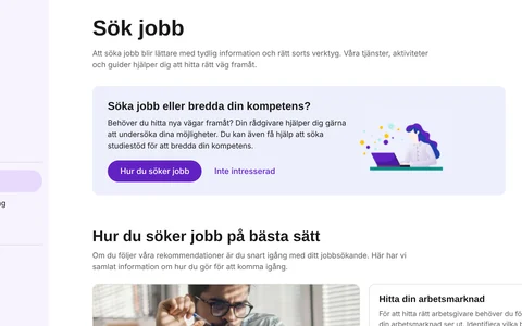
I designed the collection page Sök jobb: the concept, the structure of the guides, the screens in Figma and the prototype we used for user testing.
I involved stakeholders across the organisation to decide what content the page should show. The page gathers support from several parts of TRR, so the people who own that support needed to agree on what goes where.
I also aligned the design with the designers working on the other areas. Sök jobb is one of several collection pages, next to Kompetensutveckling and Starta företag, and together they had to feel like one coherent experience.
How we worked
We built a prototype for user testing and for check-ins with TRR’s advisors, who know which questions job seekers ask. We then iterated on the design from what we learnt.
From concept to tested design
Content agreed with stakeholders → concept → prototype in Figma → check-ins with advisors and alignment with designers from other areas → A/B user test of the old navigation and the new collection page → design iteration.
Key design decisions
Three decisions shaped the design.
- One page per need, not one entry per serviceInstead of a list of services in the navigation bar, the user gets a collection page built around what they want to do: find a job. All the support for that need is gathered there.
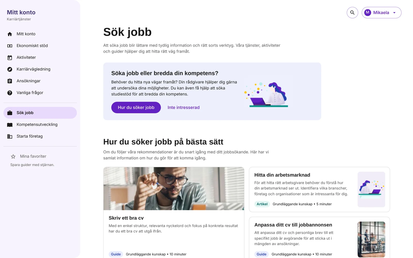
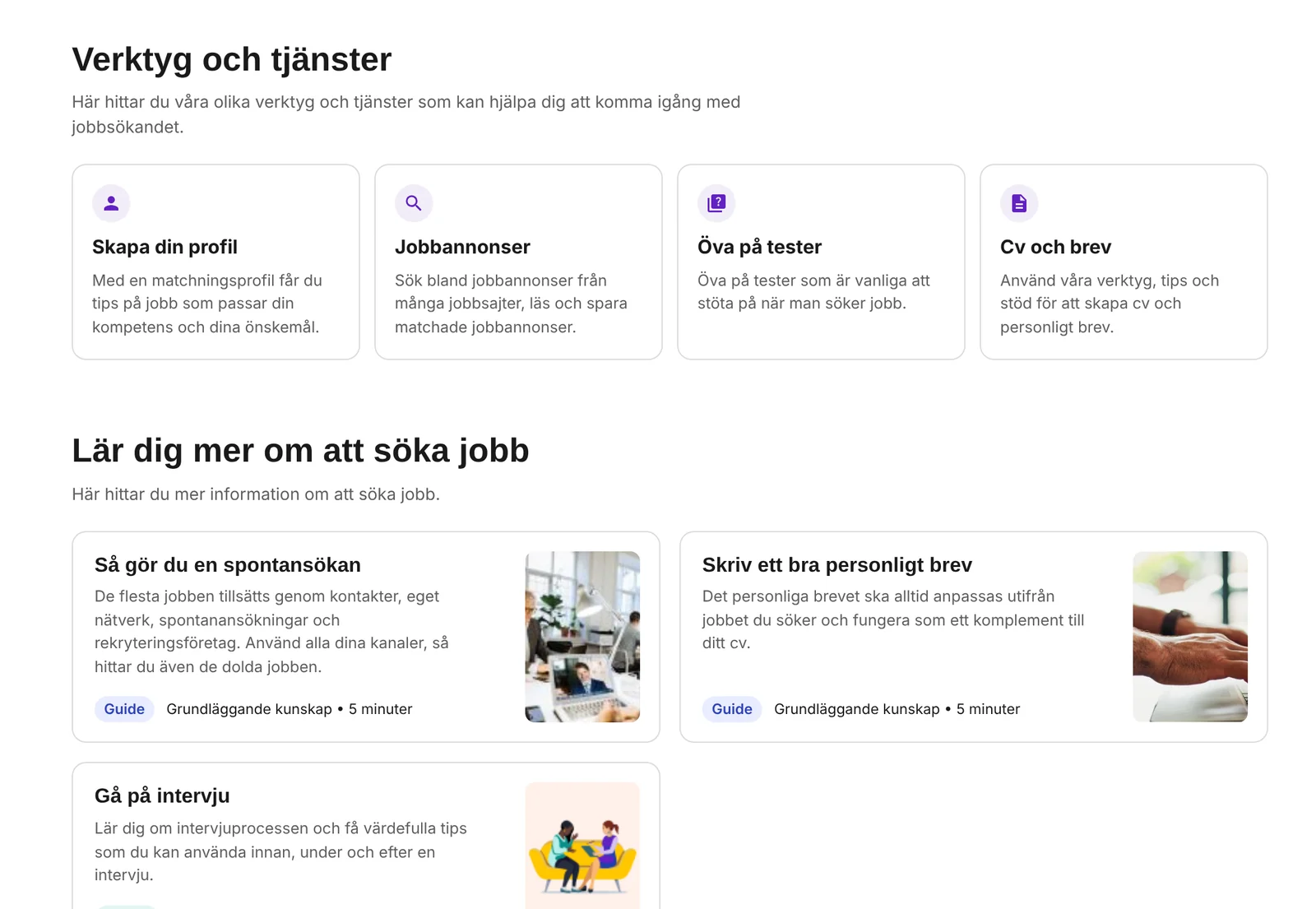
- An order that shows the wayThe page goes from the basics to the specific: first how you look for a job, then the tools and services, then more to learn. The user sees what to do first and what comes next.
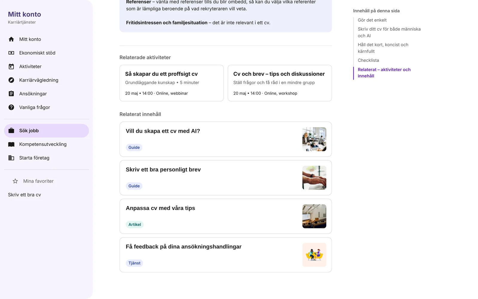
- Every guide leads on to more helpA guide ends with related activities, related content and a way to get personal feedback. Reading a guide isn’t a dead end. It leads to the next useful piece of support.
The solution, step by step
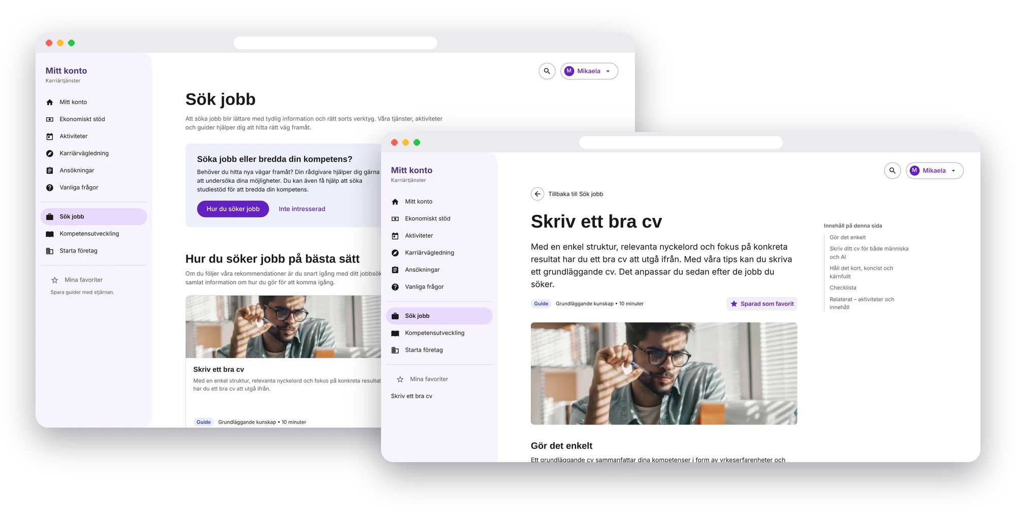
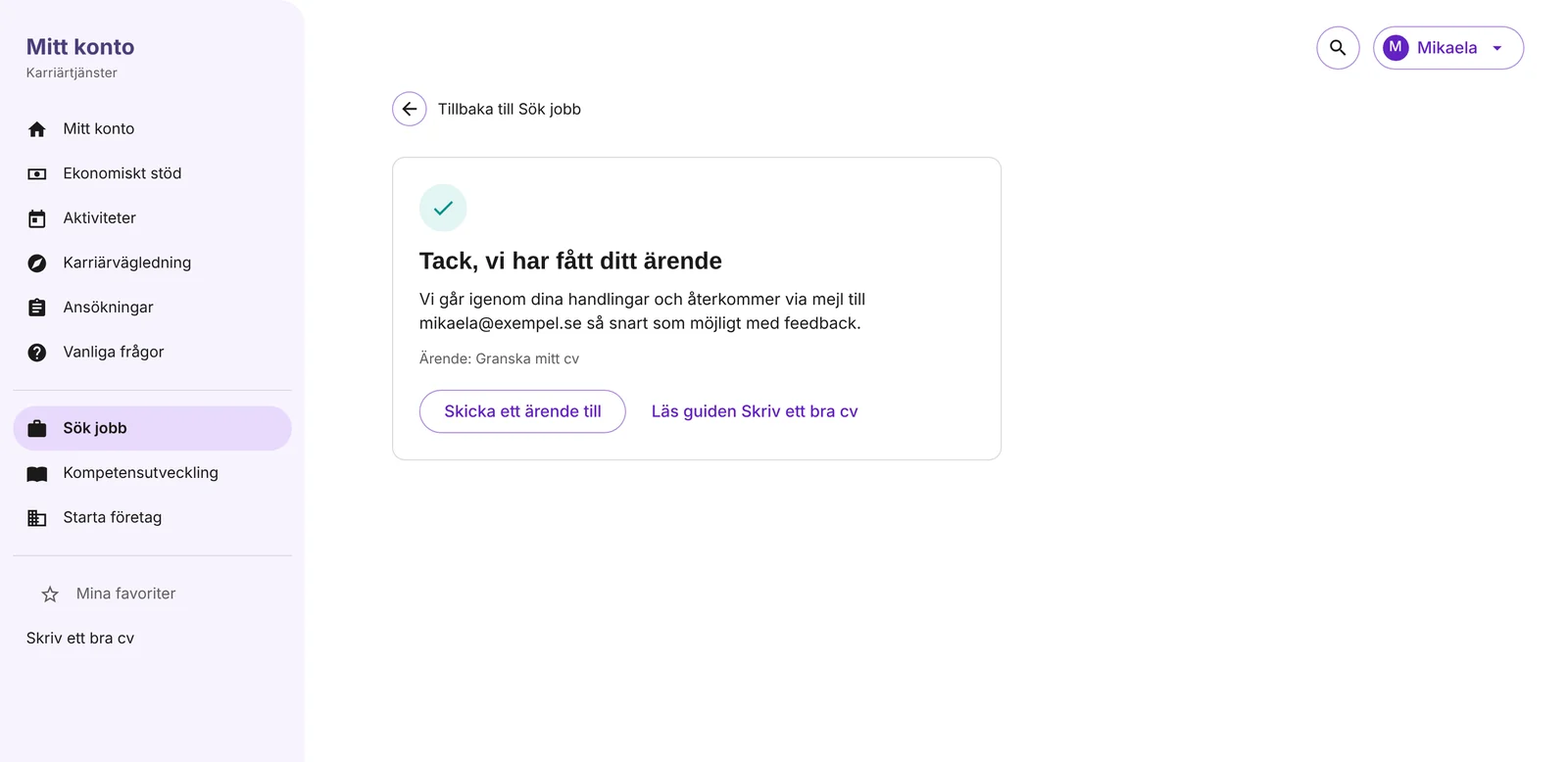
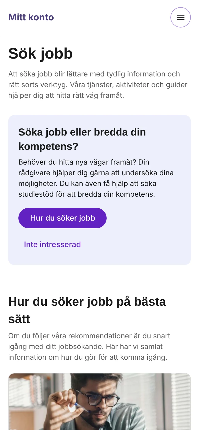
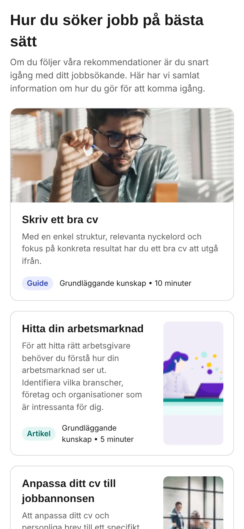
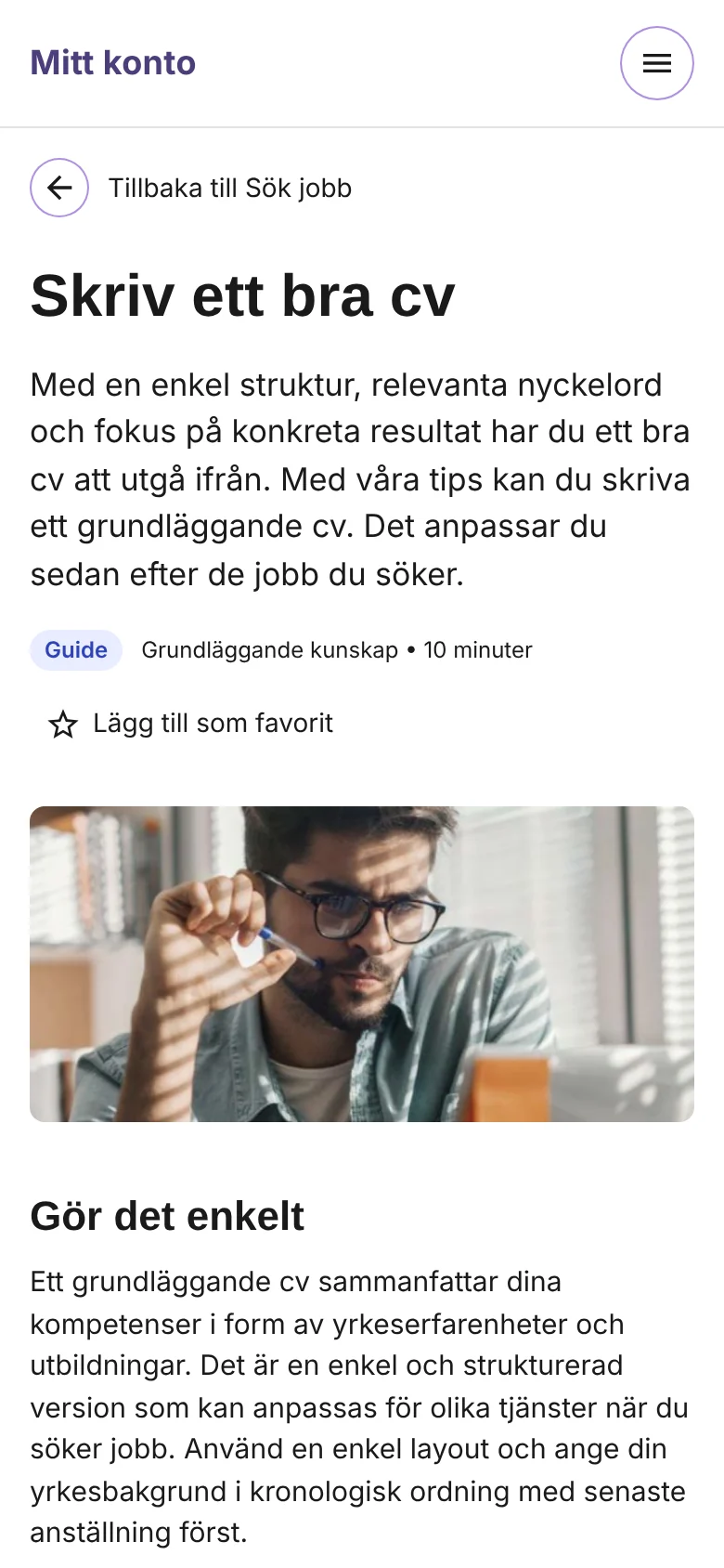
The flow follows a job seeker from the overview, into a guide and on to personal help. The screens are in Swedish, from a working prototype built from the design in Figma. The photos and illustrations come from the design file. Click an image to enlarge it.
Working prototypeTry it yourselfBrowse the collection page, read a guide, save it as a favourite and ask for feedback on your CV. In Swedish, on desktop or mobile.See: everything for job seekers in one place
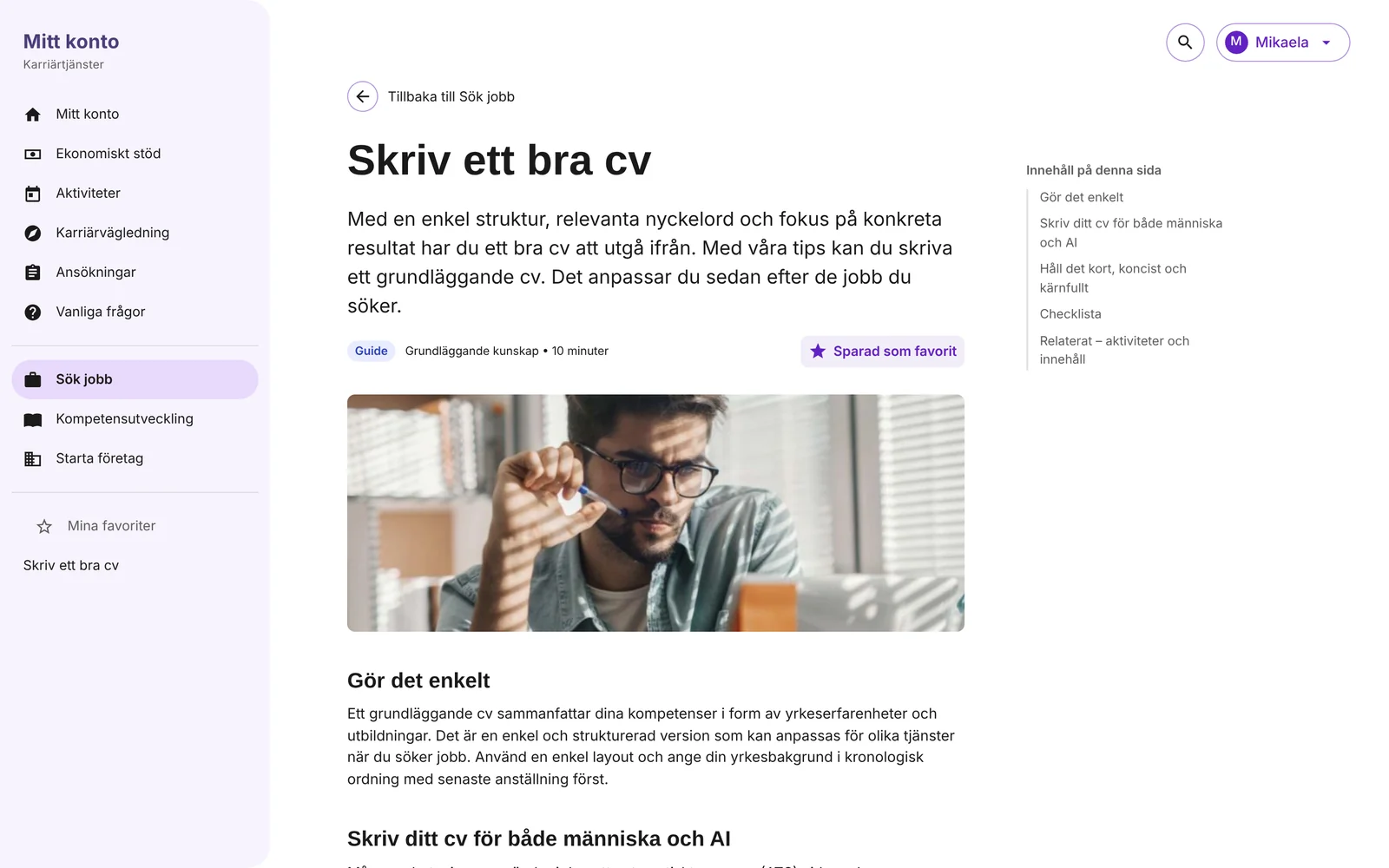
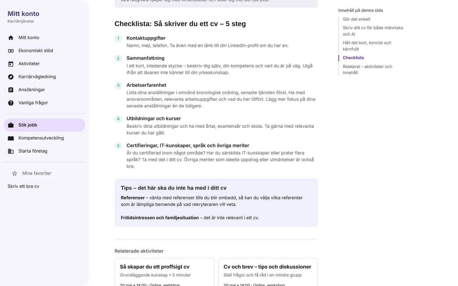
Read: a guide with the same structure every time
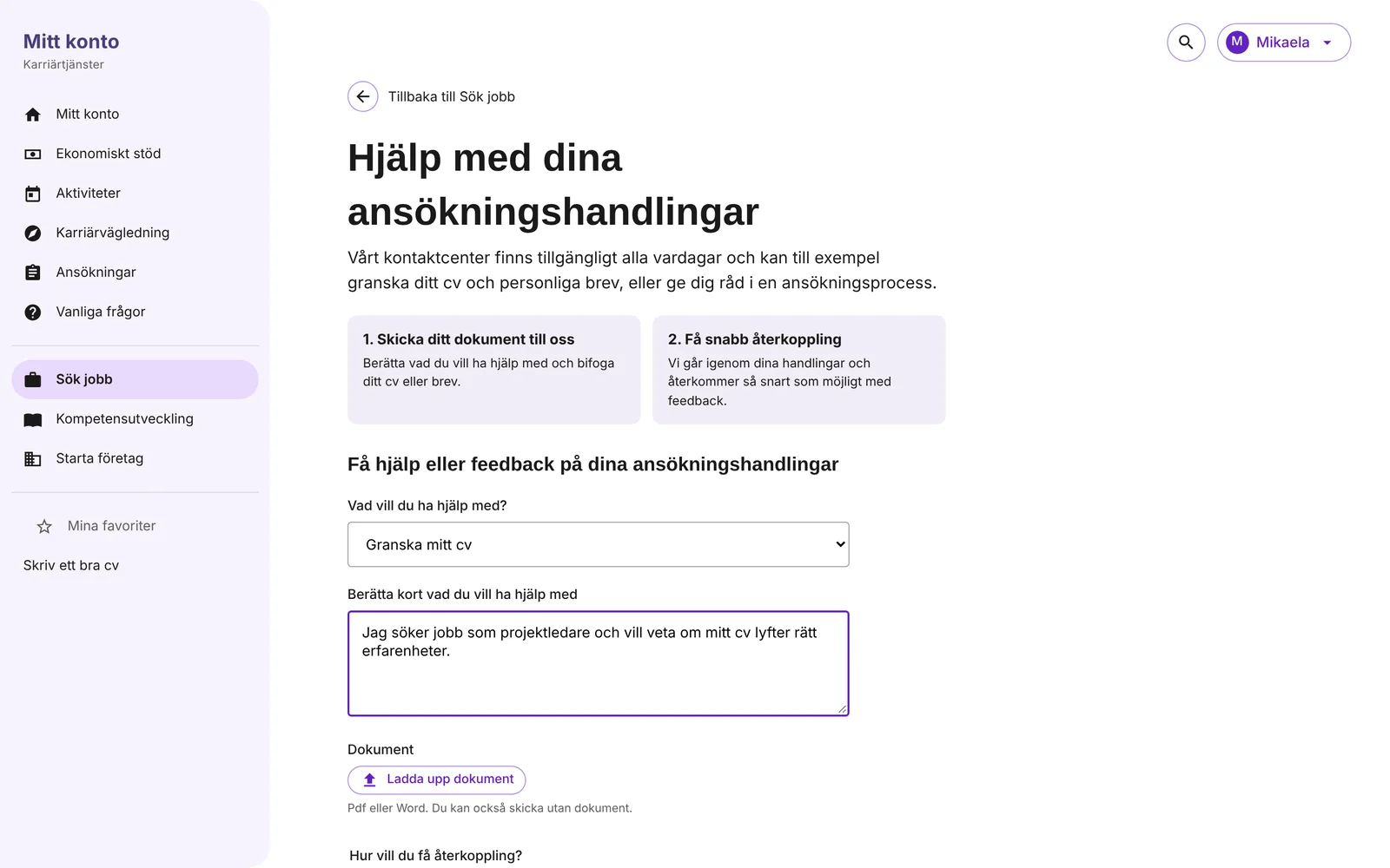
Go on: from reading to getting help
The same content on mobile
UX decisions: what and why
Each decision answers one of the three problems: no overview, no order, and help that stayed hidden.
From problem to decision
No overview
Decisions 1–2: one collection page per need, with all types of support side by side.
No order
Decisions 3–5: sections that go from the basics to the specific, a first choice at the top and the same structure in every guide.
Help that stayed hidden
Decisions 6–8: related help at the end of each guide, a short way to personal feedback, and favourites to come back to.
The decisions in the details
- Organise by need, not by servicePeople don’t think in services. They think ‘I need a job’. The collection page Sök jobb is named after that need and gathers everything that helps with it.
- Mix types on the same pageGuides, articles, tools and services sit together on the page. Each card says what type it is and how long it takes, so the user can choose what suits them right now.
- First this, then thatThe sections run from ‘how you look for a job’ to ‘tools and services’ to ‘learn more’. The order itself is guidance, and it is what made users understand how the support fitted together.
- Offer a different path at the topNot everyone wants to look for a job straight away. A card at the top asks whether you would rather broaden your skills, with ‘Not interested’ to hide it.
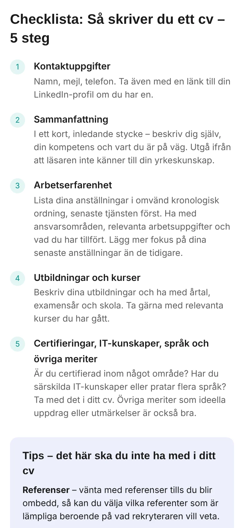
- The same structure in every guideA short lead, a few sections, a checklist and a tip. Once you have read one guide, you know how to read the next.
- End each guide with the next stepRelated activities, related content and a service for personal feedback. The guide becomes a way into more support, not the end of it.
- Make personal help easy to ask forThe feedback form explains what happens in two steps before asking anything, keeps to a few fields and lets the user choose email or a phone call.
- Let people come backA star saves a guide under My favourites in the menu, so the user can return to it without searching again.
UI design: what and why
A lot of content had to feel calm and easy to scan. These visual decisions make that possible.
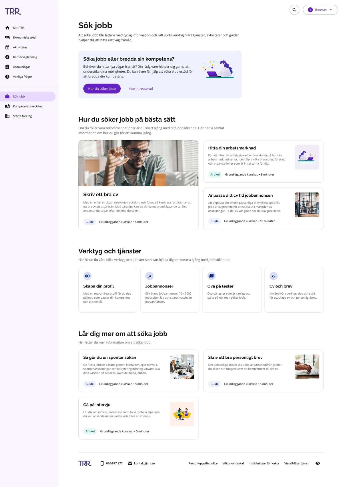
- Built on TRR’s design systemPurple for actions, Raleway for headings and Open Sans for text, with the existing components. The new pages feel like part of the same service.
- One pattern for every collection pageAligned with the designers of the other areas, so the collection pages are built the same way. Moving from Sök jobb to Kompetensutveckling feels like the same service.
- One card, several sizesThe most important guide gets a large card with an image. The rest use a compact card with the image to the side. The size shows what to start with.
- Type and time on every cardA coloured tag shows whether it is a guide or an article, next to the level and reading time. Users can tell what they will get before they click.
- A table of contents that follows youOn wide screens the guide has a table of contents that stays in view and highlights the section you are reading.
- Numbered checklistsAdvice that should be acted on is shown as numbered steps, separate from the running text, so it is easy to follow.
- Photos for guides, illustrations for ideasGuides about practical tasks use photos of people at work. Broader topics, like finding your job market or going to an interview, use the illustration style. The image hints at the kind of content before you read.
- Soft surfaces for tips and choicesThe intro card and the tips box use light surfaces, so they stand out from the content without competing with the main actions.
The result
What the user tests showed
We tested the existing navigation (A) against the new collection page (B). The result is from the user tests. We didn’t measure it in numbers.
- With the collection page, users found help that could be useful to them more easily.
- Users understood better how the support was structured: first this, then that.
- The overview showed support that users hadn’t found when each offer had its own entry in the navigation bar.
For TRR
- The design answers the goal of making the support offering more visible to the users.
- The collection pages share one design, aligned across areas, so the experience hangs together across TRR’s support.
- The content on Sök jobb was agreed with the stakeholders who own the support.
What I took with me
Making support visible isn’t only about putting more links in front of people. It is about showing the whole area and, at the same time, giving it an order.
Testing the old and the new side by side made the difference clear. When the same content was organised by need and in a sequence, people found more of it and understood how it fitted together.