UX/UI Design · AI · TRR · Sole designer in the product team
Part of Sök jobb at TRR: see how the parts connectClearer job ads, better filters and AI support, so more people get to the first interview
TRR gathers job ads from many job sites and companies for the people it helps in career transition, and matches them through each person’s match profile. I redesigned how people find and read those ads: cards instead of a list, new filters, ads with a clear structure, and two AI services built in design sprints with the cross-functional team. One compares your CV with the ad and suggests what to bring forward. The other creates a CV tailored to the ad. The parts were launched step by step, and we tested the whole flow with users.
- My role
- Sole designer in the product development team
- Users
- People in career transition looking for a new job
- Company
- TRR
- Method
- Design sprints for the AI services, usability tests of the whole flow
- Platform
- Web, desktop and mobile
- Tools
- Figma
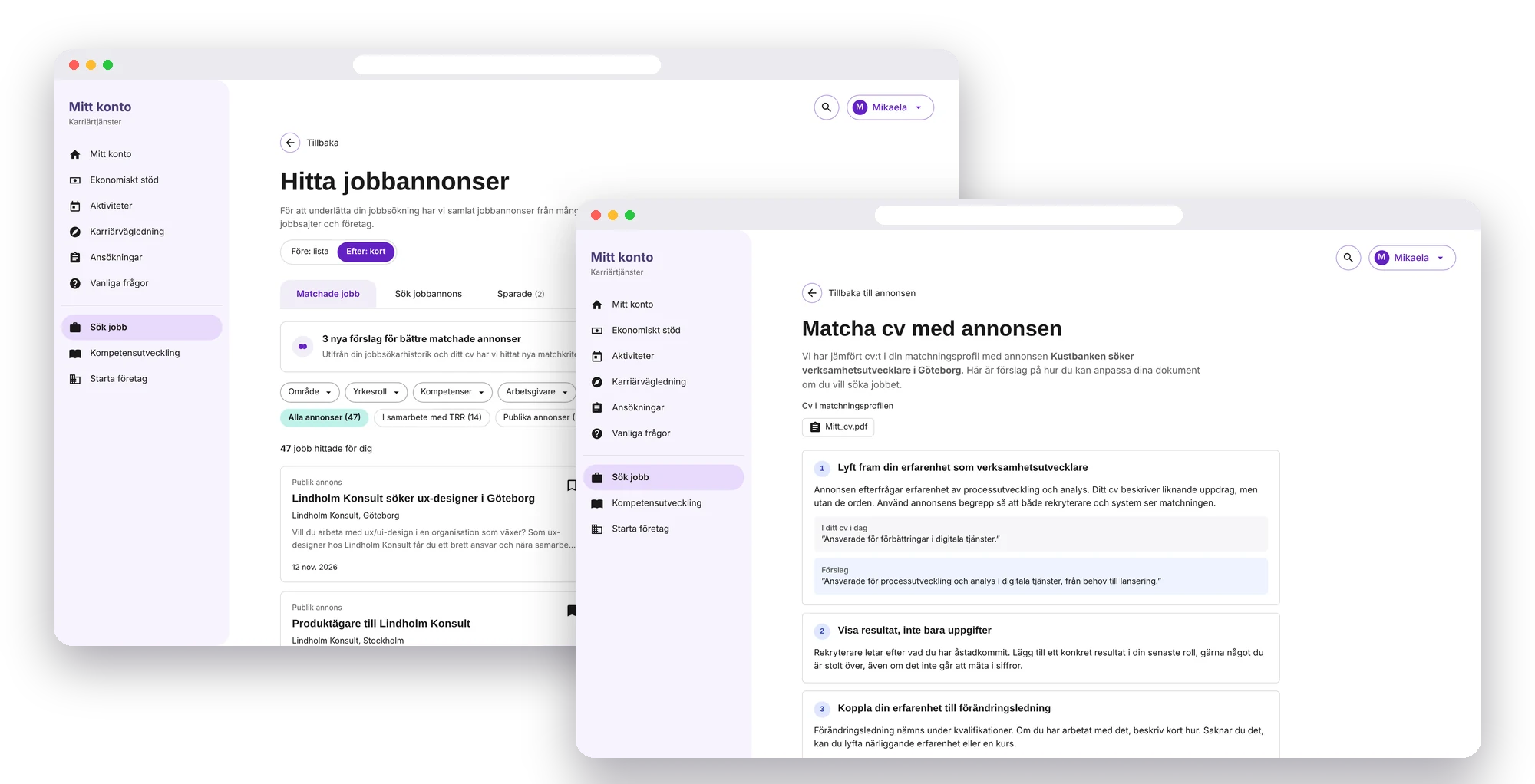
The short version
The problem
Job ads were shown as a dense list that was hard to scan, especially on a phone, and the ads themselves were long blocks of text. Applying well took a lot of work.
What we did
Cards that show the essentials at a glance, new filters, ads with a clear structure, and AI support on the ad that helps people tailor their CV to the job.
The goal
Clearer ads, better filtering and an easier way to apply, so more people get to the first interview.
The problem
People in career transition use TRR’s job ads to find their next job. The ads come from many job sites and from companies that work with TRR, and the match profile decides which ones are suggested. But finding, reading and applying took more effort than it should.
A list that was hard to scan
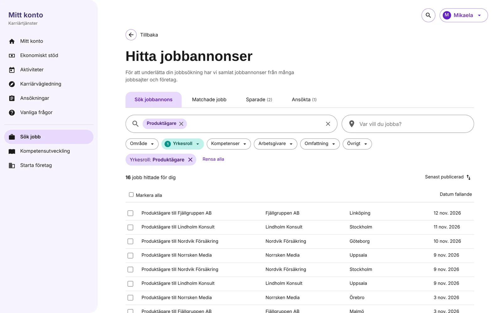
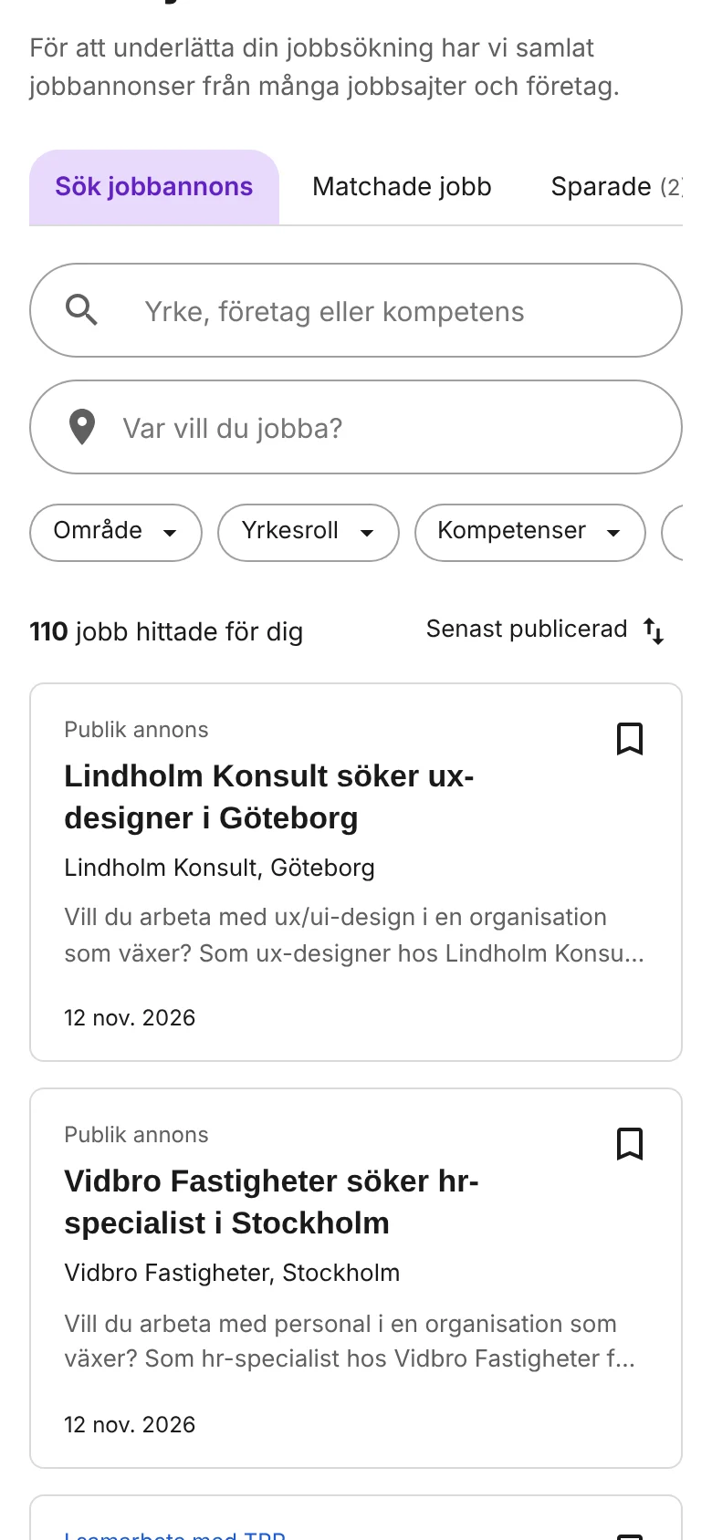
Ads were shown as rows in a table, like a list of records. Title, company and place were there, but not what the job was about, and the rows were cramped on a phone.
Ads as long blocks of text
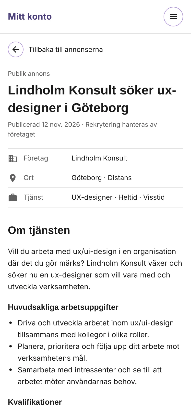
Many ads were one long text without headings. It was hard to see the tasks, the requirements and the deadline without reading everything.
Applying well was hard
To have a chance, people need to adapt their CV to each job. Knowing what to bring forward, and doing it for every application, takes time and confidence.
The goal
Clearer ads, better filtering and an easier way to apply, so more people get to the first interview.
The design challenge
The ads come from many sources, in many formats and of varying quality. The design had to make them feel consistent and easy to compare, without being able to rewrite what employers had written.
The AI support had to help people apply better without taking over. It had to be clear what was AI-generated, easy to review and edit, and grounded in what the person had actually written in their CV and match profile.
From browsing to applying
Support the whole way: find the right ads, understand them quickly, and send an application that stands out.
My role and how we worked
My role
I was the only designer in the product development team. I designed the search and the cards, the filters, the structure of the ad page and the AI services, and tested the flow with users.
Design sprints for the AI services
For the AI services we worked in design sprints with the whole cross-functional team. Together we explored how AI could better support the job search, and what we could build in a short time to raise people’s chances of getting to a first interview.
We sketched and compared several concepts, for example editing a tailored CV in a drawer next to the ad, or on a page of its own. We then chose the bets that did the most for the chance of an interview and could be built quickly, and kept the rest as later ideas.
How we chose
Most impact on getting to a first interview × can be built in a short time = the first version. The rest went into “later”.
Step by step, tested as a whole
The parts were launched one at a time: cards and filters, the clearer ad, matching the CV with the ad, and the tailored CV. We ran usability tests on the whole flow, from searching to applying, so the parts would work together and not only on their own.
Key design decisions
Four decisions shaped the new job ads.
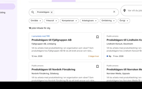
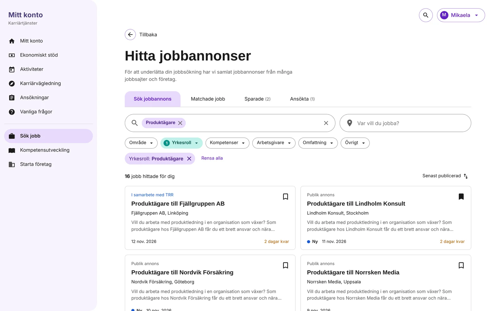
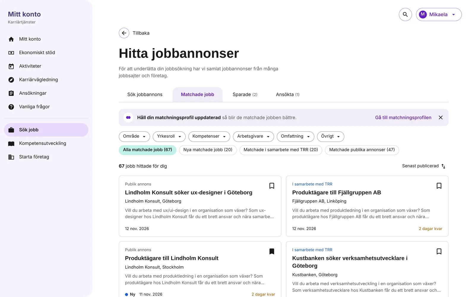
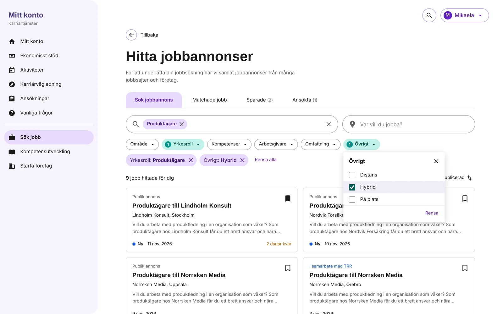
- Cards instead of a listEach ad is a card with title, company, place, a short summary and dates. People can judge an ad before they open it, and cards work much better on a phone than table rows.
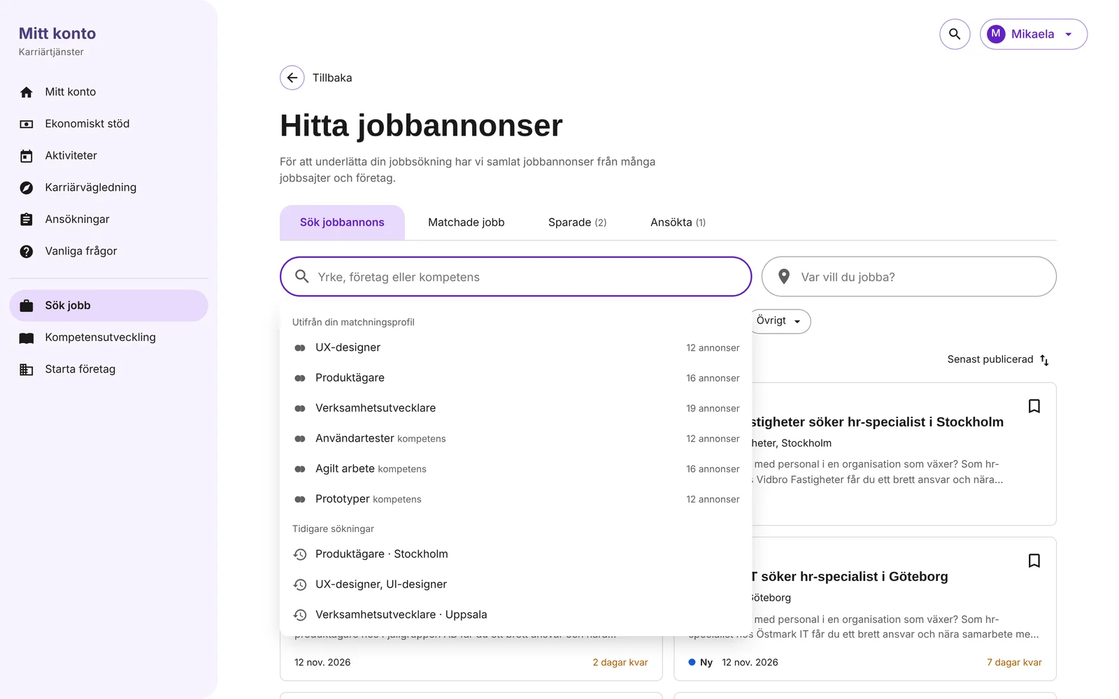
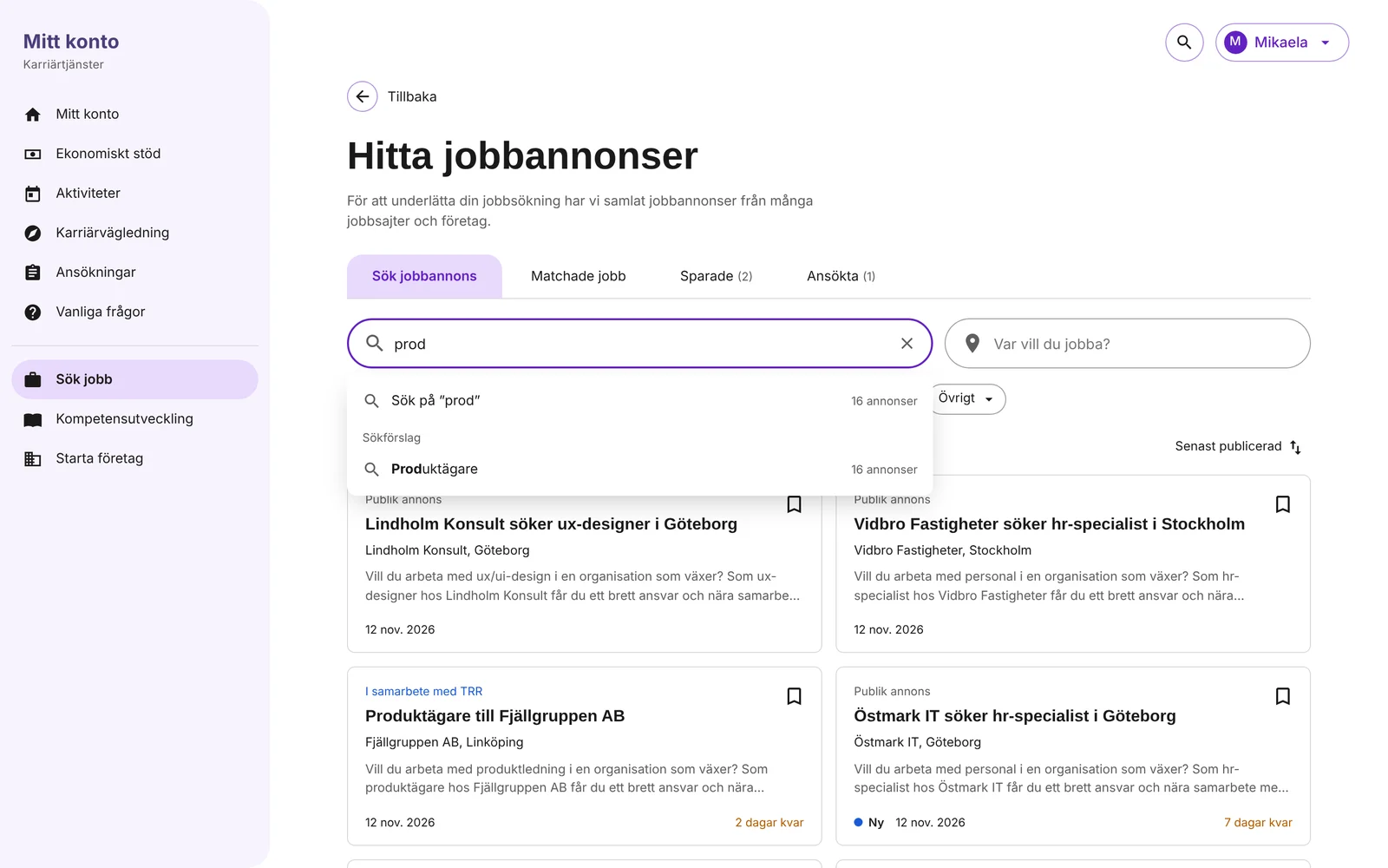
- Start from what we already knowMatched jobs come from the match profile, and the search field suggests roles and skills from the profile and earlier searches. Typing something else gives a normal search.
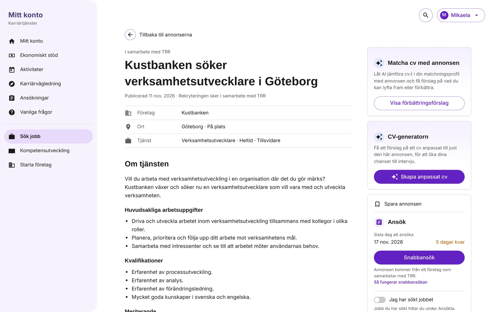
- A clear structure for every adFacts first (company, place, job), then the same headings in the same order: tasks, qualifications, merits, personal qualities, the company and how to apply. The deadline and how to apply sit beside the text.
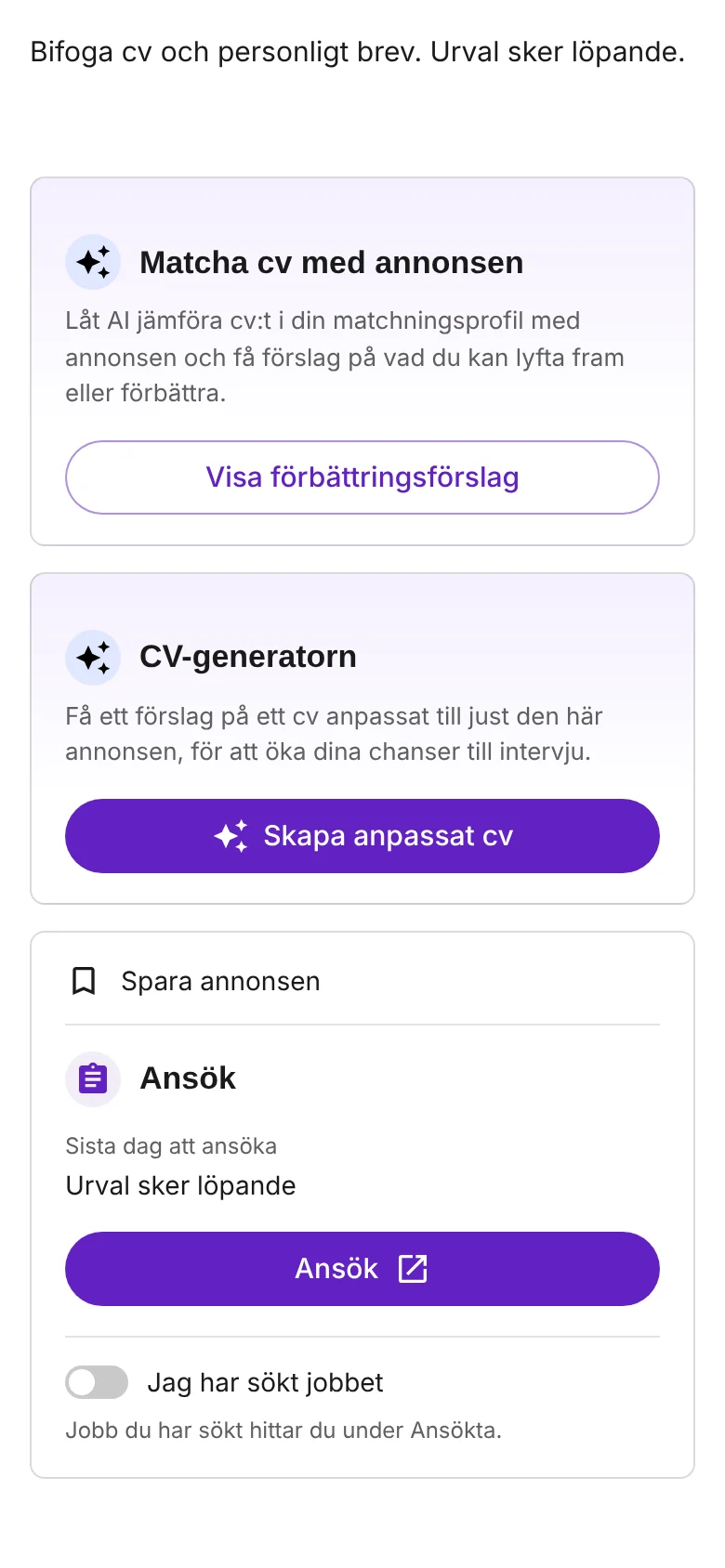
- AI where the decision is madeThe AI services sit on the ad, next to the apply button. That is the moment people decide to apply and need help to do it well.
The end-to-end flow
From the match profile to the first interview. Steps 2 to 7 are what I designed in this work. The match profile has its own case.
- Job seekerFills in the match profileRoles, skills, places and a CV. The base for everything that follows.
- The serviceSuggests matched jobsAds that fit the profile, and suggestions to update it.
- Job seekerSearches and filtersSuggestions from the profile and earlier searches, cards and filters.
- Job seekerReads the adFacts first, the same headings every time, the deadline beside the text.
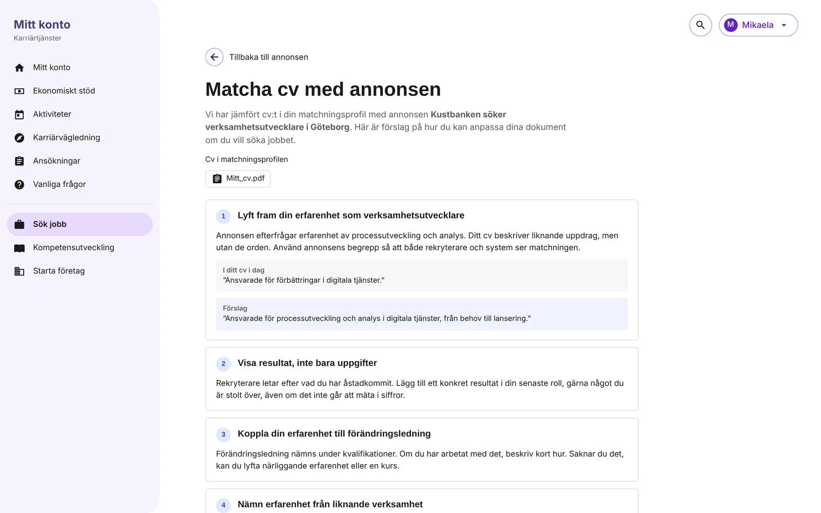
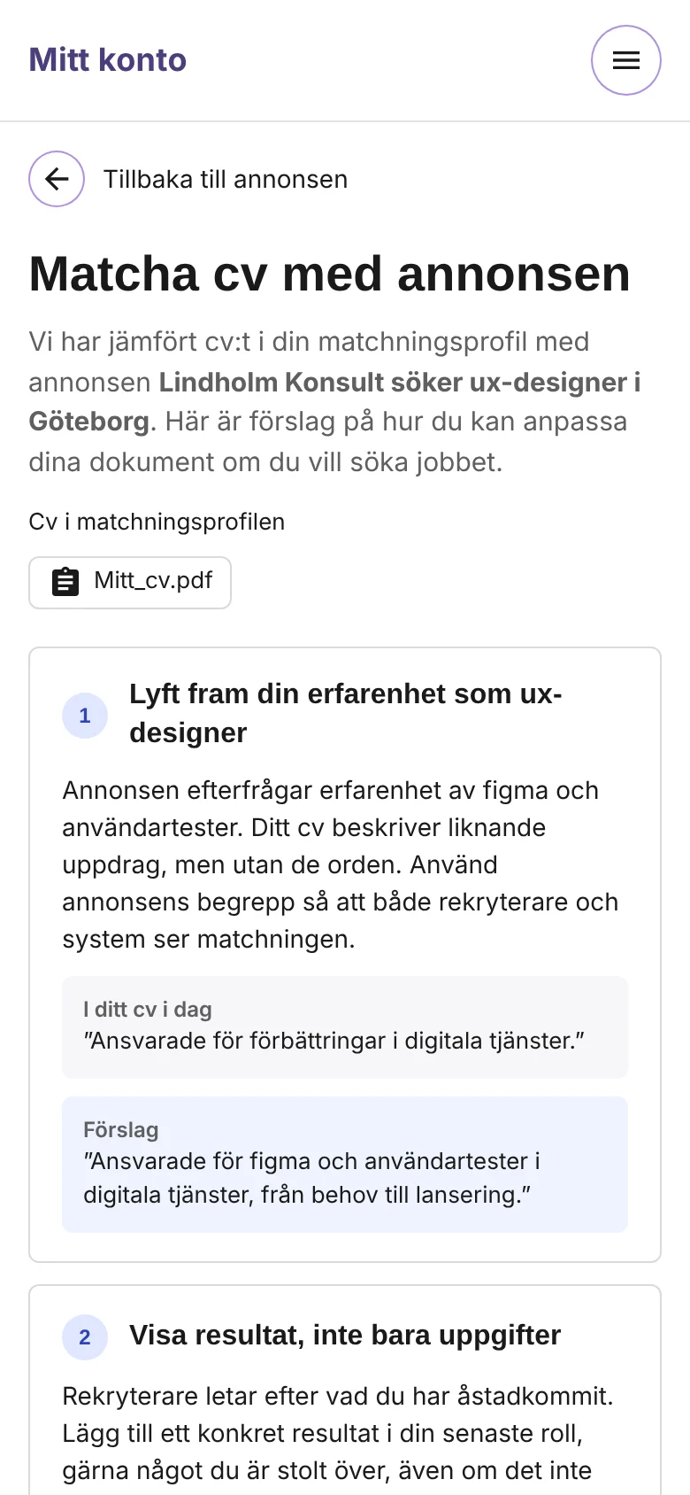
- AI supportMatches the CV with the adSuggestions on what to bring forward, and a summary to copy.
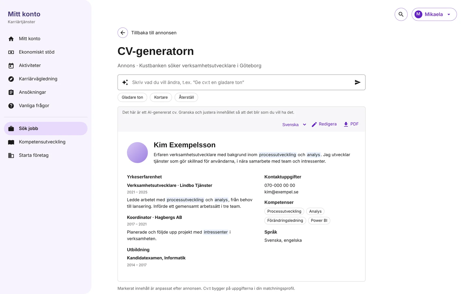
- AI supportCreates a tailored CVA first version to review, change and download.
- Job seekerAppliesQuick apply for TRR partner ads, or on the employer’s site, and marks it as applied.
- EmployerInvites to an interviewThe goal of the whole flow: the first interview.
In the flow I designedOutside the flow I designed
The solution, step by step
The flow follows a job seeker from searching to applying. The screens are in Swedish, from a working prototype built from the design in Figma. The ads, companies and AI answers are made up. Click an image to enlarge it.
Working prototypeTry it yourselfSearch with suggestions from your match profile, filter and see your choices, open an ad and try the two AI services. In Swedish, on desktop or mobile.Find: from a list to cards
Search: suggestions you recognise
Narrow down: matched jobs and filters
Read: an ad with structure
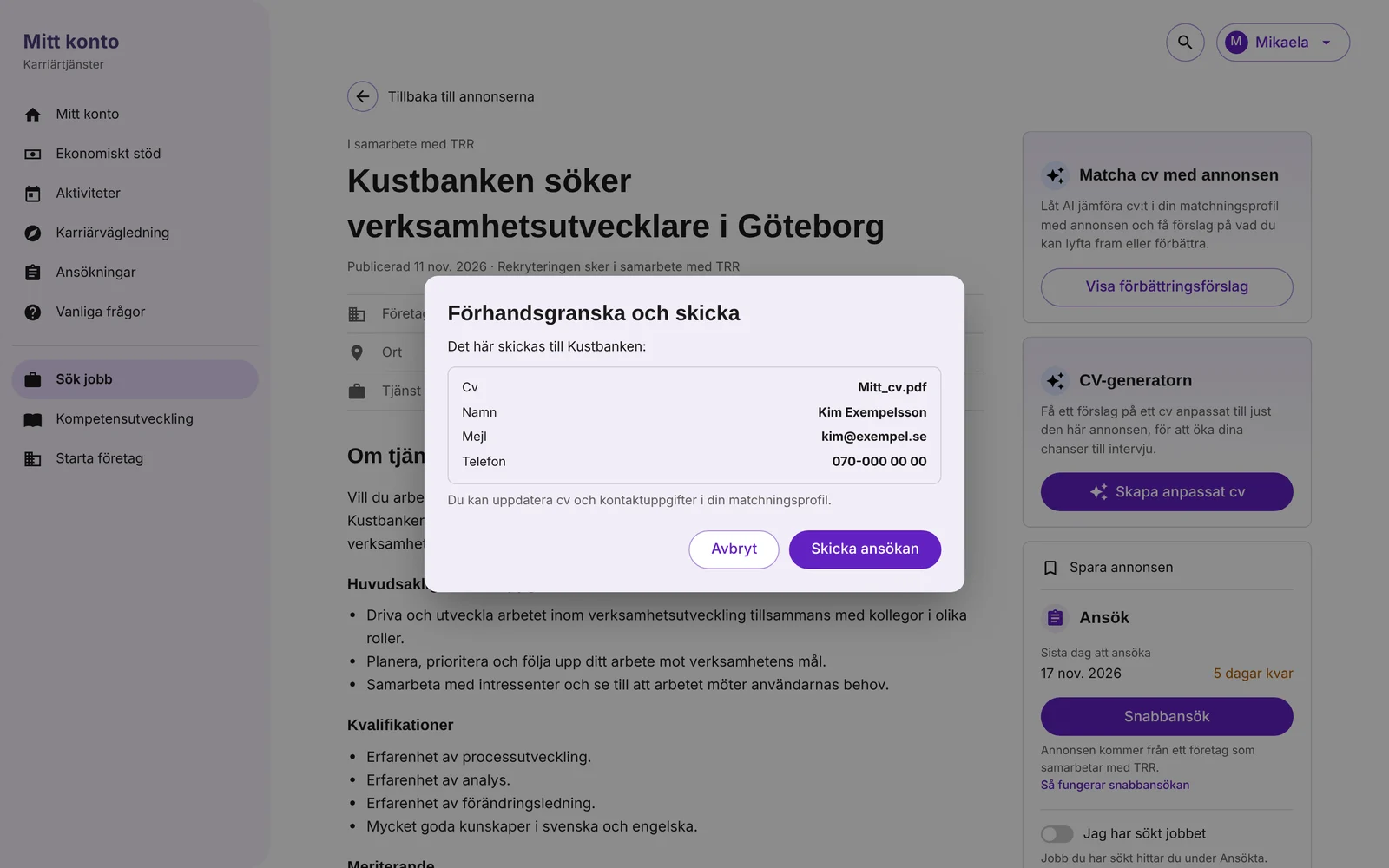
Apply better: the AI services
The same flow on mobile
UX decisions: what and why
- Show enough to decideA card shows title, company, place, a two-line summary and dates, so people can decide whether to open the ad.
- Mark what is time-critical“New” and “3 days left” on the card help people act in time.
- Save and mark as appliedA bookmark on every card, and a switch on the ad for “I have applied”, so people can keep track under Saved and Applied.
- Suggest, don’t forceSuggestions come from the match profile and earlier searches, but typing anything gives a normal search.
- Keep the profile up to dateWhen the job search history and CV suggest better match criteria, a banner offers to update the match profile.
- One way to apply per sourceAds from companies that work with TRR get quick apply. Public ads link to the employer’s own site.
- Explain the AI and keep people in controlAI content is labelled, based on the person’s own CV and profile, and can be edited before use. A thumbs up or down helps improve it.
- Help with the words, not only the adviceThe suggestions show today’s wording next to a better one, and a motivating summary that can be copied straight into an application.
UI design: what and why
- Built on TRR’s design systemPurple for actions, Raleway for headings and Open Sans for text, with the existing card, filter and button components.
- A card with a clear hierarchySource in small text, a bold title, company and place, then the summary. The eye goes from what to who to where.
- Source made visible“In cooperation with TRR” in blue and “Public ad” in grey, so people know at once which ads can be applied for directly.
- Facts in a small tableCompany, place and job sit in a short table with icons, so the basics are found without reading.
- A recognisable sign for AIAI services use the same sparkle icon and a soft lilac card, so they stand out from the ad without competing with the apply button.
The result
Where it landed
- The new cards, filters, clearer ads and both AI services were launched step by step at TRR.
- The whole flow, from searching to applying, was tested with users.
- The AI services came from design sprints where the team chose the bets most likely to help people get to a first interview, and that could be built in a short time.
What I took with me
AI is most useful at the moment someone has to act. Putting it on the ad, next to the apply button, made it part of applying rather than a separate tool people had to find.
Design sprints with the whole team made it easier to say no. When everyone had seen the concepts and the criteria, choosing the few bets that could ship quickly was a shared decision.