UX/UI Design · AI · My own site
Designing my portfolio with Claude, as one system from start page to CV
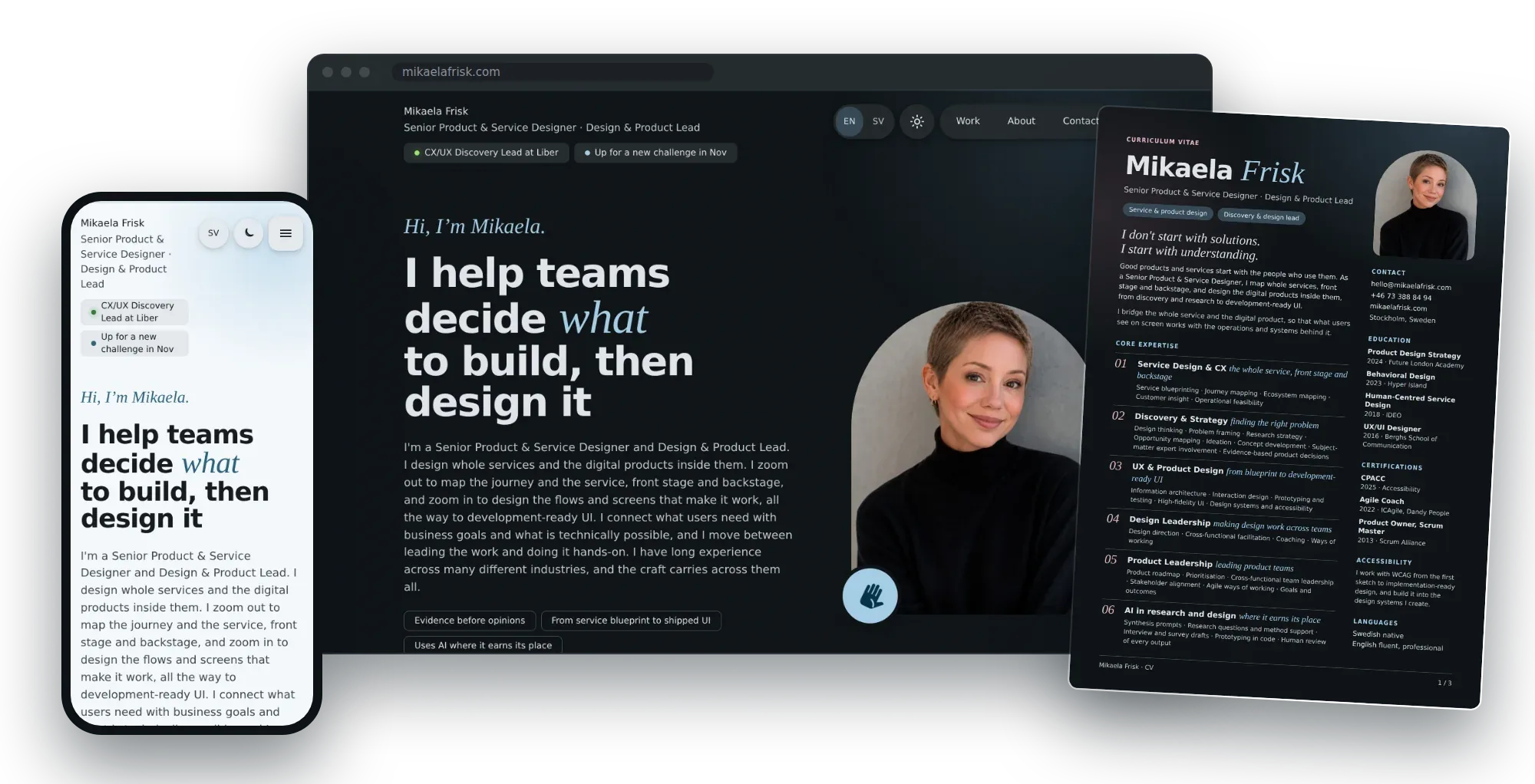
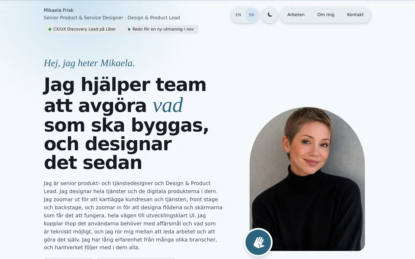
I designed and built this site myself, with Claude as my building partner. I wanted the portfolio to show more than UX/UI craft: discovery, product leadership and design leadership too. So I treated it as a product, with one visual identity across the site, the cases and the CV, a design system, design principles, and a workflow where I set the direction and reviewed every change, while Claude built, translated and checked it. Readers choose English or Swedish, and a dark or light theme.
- My role
- Designer, product owner and editor of my own site
- Year
- 2026
- Built with
- Claude, Python, HTML and CSS, and Playwright for checks
- Published on
- Netlify
- Languages
- English and Swedish
- Themes
- Dark and light
The brief I gave myself
My earlier portfolio, built in Framer, mostly showed what I had designed. It did not show how I work: the discovery before the screens, the product decisions, and how I lead designers and teams. I also wanted it in two languages, and my CV to feel like part of the same work.
The question
How can a portfolio show how I work, not only what I have designed?
Most portfolios show finished screens. Mine also had to show the discovery before the screens, the product decisions behind them, and how I lead designers and teams.
Four goals
- Show the whole rangeCases in CX/UX discovery, UX/UI design, product leadership and design leadership, each showing my role and my decisions.
- One identity everywhereThe start page, every case, the company pages and the CV share one visual identity.
- The reader choosesEnglish or Swedish, dark or light, and the choice follows the reader through the site.
- True, or not at allReal facts and real figures only. What was delivered is kept apart from what we aimed for.
Designing and building with Claude
I designed the site and built it together with Claude. I set the direction, and Claude wrote and changed the code, translated, rendered images and checked every build. The site is static: small build scripts generate every page, the CV and the Swedish versions from the same source, so one change reaches everywhere.
- 1BriefI describe what I want in plain words, often in Swedish, sometimes with a screenshot or a review.
- 2BuildClaude changes the build scripts that generate every page, in English and Swedish.
- 3LookClaude renders the pages and checks screenshots on desktop and mobile, in both themes.
- 4ReviewI review on the real page: I edit text directly on it, or point at what to change.
- 5CheckAutomated checks for overflow at 320, 375 and 1280 px, broken links, and a CV that fits A4.
- 6ShipA zip of the finished site that I publish on Netlify.
Who did what
Using AI where it earns its place meant being clear about what I keep. Claude is fast at building and checking. Deciding what a case should prove, and what is true, stayed with me.
- What each case should prove, and how it is structured
- What is true, and what is left out
- The visual identity, the principles and every final call
- Reviewing every change before it shipped
- Writing and changing the code that builds the pages
- Translating every text into Swedish
- Rendering images and diagrams from my direction
- Checking layouts, links and the CV on every build
Reviewing on the real page
Instead of commenting on documents, I reviewed in a private preview of the site. I could switch on “Edit text”, change any sentence directly on the page, and ask Claude to apply my edits, in both languages. I also used outside reviews of my cases, and turned them into new structures for the leadership cases.
case studies, across four kinds of work
company pages, each linked from the CV
languages and themes for every page
preview versions published along the way
Cases that show the whole range
I wanted the cases to show four kinds of work, not only UX/UI design. Each case says exactly what my role was: Product Manager, line manager for designers, or hands-on product designer, and some cases split those roles apart.
The anatomy of a leadership case
The leadership cases follow one structure, so a reader can compare them. Insights are followed all the way to a design decision and an impact goal, and outcomes keep what was delivered apart from what we aimed for.
- Where I started fromThe situation and the challenge, in one question.
- DirectionThe roadmap and how it was prioritised.
- UsersDiscovery, insights and where people got stuck.
- ExperienceDesign principles, decisions and the red thread from insight to impact goal.
- LeadingHow the teams worked, and a real decision or trade-off.
- OutcomesWhat was delivered, kept apart from what we aimed for, and learnings.
One identity, from site to CV
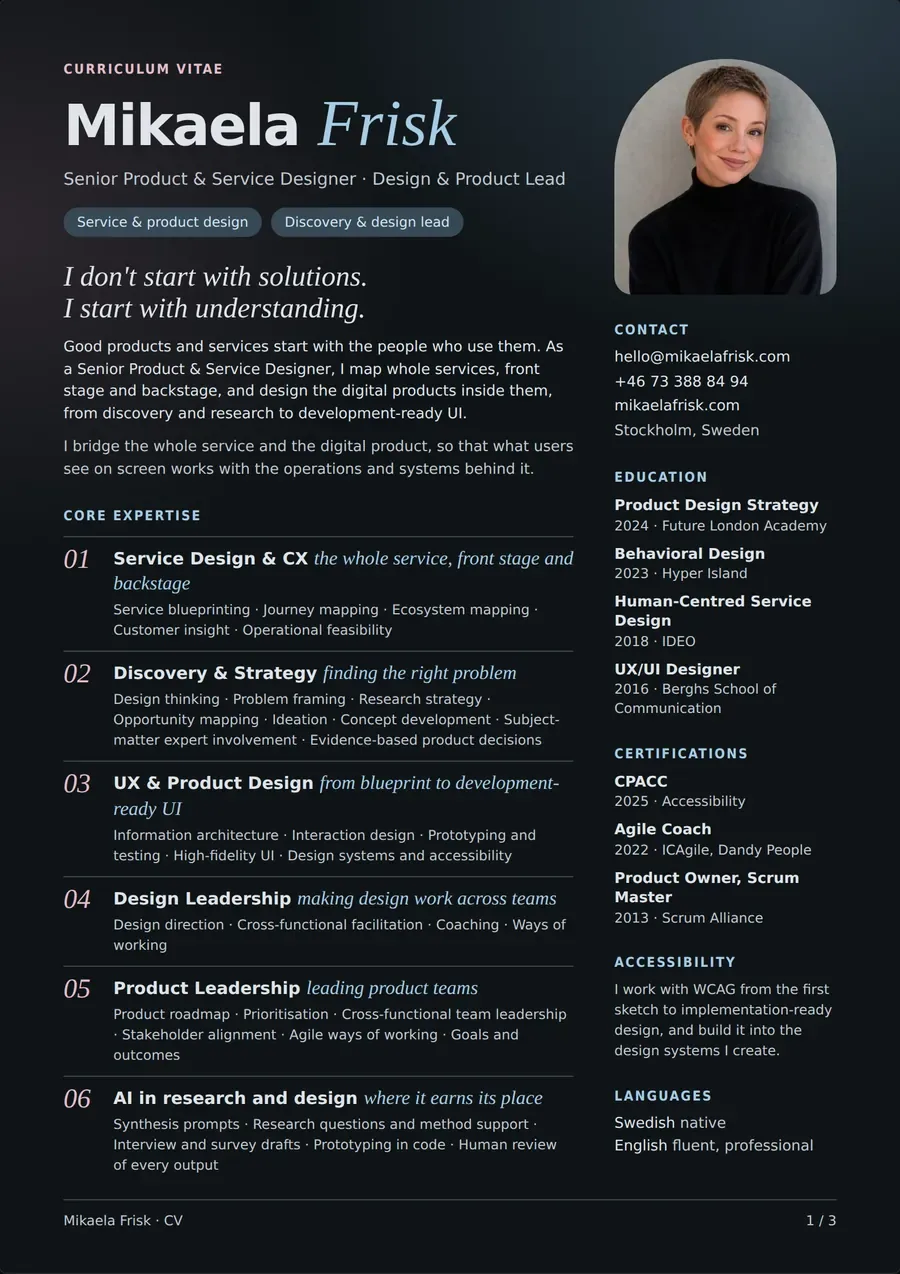
The CV is designed in the same system as the site: the same colours, the same two typefaces, the same rose labels. It is built from the same source, in English and Swedish, and checked so that every page fits A4.
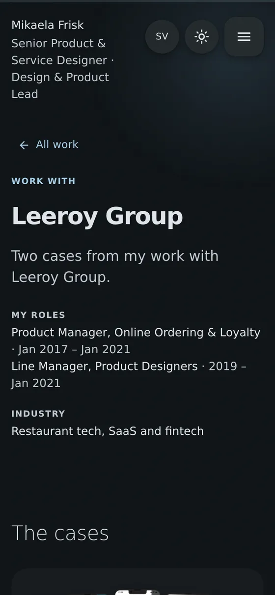
Each job in the CV links to a company page with the cases from that company, and the company names on the start page lead there too. A recruiter can go straight from a line in the CV to the work behind it.
The design system
The site is built on Material 3: colour roles, a type scale, a shape scale, a 4 dp spacing grid and expressive motion. Everything is set as tokens, so the whole site, and the CV, can be restyled in one place.
Colour
- Primary
--primary - Primary container
--primary-container - Secondary container
--secondary-container - Tertiary
--tertiary - Tertiary container
--tertiary-container - Surface
--surface - Surface container
--surface-container - Outline
--outline
Type
Dark and light, English and Swedish
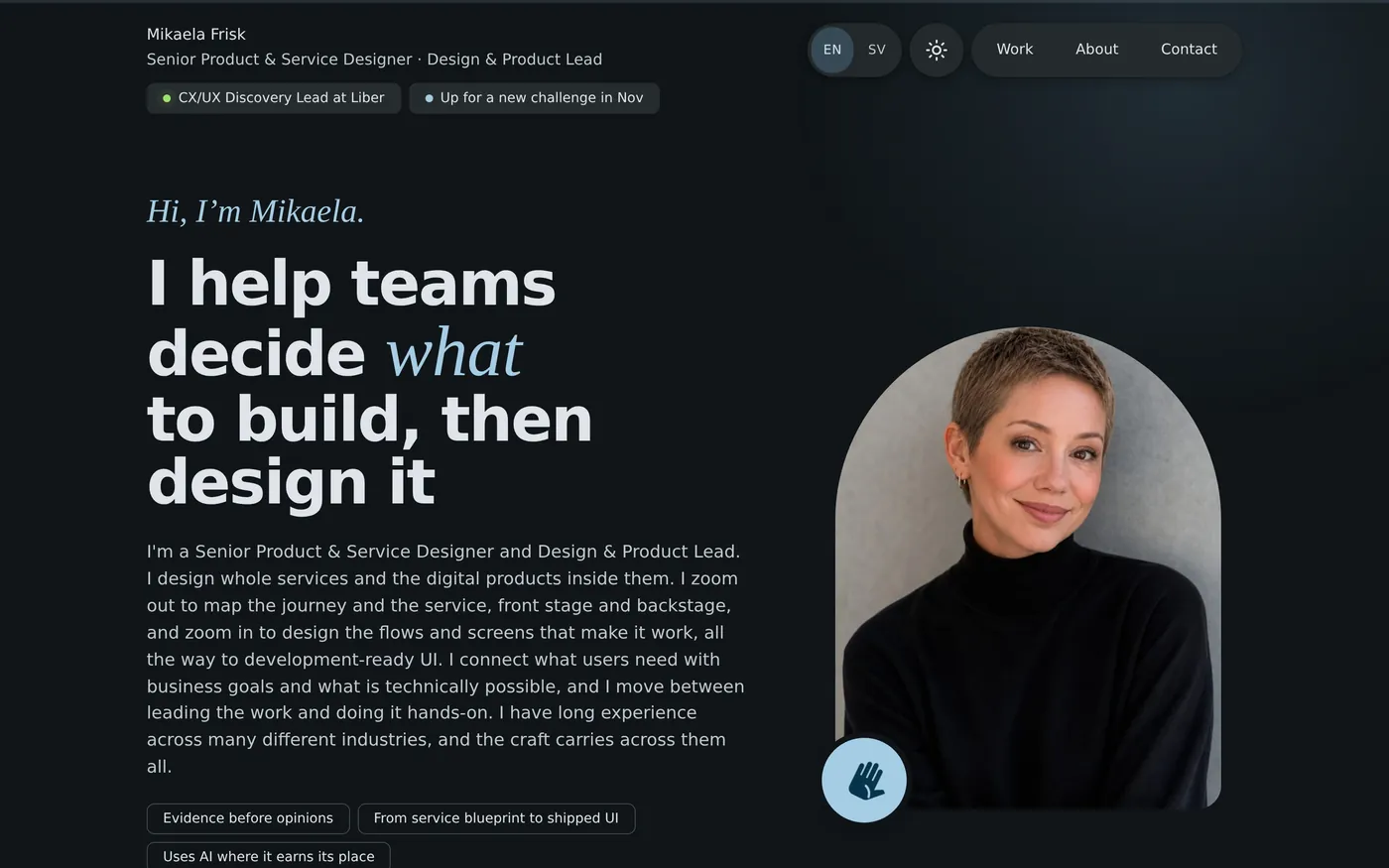
Readers choose a dark or light theme, and English or Swedish. Both choices are remembered, and every page, case and the CV is translated, including diagrams and image text.
 Dark · English
 Light · Swedish
UI components
Diagram components
Offers got diners to download the app, loyalty brought them back
From the Leeroy case.
- Discovery insightDiners didn’t know when the order was ready.
- Design principleAlways know the status of the order
- Design decisionOrder status, and a notification when it is ready.
- Product direction“I know when my food is ready”
- Measuring successOrders ready on time
- Decision
- Build ordering first, and loyalty next.
- Why
- Without orders there is nothing to reward.
Design principles for the site
I gave the site its own design principles, written as questions I could test every change against.
Show the thinking, not only the screens
Every case shows the problem, my role and the decisions, not only the result.
AskCan a reader tell what I decided, and why?
True, or not at all
No invented facts or figures. What was delivered is kept apart from what we aimed for.
AskCould I defend every sentence in an interview?
One identity everywhere
The site, the cases and the CV share colours, type and components.
AskDoes it feel like the same person made all of it?
The reader chooses
Language and theme are the reader’s choice, and the choice is remembered.
AskCan a Swedish reader in a light room read everything comfortably?
Built for every screen
Checked down to 320 px, in both languages and both themes.
AskDoes anything break on the smallest phone?
Respect the people in the work
Names and personal data in screenshots are blurred, and credit goes where it belongs.
AskWould the people in this case be comfortable reading it?
Learnings
Looking back, four things stay with me from designing my own site with Claude.
AI is fast, judgement is mine
Claude could rebuild a whole case in minutes. That moved the hard part to deciding what is true, what matters and what to leave out.
Review on the real thing
Editing text directly on the live page, in both languages and themes, was faster and more honest than commenting on documents.
A system makes new things look native
With tokens and shared components in place, new diagrams like the red thread or the KPI matrix fitted in from the first version.
A portfolio is a product
It has users, recruiters and hiring managers, and it needed a brief, versions, quality checks and a backlog, like any product I have led.